As you might expect, there are all sorts of unexpected and intriguing materials held in Special Collections. What you might not expect, is that we don’t often have the time or opportunity to delve into them in as much detail as we might like to. This post is the tale of one of those intriguing items, and how I finally got to explore it!
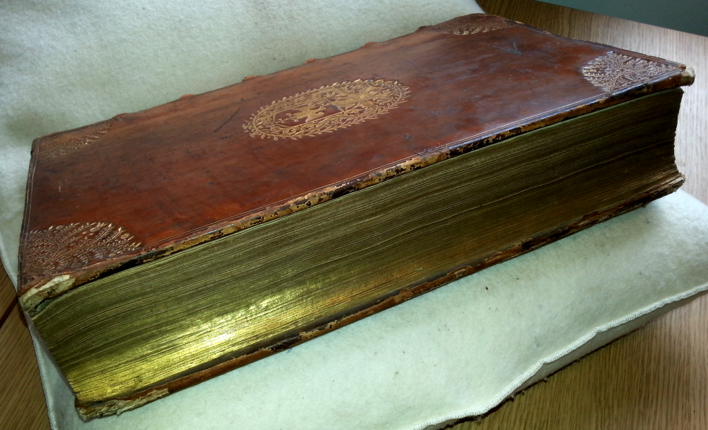
![]() The book itself is rather unassuming: in a plain, half leather binding, with gilt edging and title which reads ‘Selection of Precedents’. Inside, it’s rather more interesting, with manuscript list, contents and index in a late eighteenth or early nineteenth century hand. So far, you might think, so archival, and I must admit to not having much expertise in legal history, with which this tome is so heavily concerned: ‘precedents’, in this case, referring to the legal sense. Something else, however, caught my eye: amongst the names listed on the first few pages, beneath their respective kings, are some key players in medieval politics including Hugh Despenser, Alice Perrers and Thomas Monatcute, the Earl of Salisbury.
The book itself is rather unassuming: in a plain, half leather binding, with gilt edging and title which reads ‘Selection of Precedents’. Inside, it’s rather more interesting, with manuscript list, contents and index in a late eighteenth or early nineteenth century hand. So far, you might think, so archival, and I must admit to not having much expertise in legal history, with which this tome is so heavily concerned: ‘precedents’, in this case, referring to the legal sense. Something else, however, caught my eye: amongst the names listed on the first few pages, beneath their respective kings, are some key players in medieval politics including Hugh Despenser, Alice Perrers and Thomas Monatcute, the Earl of Salisbury.
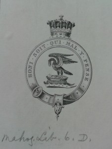 Though I knew this item was interesting, it wasn’t until we looked at cataloguing it that we really began to look at it in more depth. As I sat with Rachel, looking at the provenance suggested by the unusual bookplate (a Knight of the Garter, and most likely a Scottish earl), my enthusiasm for all things medieval got the better of me. With Rachel’s background in Classics, we thought that it might be best for me to take a look through, to find out just what this book was!
Initially, I was intrigued to see the name William de la Pole, Duke of Suffolk, under the reign of Henry VI. If you didn’t know, Henry VI proved a rather ineffectual king, and became overly reliant on various favourites. One such unlucky favourite was de la Pole, who successfully negotiated a Henry’s marriage to Margaret of Anjou, but ended up ceding the regions of Maine and Anjou back to France in return, after they had been conquered by the English during the Hundred Years’ War. This made Suffolk hugely unpopular with the Commons (both in Parliament and in the wider country) and so, according to the Selection of Precedents, he demanded that the ‘infamous charges rumoured against him’ should be openly exhibited, so that he could offer a defence. What followed was wrangling between Lords and Commons, and between rivals: although the Commons did eventually impeach the Duke, the king refused to have him executed and instead banished him. According to the Selection of Precedents, the Commons launched a protest as soon as the new Parliament opened in 1451, demanding that the Judgement of Attainder should stand. Their only slight obstacle was the fact that Suffolk was already dead. A laconic note adds:
N.B. Between the time of his banishment and of the above petition, the Duke was murdered
In fact, he took a ship to France but was met en route by ‘pirates’ (although many English gentlemen and soldiers were at this time engaged in piracy as warfare against France) and beheaded. His body washed up on the beach at Dover shortly afterwards.
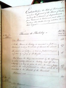 With my interest piqued by this sorry tale, I have been spending time looking through other cases detailed. On such details the complaints of Edward III’s mistress, Alice Perrers, about her loss of land and liberty, towards the end of Edward’s reign, and the beginning of Richard II’s. Thomas de Berkeley was examined in 1330 on suspicion of the murder of Edward II; although cleared of committing the crime himself, he was considered culpable since the king was in his custody at the time. In the reign of that unfortunate Edward II, Hugh Despenser came to Parliament to claim lands from the deceased Earl of Gloucester and Hereford, by right of his wife. In terms which would have been headline news in the later Victorian law courts, the debate was whether the Earl’s wife had been pregnant when the Earl had died: if not, and the child was illegitimate, then Despenser stood to gain. Other cases detail extortion, treason and pardons of the basis of having been impeached ‘by the hatred of his neighbours’, in one Hugh Fastolf’s case. Following this case, in 1376, the Commons requested that the king should not pardon anyone impeached in that Parliament, ominously identifying ‘any one great or small who have been of his privy Council’. The king in question was Edward III, identified by many as the greatest medieval monarch. His answer rather sums up the relationship between the king, justice and the Commons at this point:
The King will do as shall seem best to him
Later, following the Civil War and Restoration of the monarchy in 1660, members of the Commons were once again pondering the power of the king to pardon or intervene in legal matters. By that stage, Parliament was a far more powerful force than it had been three centuries earlier, and there was concern that any judgements could effectively be halted and the accused set free by the prorogation or closing of that Parliament by the king. This would protect the king’s favourites and, far from Edward III’s motto of doing as he saw best, the idea was no longer acceptable to the Early Modern Commons.
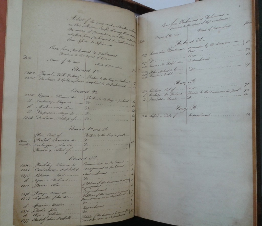 The Selection of Precedents records that in 1673, under Charles II, a Committee reported:
…“That businesses depending in one Parliament or Session of Parliament have been continued to the next session of the same Parliament, and the proceedings thereupon have remained in the same state in which they were left when last in agitation
This meant that no-one would be set free or allowed to enjoy assetts removed while under judgement even between Parliaments; it removed from the king the power to halt such proceedings. Of course, this was not the end of the matter. New cases came forward over the years and during the reigns of successive monarchs. In 1791, the Lords were again debating this issue, pointing out that laws did not lapse between Parliaments, and questioning why judgements be any different.
In each of these debates, according to British law, precedents were sought to bolster the cause for the contiuation or cessation of judicial proceedings between Parliaments. Drawn from the Parliamentary Rolls and the Journal of the House of Lords, the accounts in this Selection of Precedents are just such an excercise: detailing cases which continued between Parliaments from the reign of Edward I, right up until that of George I and the impeachment of the Earls of Oxford and Mortimer for high treason.
 It is not clear why this book was put together: its extracts evidently come from learned sources, and the notes in red on some verso pages comment on the proceedings with an expert knowledge. In the case of Salisbury and Peterborough, in 1690, the commentator writes:
The report in this case is in several instances inaccurate and unintelligable – and untrue
I haven’t yet got to the bottom of this mystery, and it would probably take someone more expert in legal history than I am to give a full account of this item. But I like to think that this books was part of a gentleman’s legal training, looking into precedents and commenting upon the processes used in the arguments. Stretching to 73 handwritten pages, it would have been a considerable undertaking and the care taken in rebinding the pages suggest that it was a valued item. Although the content may be duplicated elsewhere, in official government sources, perhaps the owner treasured this volume for the study he remembered and the enjoyment in his meticulous research.
Perhaps he even enjoyed putting it together as much as I have enjoyed reading it!

