 By
By 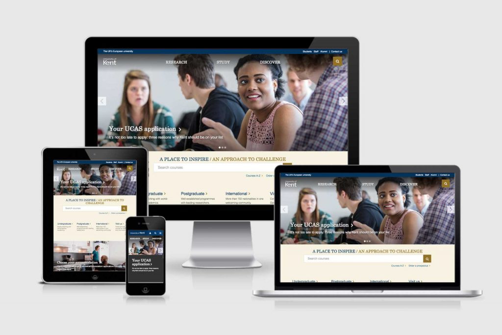
So where are we and what are the next steps?
A short history
A new university website hasn’t just been a change of new theme, but it’s a programme of work that has required institutional changes in order to progress.
We’ve needed to adapt as Higher Education has moved towards a stronger user-focussed environment.
Adjusting to this has required a cultural change at times where the outside world wants to see a simple, integrated service rather than an institutional hierarchy.
Under the sponsorship of the Brand Strategy Group, it has involved teams across the university.
2015 – discovery
Our discovery phase (view findings here) included a range of research from interviews and competitor analysis to user testing and focus groups.
This resulted in the vision and high-level objectives for a new website to help support the University Plan.
A design process, led by workshops with central teams and schools, helped develop design/user experience principles and prototype concepts.
2016 – beta
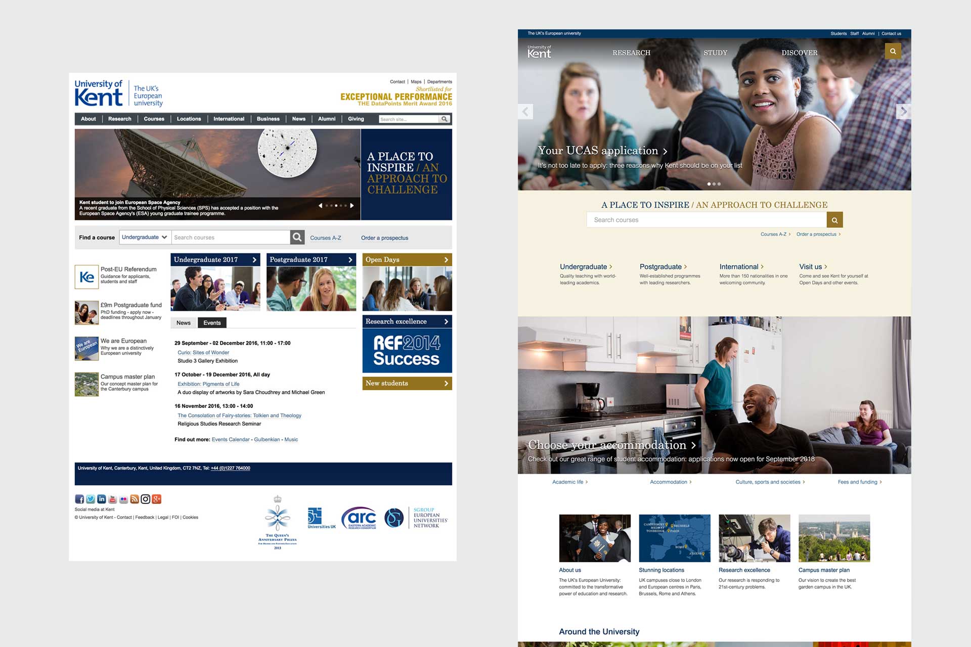
We had a beta launch in 2016 of a new homepage and News Centre and continued to develop patterns for the new template.
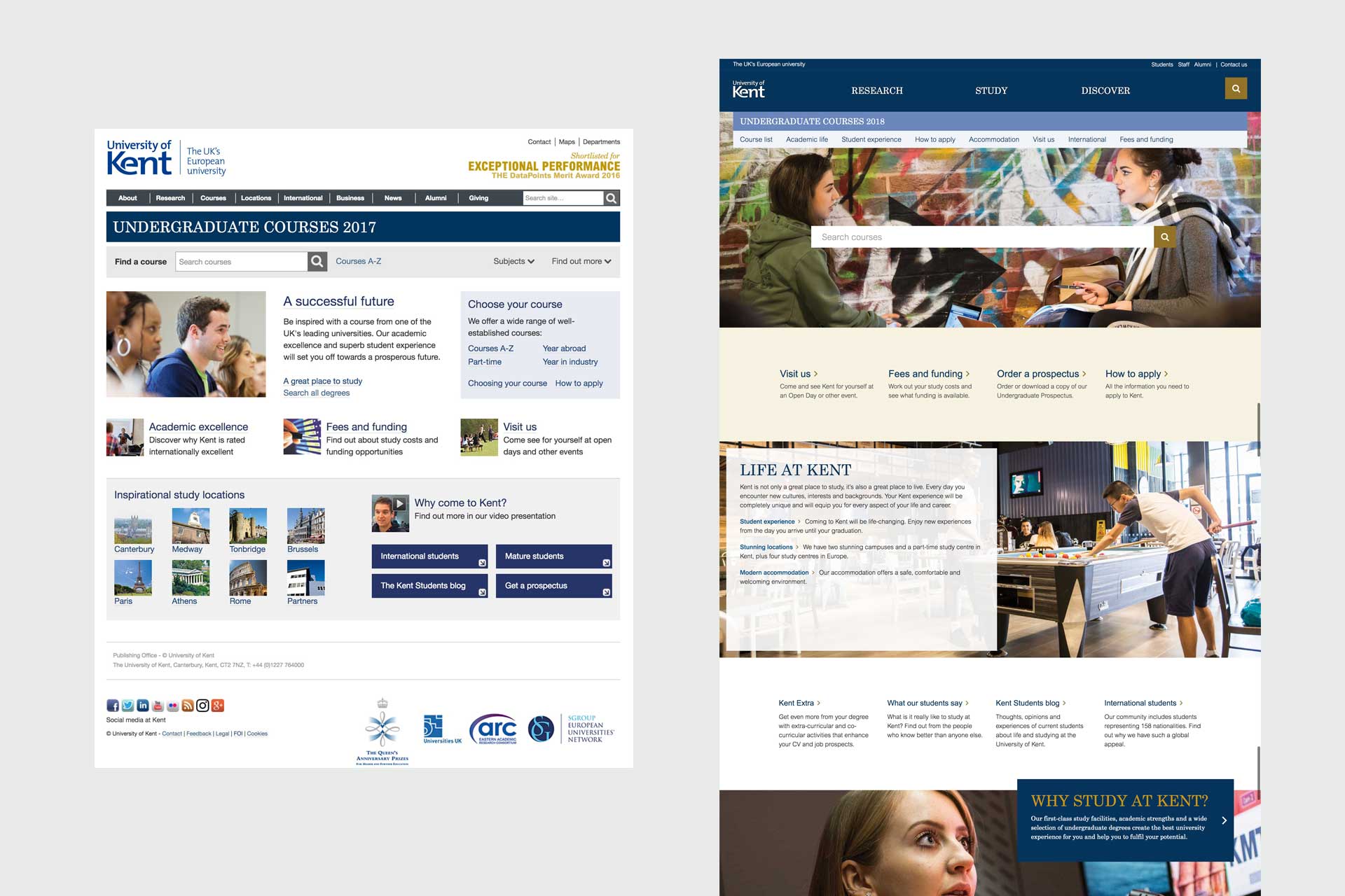
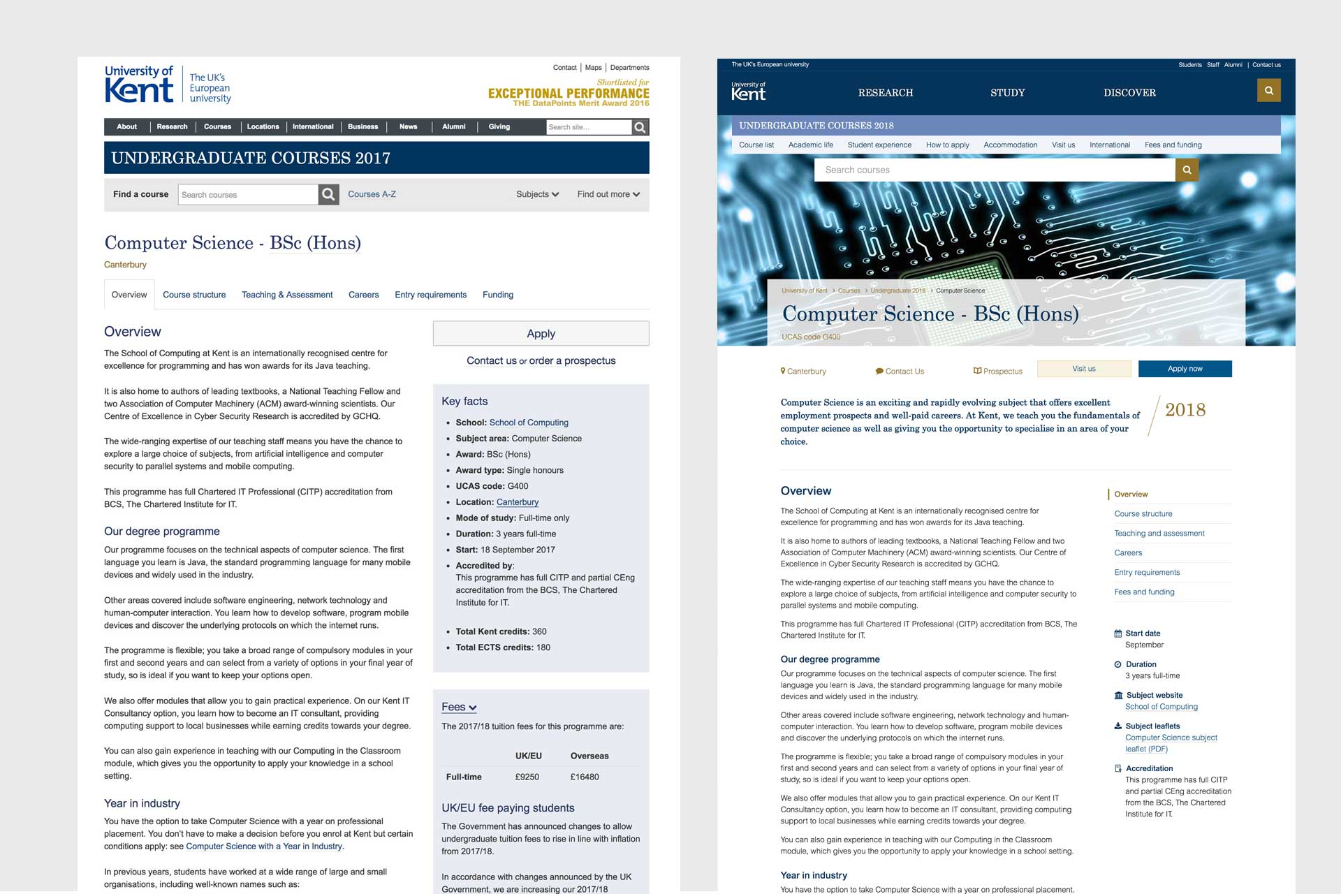
Working with central teams we developed key content for the homepage, top level pages, news centre, course pages and course sections.
2017 – launch of key pages
The ‘go live’ with the initial pages was on 28 February 2017.
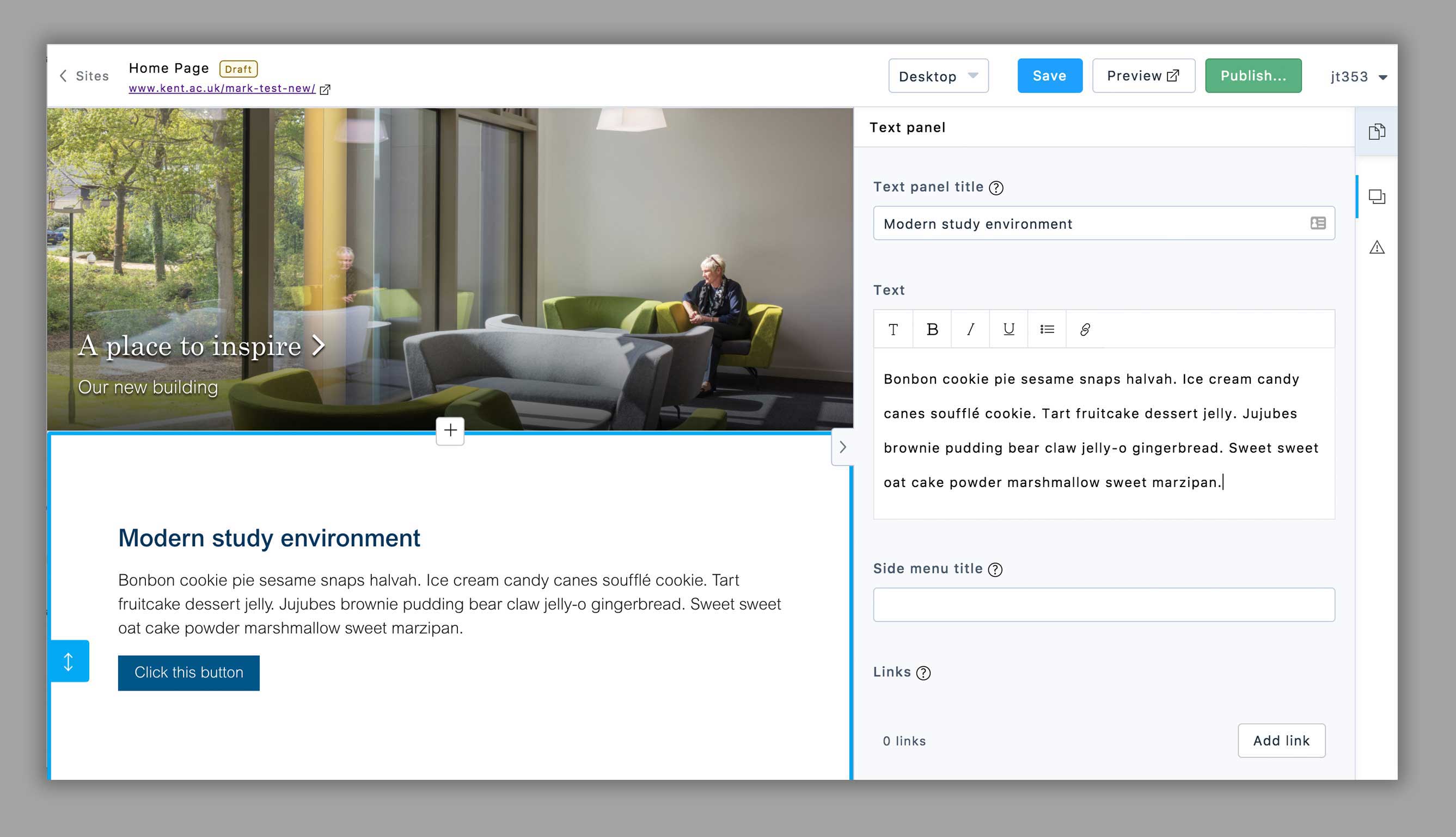
We eventually decided on developing ‘Site Editor’ as our replacement for Dreamweaver as a more content-focussed and open-source editing tool.
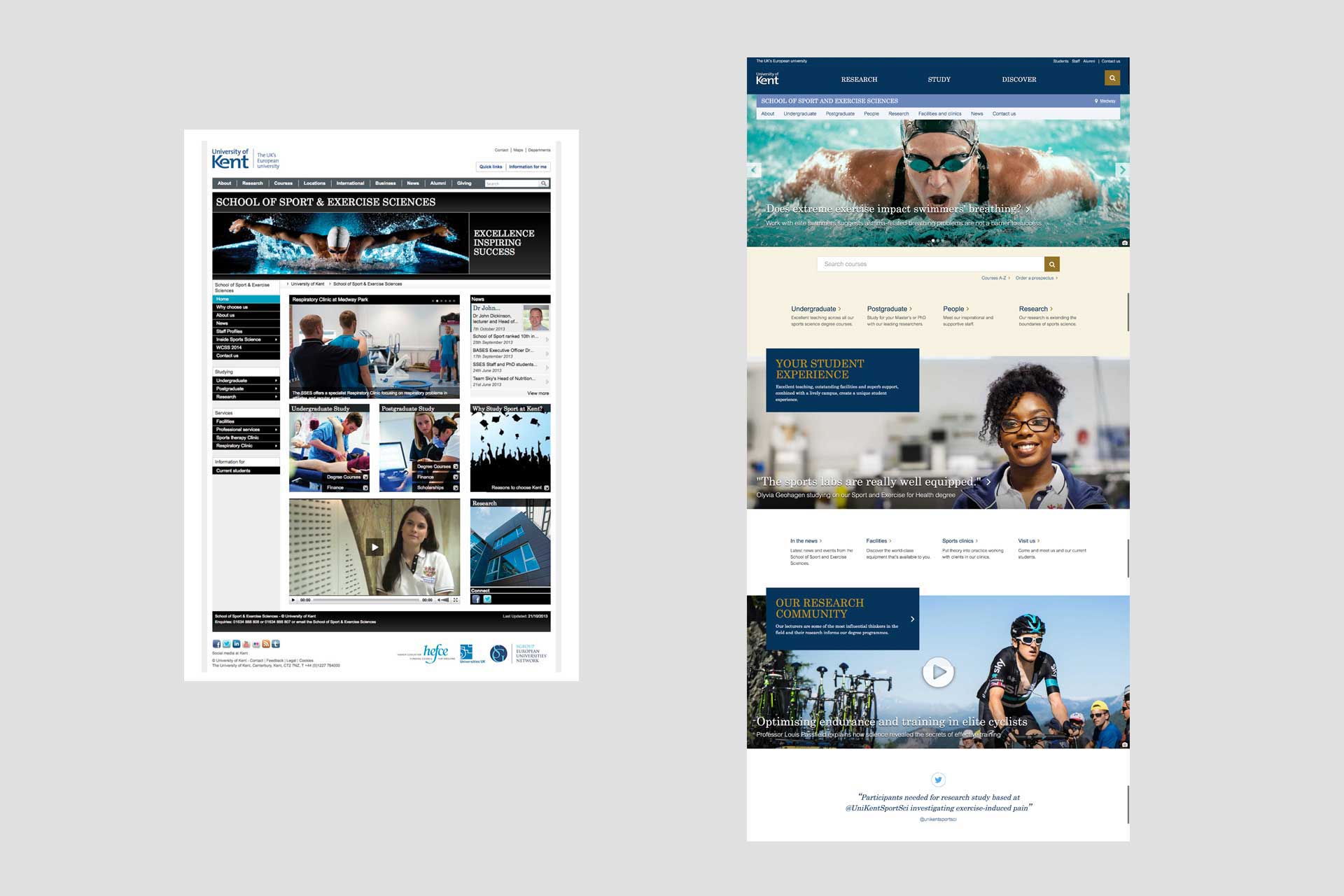
School pilot work began working with Sports Science and Exercise, Architecture and Kent Business School.
Research.kent framework was developed to help promote the breadth of research with research sites beginning to move over to the new system.
Many ongoing refinements (such as the new contact us link) and user testing of the new theme, led to new patterns and the development of our content guidelines for building in Site Editor.
2018 – the year ahead
It is going to be an exciting year ahead for the new website. There is a lot on the go.
A range of ‘recruitment-funnel’ websites are being migrated to the new template and there is a programme to move school sites into the new theme. Workshops will help schools plan for quality imagery and videos.
We’ll be launching Site Editor to edit new website content, finally bidding farewell to Dreamweaver. This will include a lot of design improvements to the new theme including a slicker mobile experience.
We’ll be developing a new staff profile system to help support research and postgraduate recruitment.
A particular focus will be looking at internal content. Having focussed on external audiences, it’s time to support our current students and staff. We’ll be looking at templates and patterns to support internal content.
Feedback and analysis
We continue to monitor and get feedback on the new pages. A year on, the indicators are promising.
Does the new website improve the perception of our brand and does it help people get to the tasks and information they need more easily?
User feedback
Lots of user testing has been done during the school pilot project with mostly positive feedback from students:
“Cleaner and brighter”
“Better UX”
“Easier to scan”
“There is a sense of priority”
You’re making it about the student”
“I like the layout and colour, it pops up more”
“I like how they used someone’s opinion here and what they actually do”
We also received feedback from prospective students in local schools with overall positive feedback:
“swish”
“easy to read and navigate”
They particularly enjoyed visual content: videos, images and 360° tours.
It hasn’t all been positive. The new design change and the need to scroll, has taken some adjustment for those familiar with our old website template.
Course page stats
Course section and pages show more views, lower bounce rate, longer time on site. This indicates greater engagement with the content.
People are engaging more with course pages on mobiles. There is a adjustment of traffic from desktop to mobile. For mobile users, the courses section had a 10% increase and a 27% drop in bounce rate with slightly longer sessions.
*November 2017 to November 2016
User observation
We use software to anonymously observe user interaction with our website and have over 130,000 recordings!
We’ve observed hundreds of these and it has helped us refine various design and navigation aspects and to ensure that users can complete key tasks when navigating.
Improvements, such as the new ‘contact us’ links and various refinement to search filters and menus (centred course search and clearer course filter fields) are some example resulting from the observations. Many mobile design elements have also been refined.
We haven’t observed any major issues with users interacting with the new design.
An example recording we observed to see how people are using the website:
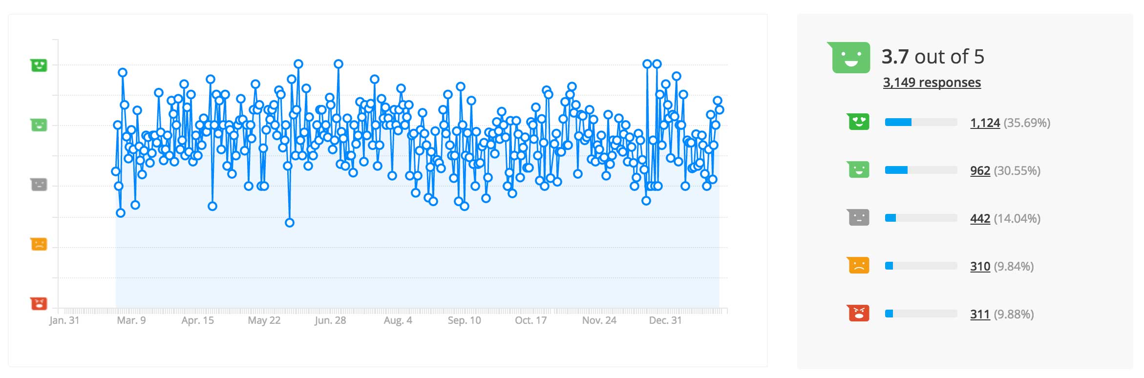
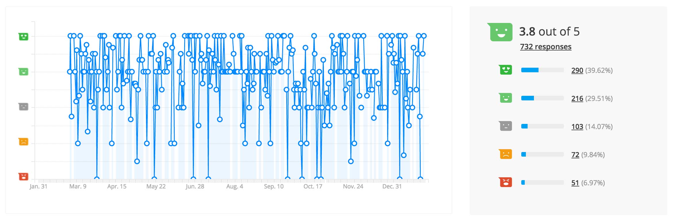
Website feedback indicator
This is a bit of a finger-in-the-air indicator. It is generally positive and is based on the feedback tool on the website.
All pages
Undergraduate pages – including courses
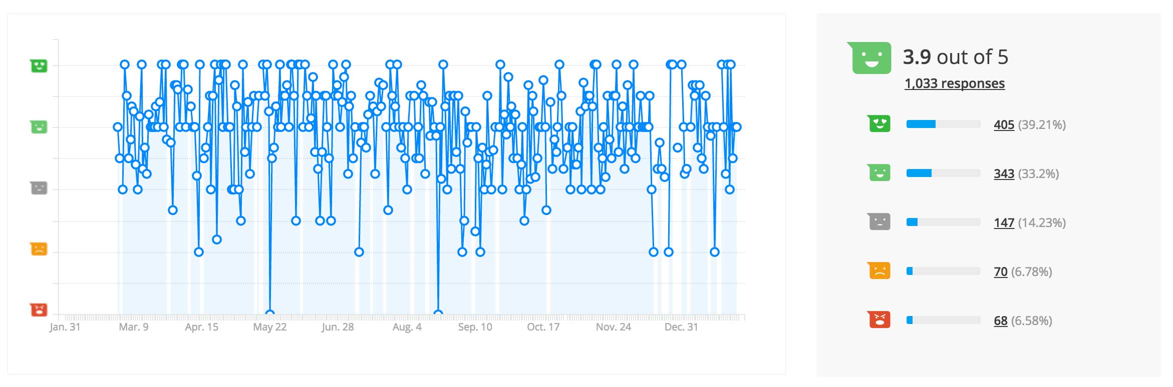
Postgraduate pages – including courses
Conclusion
We’ve had a year of the homepage, research and other top-level showcases pages being updated regularly with fresh, relevant content to promote recruitment, research, our people and involvement of broader business and the community.
A part of the content strategy is to simplify our publishing tools, reduce our website ‘bloat’ and prioritise content that gives our users the most value. Focussing on strategic content supported by good quality imagery and videos is important to create the impact that we need.
The templates for the university site seem to be performing okay. Our observations show that people are interacting with the new design patterns and templates – we’ll continue to refine and improve them.
Based on user-testing feedback (prospective and current students) the refreshed design does seem to resonate with students in presenting a modern, progressive university.
Our user testing of school pilot sites show that the basic structure for schools is fine (unsurprising as the structure is a common denominator across all school sites). Students were able to navigate and perform key tasks. They gave positive feedback about the impact of the design.
As with all website content; evaluating, monitoring and refining is an ongoing process. For now we have have a new scalable and responsive design framework and publishing system that we can build upon and adapt to changing needs.
Really interesting to see the progression and ongoing research, thanks for sharing.