The new Sport and Exercise Sciences (SSES) pilot site launched in September and we wanted to get feedback from students to help us evaluate it.
Six students (5 x 1st years and 1 x 2nd year) gave us feedback in separate moderated sessions.
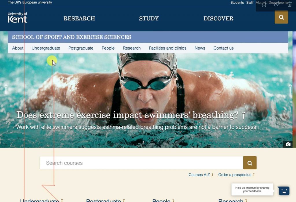
We wanted to test the impact of the new design through ‘first impressions’ and usability through tasks which we asked each participant to complete.
Choosing Kent
There were the familiar answers such as rankings, locations (near to London), course quality, modules and accreditations.
Facilities stuck out as a very important selling point.
It was nice to hear some positive perceptions about Kent before students came here:
“They know what they’re doing”
“At Kent they really want you to join a particular course because they know they are good at it”
“You know it’s the UK’s European University”
And other expected routes also helped promote Kent such as Open Days and outreach visits to schools. One international student used an agency, for him proximity to London was vital and he relied strongly on the website for making his decision.
First impressions and brand impact
In order to gauge the impact the design had on perception of the university, we asked the students to give a rating of 1 to 10 on various criteria of the old and new homepage designs and then discussed their reasons.

This included:
- initial impact,
- quality of teaching,
- dynamic and modern environment,
- future investment/prospects,
- and quality facilities.
In all instances the students said that the new design had stronger impact across all areas except for facilities, which received an equal rating.
Average ratings across different criteria was 5 for the old design and 7.5 for the new design implying an improved perception of the university.
| Old | New |
|---|---|
| “Vague” “too cluttered” “There are too many things going on” “cluttered navigation” “There’s so much to click on” “Buckety” “I just want easy [choices]” |
“You’re making it about the student” “I like the layout and colour, it pops up more” “I like how they used someone’s opinion here and what they actually do” “More welcoming and fresh” “more modern” “Easier to find the little sections, all labelled.” |
Tasks
Starting from the homepage, we asked participants to perform key tasks to ensure that they could navigate easily around the site and find what they needed.
Finding a course
Most selected undergraduate tab in menu or autocomplete on the homepage. Successfully found the course in all cases. On the undergraduate page, they tended to glance over content and focus on finding a course.
Exploring the course page
Entry requirements were important followed by course structure and modules. Most were aware of the KIS widget and found it helpful.
Finding out about the school
Most spotted the about link in the menu and said that the page had the kind of information expected. They found the rankings useful, but would have likely researched through other sites, such as UCAS or Guardian rankings first.
Learning about facilities
Easily navigated to the page. Virtual Tours were very popular. For SSES, where their facilities are vital to the courses, this is particularly valuable. They all liked the gallery. Particularly beneficial for international students who may be unable to attend an Open Day.
“Ooh! I like how they do the virtual tours”
“It’s nice” liked the virtual tours. “It’s really easy to navigate to find out about the facilities”
Finding an academic profile
All managed to find an academic that we gave them. Most were unlikely to use this page when researching a university or course, but may find it interesting to learn about their lecturers.
Contacting the school
Finding the page was straightforward. There was a preference towards using email. Other routes for contacting was via the international Office or Open Days.
One student used an agency to make contact with the school. Generally they didn’t widely use social media, some followed the Canterbury and Medway student Twitter feeds.
Highlights
- Impact/first impressions – in general users found that the new design provided more impact and gave them a better perception of the university.
- Navigation – all straightforward using the horizontal menu navigation.
- Course page – as seen in previous testing, course pages are mainly initially used for entry requirements and course structure information. Users are aware of the KIS widget and do find it helpful.
- Facilities – virtual tour and gallery were very popular, particularly helpful for international students who may be unable to visit. Having a stronger lead feature about facilities may help on the home page. Linking to the school facilities page may be a consideration for the course pages.
- Contact – users prefer email contact with the school/university to start with.