We did guerrilla user testing with 6 people ( 2x PhD, PGR, PGT and two graduate staff members) in the Library.
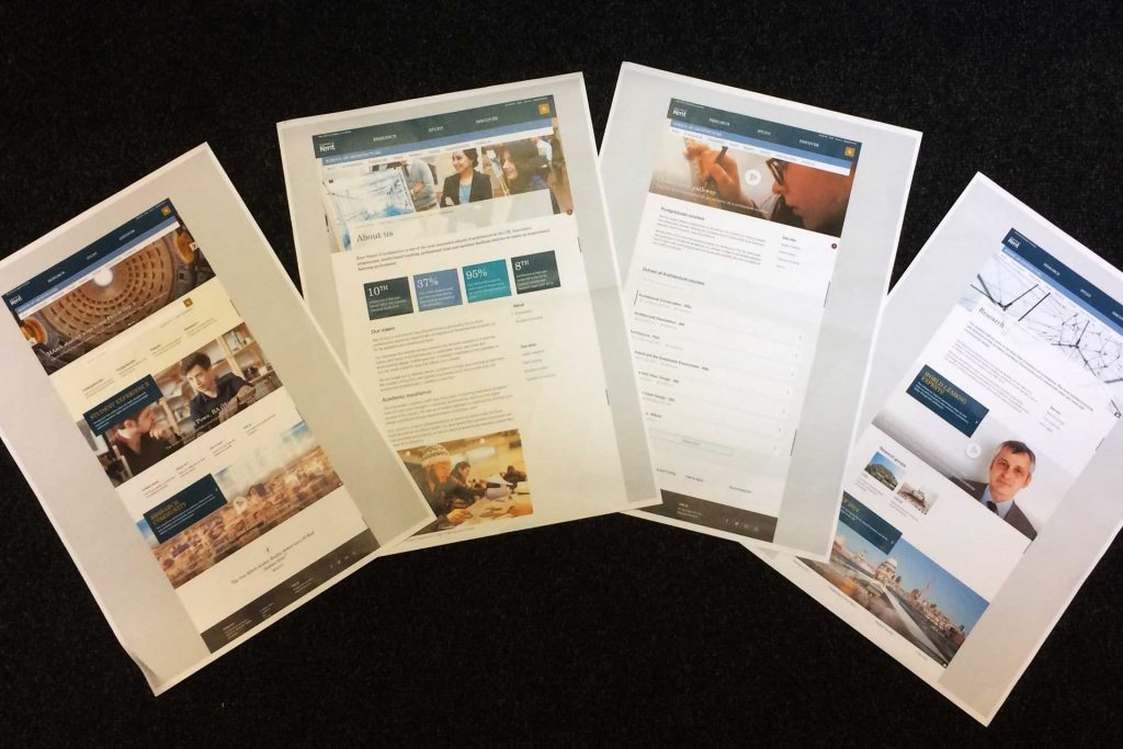
We used the home, about, facilities, research and course page designs for School of Architecture (part of our school pilots project).
Our research backed up the earlier findings from the user research we did for the School of Sports and Exercise Sciences.
Overall comments were very positive:
- “Cleaner and brighter”
- “Better UX”
- “Easier to scan”
- “There is a sense of priority”
About page
We wanted to get feedback on the priority of the sections use on the About page.
Generally thought that locations were lower priority and perhaps facilities and employability prospects are a stronger selling points and could be nearer the top of the page.
Showcasing a graduate who has become successful in their employment by investing in the school is a great selling point.
The term “vision” was liked – although this needs to have an external focus about where the school is going in relationship to how that benefits prospective students, not business speak.
Liked that the content gave a “human face to the school” through imagery, video and tone.
Course pages
We received good postgraduate feedback on the course pages from PhD students and a Master’s student.
Having a short description/preamble about PGR and PGT courses on the postgraduate course listing pages was appreciated. Putting a stress on the PGR to PhD route could help make this link clearer.
Funding and supervisors were key for postgraduates. Content on how to find a supervisor was very popular – staff profiles are key.
A preamble wasn’t thought necessary for the undergraduate listing page – there may be exceptions if unusual course options need explanation.
Facilities page
The visual nature of the page was praised, users loved the 360 tours, videos and gallery of facilities. It was stressed that facilities are a big selling point for a course like architecture and therefore should be linked in from the home/about pages.
Research page
Positive feedback on the layout and content structure.
Information about professional links to research, media relations and broader audience focus were thought to be good additions to the page.
Conclusion
- We backed up our previous findings
- Use profiles – videos and profile content create a stronger connection to the content giving a “human face to the school”
- Create content and signpost key postgraduate needs, how to find a supervisor and funding opportunities, through videos, profiles and clear links
- Clarify PGR and PGT as some prospective students don’t understand the differentiation
- Stress PGR more on the Postgraduate course page (better description and filters)
- Link facilities into the home and about pages