We did guerrilla user testing with 10 people (8 students, a staff member and by chance a parent of a sport sciences student) in the Library.
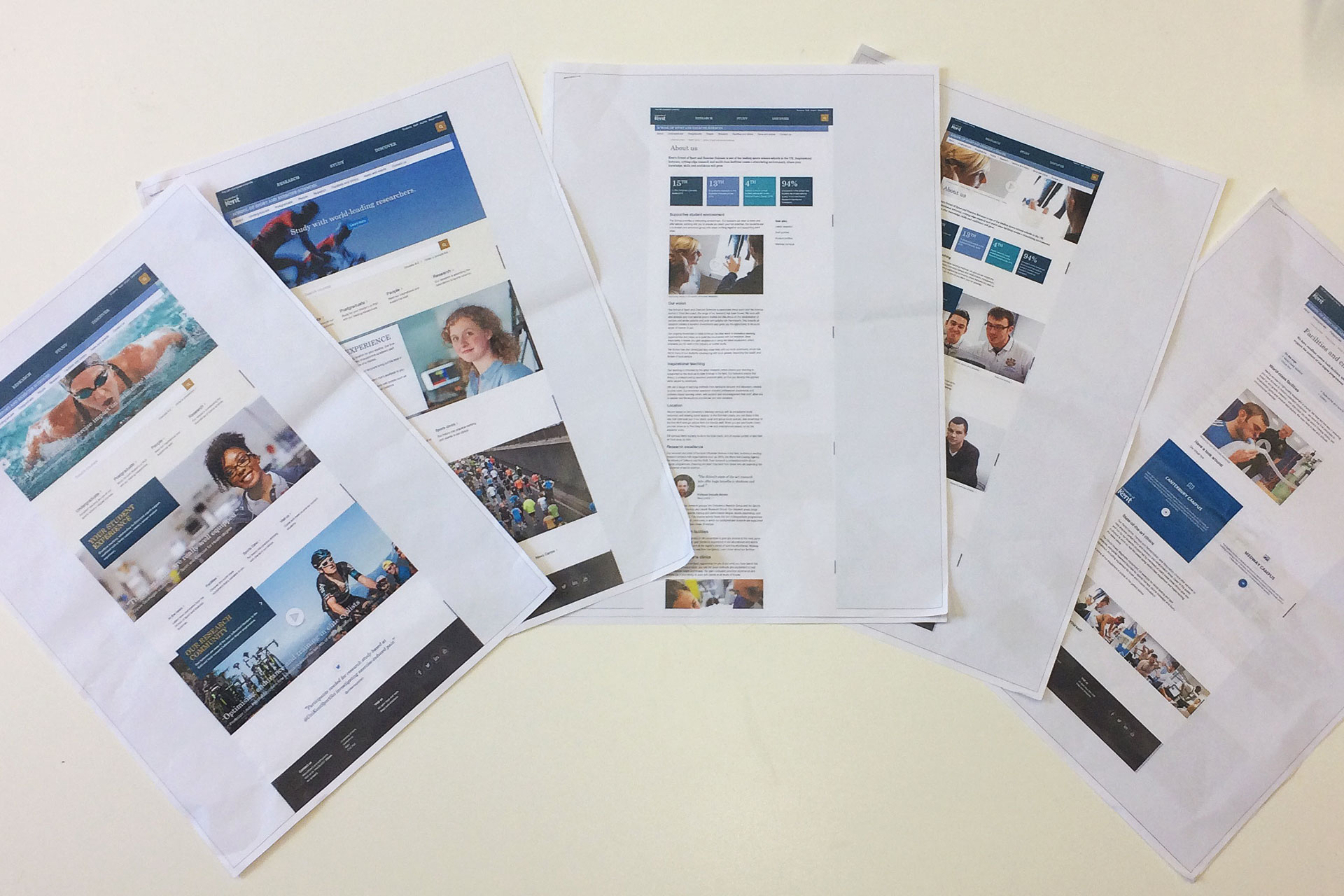
Using the home, about and facilities page designs for School of Sport and Exercise Sciences (part of our school pilots project), we received feedback on:
- Keys tasks – finding a course, staff profile, about the school/facilities
- Content design
- Editorial style and tone
Key tasks
- Everyone found a way to search for courses – the top section links were popular for navigating
- When asked to find a staff profile, everyone used ‘People’ link
The term ‘People’ was thought to be broader than ‘Staff’ profiles. There was a comment that ‘People’ sounded friendlier - Rankings for the school were expected to be found in the ‘About’ section
- There was a comment that the global navigation links (research, study, discover) didn’t look clickable
Content design
- Design
Positive comments – “modern”, “visually appealing”, “clean” and “less cluttered” - Imagery
Strong, quality imagery which works in tandem with good stories and marketing messages ‘incites more interest’ making users more likely to engage with the content - Media
Liked short videos, particularly students talking about their experiences.
Interactive 360 degree tour concept for the facilities page was very popular enabling. prospective students to get a better feel for the facilities and environment.
Gallery concept received good feedback. - Content elements
Positive comments about profiles and student quotes which use images of people.
Like key facts/figures panel at the top of the about page. - Image/editorial balance
We tested two variations of the About page. One was more image-led (showcase style). The other more editorial (standard content-page style).
They were positive about both approaches.
Some preferring a stronger editorial content so that it didn’t double up on the homepage showcase style and provided the option for more context.
Editorial style and tone
We asked some people to read the About us editorial content:
- Tone was “personable”
- About the right balance “not too chatty”, but “not dumbed down” either
- Liked the shorter, scannable sections of text – “a simple nice way of writing the content”
- As for specific content, careers/post degree and locations were mentioned as important
Conclusion
- Users were able to achieve key tasks
- Content and visual design received positive feedback on all examples
- The first homepage received better feedback due to stronger imagery and profile – feedback fairly split
- A more editorial approach to the About us page, may help distinguish it more clearly from the homepage and provide more context
- Interactive content using videos, 360 degree tours and gallery were popular – as used on the facilities page
- Editorial tone had the right balance
- Making reference to careers information in the course pages or having alumni profiles may help with the career/post degree content which some users were interested in
The visual design, templates and patterns were sufficient in supporting the requirements for the content.
The strength of the design relies on quality content based on user needs.
Strong imagery and editorial work together to feature relevant links, strategic information, interesting stories and profiles.