 By
By 
We’re planning to release a range of key web pages in the new theme by the end of February. This is a summary of what we’re hoping to release, and the components those pages are built up from.
A couple of months ago I wrote about all the work we’d done on our new theme over the summer. Now we’re planning to release a range of key web pages in the new theme by the end of February 2017. This blog post outlines where our designs are at barely two months before they go live. Some of our new-look pages are already available on our beta website.
New content
This is the content we’re planning to release in the new theme by the end of February 2017:
- new homepage
- new top-level showcase pages – research, courses, engage
- new course detail pages
- new events pages
- new search results pages
- new news pages
- new error pages (404, 500)
Much of this has been completely rebuilt, or written from scratch following both business needs and user needs. The aim is to convey something of what Kent is about in a way which is engaging to a range of people using the website.
We’ve also tried to adopt much more of a content-centered approach. What are the stories we want to tell, and how do we want to tell them? We’ve put a lot of time into thinking about what tone to adopt for certain pieces of content, and how each page can successfully meet overt user needs (for example my analysing our stats to see what people are trying to get done) while providing latent user needs and marketing expectations from the business.
Design principles
Our new theme follows atomic design principles, reusing basic design components in a consistent way. It also aims to enhance the user experience through the use of:
- space
- bold, high quality imagery
- clear typography
- plain English
- simple, content-rich layouts
The use of bold imagery has in particular been a key area for the redesign. It assumes a level of marketing sophistication not readily available on our old website, and web publishing has not previously been particularly visually focused. Shifting this focus is a challenge.
Page types
Our web pages fall into three basic types.
- Feature Pages. Navigational pages, primarily visual and relatively low on text. These pages typically act as subsite (e.g. departmental) homepages, or key corporate pages.
- Content pages. Content Pages are the core content people might typically be looking for, such as finding out how to apply, course details, or a video of a student explaining catering facilities on campus.
- Navigation Pages. In between the extremes of Feature Pages and Content Pages are a range of Navigation Pages which mix links, images, video, and text to different levels to achieve different business and user needs. However their primary aim is to get people quickly and easily to the content they are interested in.
High-level building blocks
All pages are made up of a relatively small number of high-level core building blocks. We’ve tried to keep things as simple as possible. This helps us (we’re simple folk) and it helps the user. Too many competing design elements just get in the way of the message, the content, and the task someone is trying to do.
As much as possible we’ve kept asking ourselves whether a design element is really necessary. Does a feature have some use in highlighting something as important or useful? Or does a design feature help make things clearer for someone using the site? Quite often there are corporate or business needs to think about too in a design choice.
Below is a list of key elements that go to make up a page. It’s not fully exhaustive, and there are variations of some of the elements. If you’d like to see a fuller example of our elements take a look at our pattern library on our beta website.
Corporate header.
Present on every page. This consists of high-level navigation to key corporate pages, search, and key services for staff and students.
Local header with menu.
The subsite title and associated top-level navigation.
Breadcrumb and page title.
For Content Pages only.
Text panel.
This can be many paragraphs long (on Content Pages) or just a few lines (on a Feature Page). Text panels have an optional lead text section at the top of Content Pages and Navigation Pages. The lead text should not be used where the text panel joins two feature panels.

Context menu.
Primarily for Content Pages as a means of linking to closely related content.
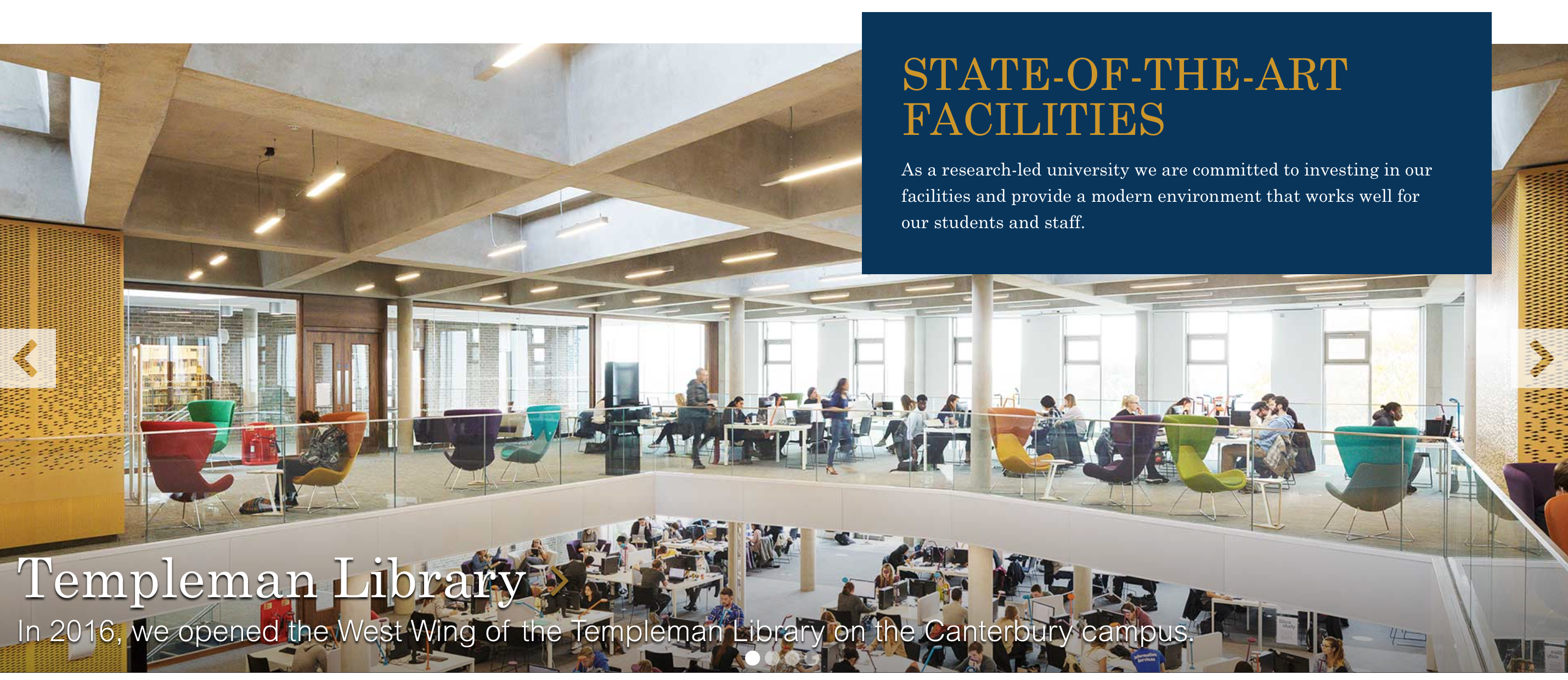
Feature panel.
A key element across the website, feature panels consist of a full-width image with one of three types of overlay: blue title block, short text, or an editorial panel with several paragraphs of text. Feature panels can also take the form of carousels, news/events panels, and profile panels (the latter two being a grid of separate elements, but presented in approximately the same dimensions as other feature panels).
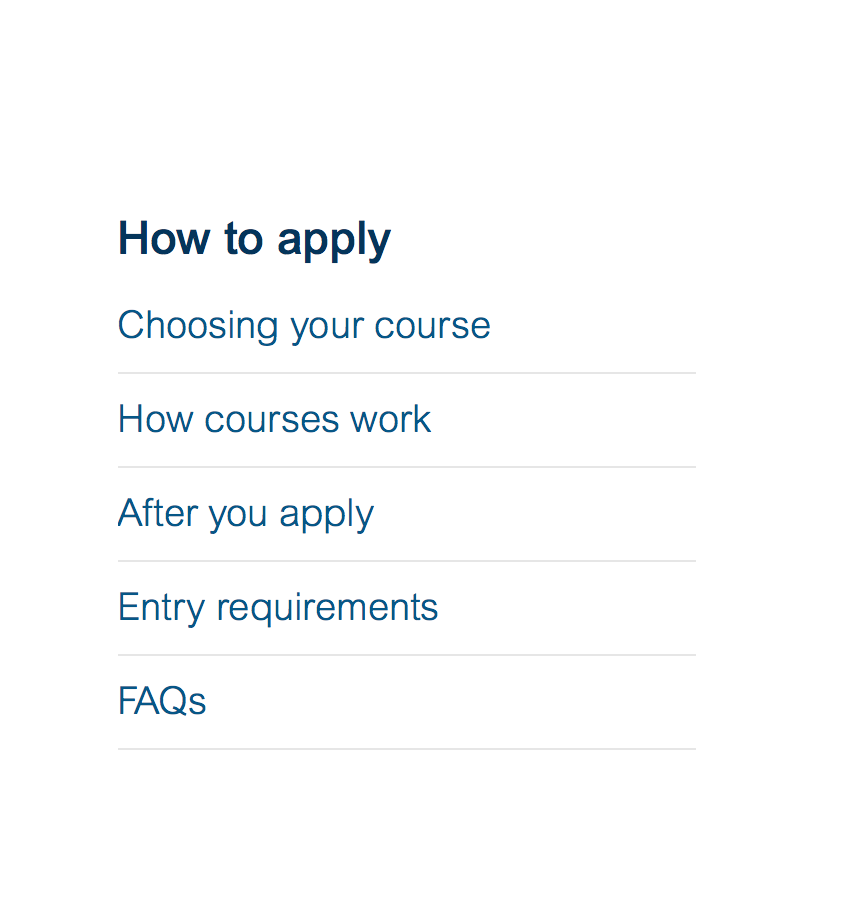
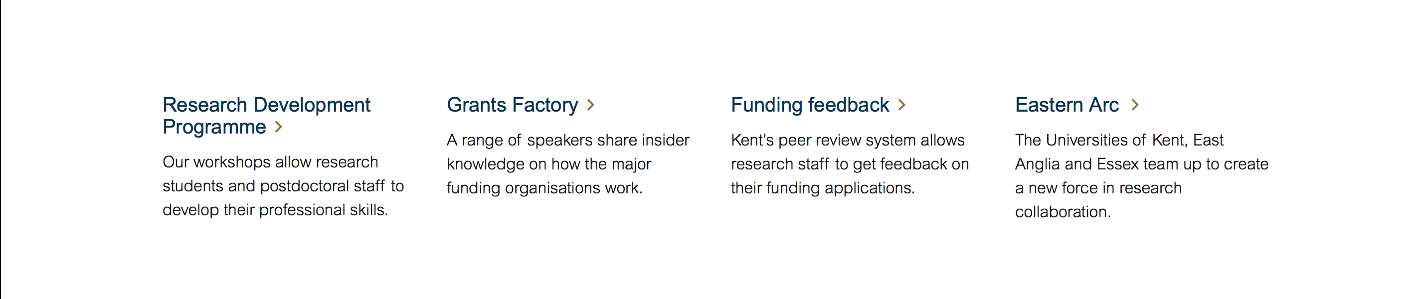
Link panel.
Links panels must always contain a link, but optionally also have a thumbnail image, and associated text. These panels always contain 4 cards in a row (desktop) and can consist of more than one row where needed.
Search results.
Results for internal Google search, course search, news or events searches. The same pattern will be extended to other types of search as other services come online.

Footer.
Again, a non-negotiable corporate element. It contains various subsidiary corporate links, contact details, and other information.
Combining the building blocks
The core building blocks can be reused on different page types according to some basic principles:
- corporate header, local header and footer are required elements.
- Feature Pages must always have a feature panel at the top.
- feature panels must be separated by either link panels or text panels.
- context menus always appear to the right of a text panel (desktop).
- Content Pages must always have a breadcrumb and page title. Navigation Pages typically do too, and this is one of the key ways a Navigation Page can differ from a Feature Page.
Responsive high-level building blocks
For the most part, our high level building blocks translate fairly easily into responsive views, typically stacking elements or text over images. The key complications are in the global header navigation links, which reduce to a stacked set of links on mobile views.
Low-level building blocks
We also have low-level common elements. Some examples are:
- a gold-coloured chevron is used as an indicator of a link in all places outside body text.
- consistent blue/white buttons.
- form elements.
- consistent lead text font and sizing for Content and Navigation Pages.
- consistent use of our corporate blue and gold colours, using lighter variants for some design effects such as backgrounds or highlights.