 By
By 
Here’s your summary…
– New programme of work for a University content management solution.
– Short-term plan to rebuild and retheme a small number of business- and user-critical pages in existing publishing solution.
– Looking at content strategy.
– Evolution, testing and development of our theme and patterns.
– Image guidelines.
A lot’s been happening over the summer months!
Kentweb
We now have a University programme to replace our existing web publishing solution.
However we definitely do not want to just buy and install a new CMS. We need a thorough reappraisal of our content strategy: what content do we need to publish, and why? Who are the key audiences? What is the governance process? Are owners and stakeholders clearly identified?
This will be a significant change in how we deal with web content, and this takes time to get right. In the meantime we wanted to be able to test out some of the key ideas of our new theme, so we came up with a plan to refresh some of the key pages in our existing publishing platform.
This gives us a good short-term value to the business in terms of a fresher, responsive design for a large bulk of our visits. It also allows us to test out many design patterns and content strategy approaches before we update the entire website.
Short-term goals
Our key goals this summer and autumn have been to evolve our theme to allow some business-critical, user-critical pages to be built by the end of February 2017.
We held a workshop with key stakeholders from areas such as Recruitment and Marketing, Research, Corporate Communications, Development Office, and International Development to identify key business messages (split into our key objectives of Research, Education, and Engagement). Tied to this we had user analytics and research we’d already carried out over the past couple of years.
We identified 12 top-level pages, plus the homepage, to focus our attention on. We also decided to revamp the whole of our courses section, because this was a key area both to the business and our users.
End of February 2017, priorities:
- Top level landing pages
- Homepage
- Course content
Content-focus
We’re now working with a content specialist from the Publishing Office, to help break down each of those 12 pages into key messages, and narrative flow. What does the University want to say? How do we frame that message to the key audience group?
As outlined in a blog post about content design, content can and should be designed using:
- an understanding of business needs and user needs
- data and analytics
- personas and scenarios
- heuristics
- user feedback and testing
Once we have a clearer idea of what exactly each page is trying to convey, we can start to build those pages using design patterns we’ve already built.
Of course, this is an experimental, iterative situation. We need to test out our design ideas, and we need to test out the validity of the 12 top level pages.
It may be that some of the pages will evolve in message scope as new user and business needs are discovered.
And we may find that some our design ideas don’t really work so well in practice.
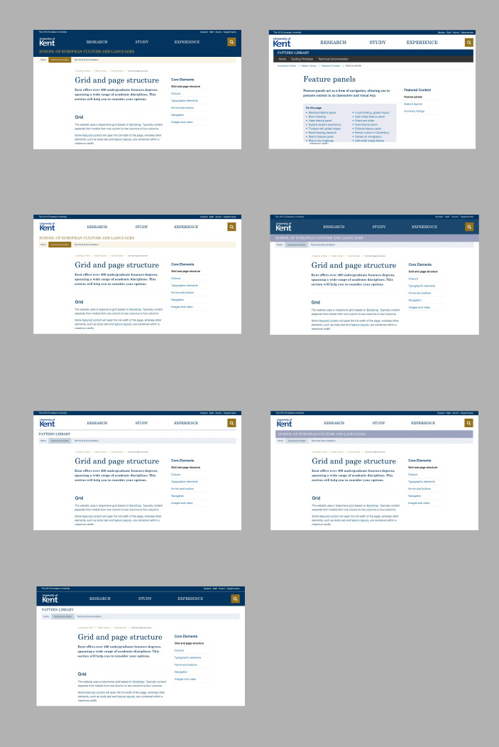
3 Page types
We’ve been refining our ideas of using three basic types of page for our website, where each contains differing levels of imagery, navigation, and text content:
Feature pages – high image content, some navigation, low text content.
Navigation pages – medium image content, plenty of navigation, some text content.
Content pages – low or no image content, some navigation, high text content.
All 12 key pages and the homepage will be feature pages. However most of the pages in our courses section will be content pages, and only a few will be navigation or feature pages.
Again, this is experimental. We’re hoping to find out exactly how the three page types will work out in practice.
Design elements
We’ve been working these past few months on our general design patterns, which follow atomic design principles. Some patterns seemed to be more useful than others, so we prioritised building those with our development team.
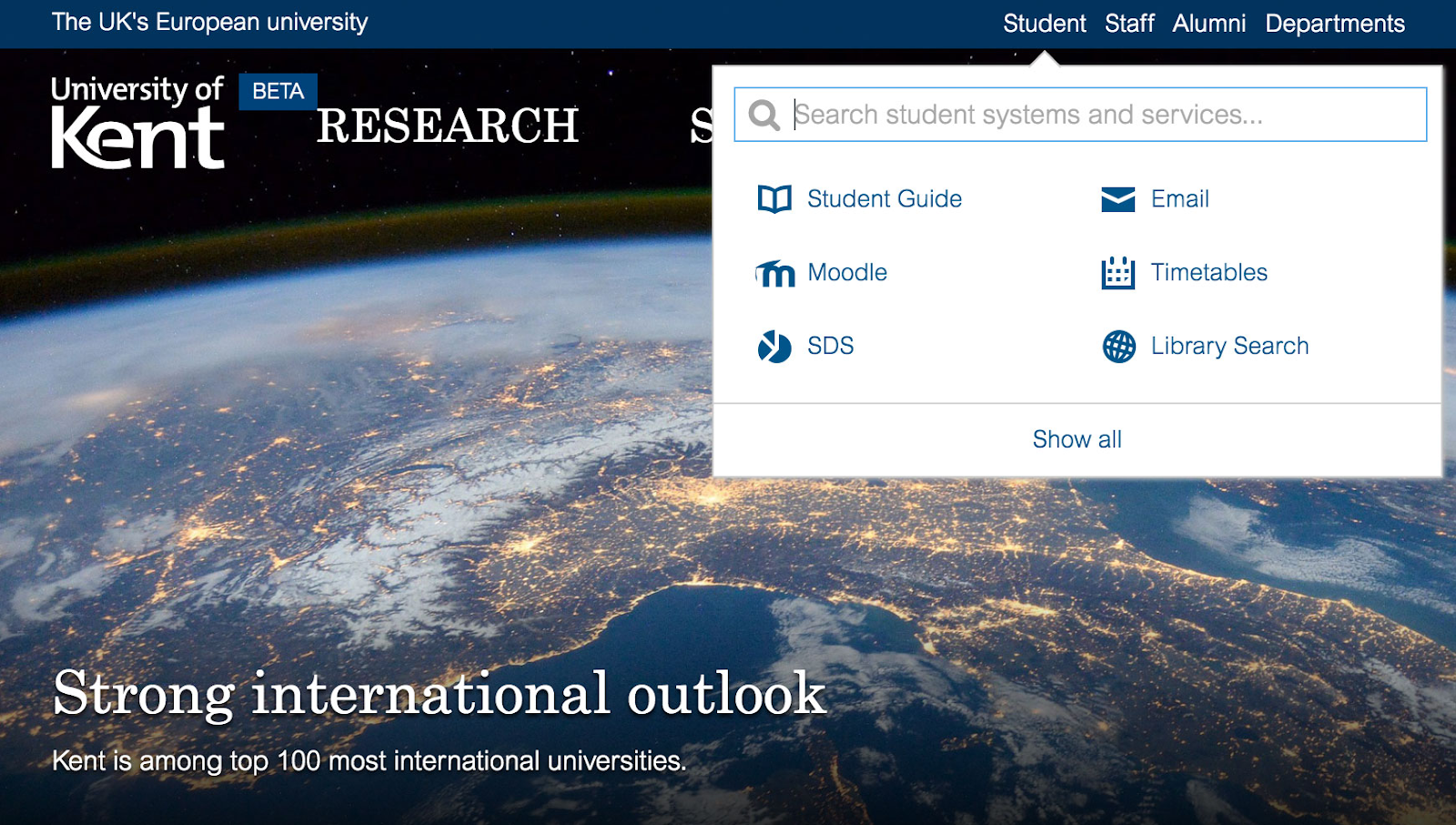
Other areas that we’ve really focused on are:
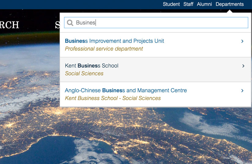
- smarter autocomplete searches for courses.
- fresh course page, student/staff profiles, news and events patterns.
- accessibility and screen reader suitability and testing.
- cross-device/responsive patterns.
- reinventing quicklinks into smarter autocomplete searches for students and staff.
User testing
Although we have done some user testing and feedback on the temporary home page, we still need to do much more user testing of a range of pages, with real content.
We therefore hope to get our new content up on beta.kent.ac.uk as quickly as possible, and run a combination of guerrilla testing and online feedback to get a better feel for some key questions:
- does our navigation work well?
- is it easy to work out how to search for relevant content?
- is scrolling down a long page causing issues for some users?
- do we have too much or too little imagery and videos?
- do users use the new global navigation menu?
- do internal users notice the student/staff quicklinks?
- do users scroll down to the footer for more links, contact info, etc?
Image guidelines
The new theme places a strong emphasis on great images.
We noticed that the existing Kent website tends to allow publishers to choose large numbers of images (perhaps as many as 10 or 20 on a page) to help ‘spruce up’ their sites. However this tends to have the opposite effect. More is definitely less.
It is in fact just very hard to choose lots of great images for a website, without it appearing cluttered.
We’ve therefore been careful to allow fewer images per page: typically no more than two or three are needed even on a high-impact feature page. But now the images are much bigger and much more prominent. Focus on doing less better.
We also want to refresh the brand slightly in terms of images and videos.
We’re therefore in the process of working with our Brand Group to see how we can define the kinds of fresher, more personal and engaging sorts of photography that suit the University as it looks to the future.
Summary
I told you we’d been busy over the summer…
We looked at:
– New programme of work for a University content management solution.
– Short-term plan to rebuild and retheme a small number of business- and user-critical pages in existing publishing solution.
– Looking at content strategy.
– Evolution, testing and development of our theme and patterns.
– Image guidelines.