 By
By 
The new theme has been designed to be responsive – it needs to look good on different screen sizes from mobile to desktop.
It’s a challenge as content needs to be adaptable. Varied screen sizes and devices will present content differently. So we don’t know how short or long content will end up on any individual’s screen which makes scrolling inevitable.
The new design uses white space, simple layouts, bold imagery and clearer typography. We’ve followed modern website trends and a ‘mobile first’ approach – overall making our website more accessible.
We wanted the visual design to present our brand in a modern and progressive way. So far it has been popular with our audiences.
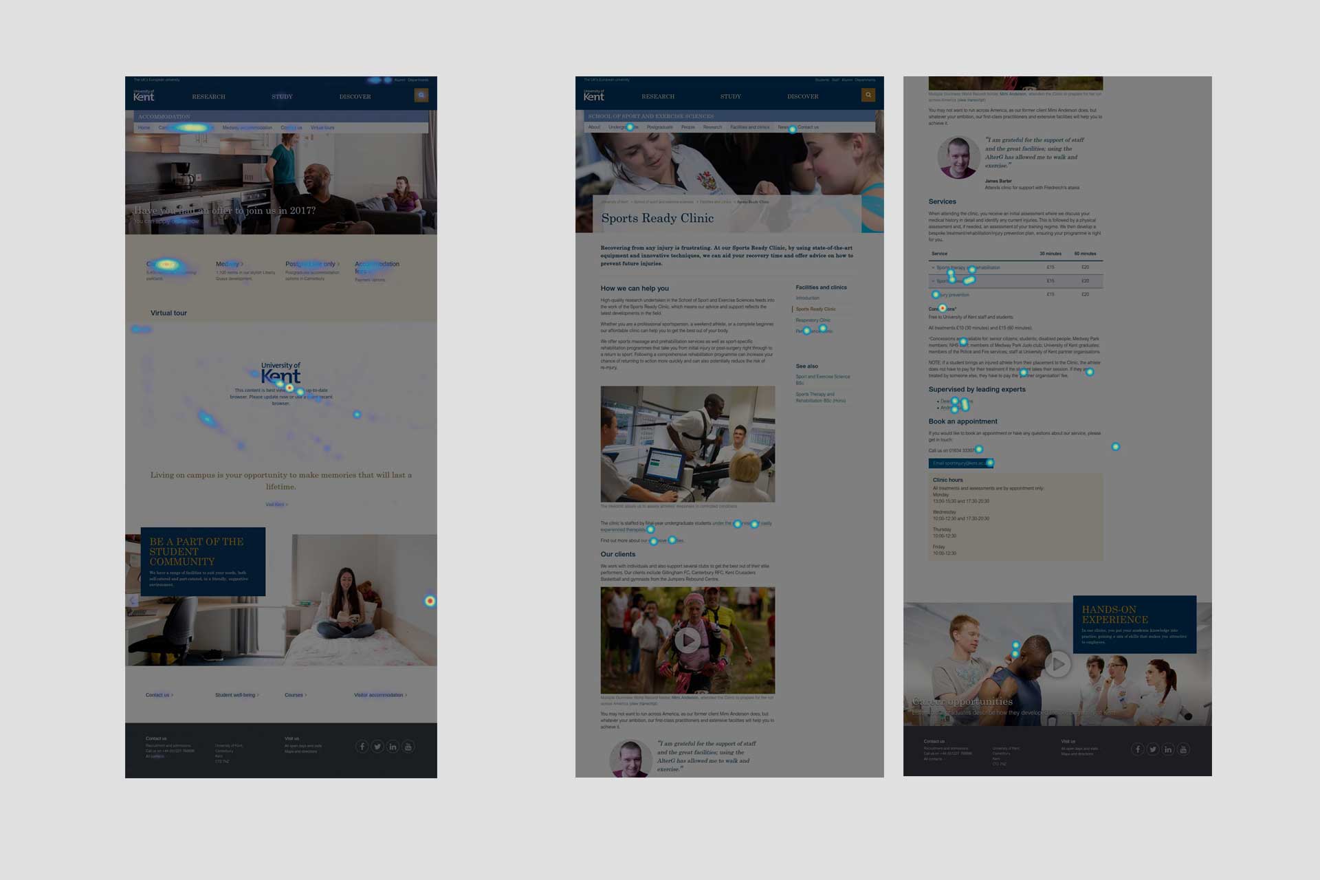
The screenshots above show heatmaps which capture the interaction with page. There is more interaction at the top of the page where key tasks and calls-to-action have been prioritised. People have, however, scrolled the extent of the content.
What if they cannot see all my links upfront?
For those familiar with the old website design, the change may seem quite drastic. People may have to scroll to see content rather than seeing a high density of information upfront within the “fold”.
Research shows that people scroll, especially on mobile devices.
Having observed lots of people using the new website over the past year, scrolling has never been a problem – it has become instinctive when exploring content. Implying continuity is the principle to follow (this can be tricky at times across different screen sizes), but people generally scroll anyway.
This can be seen on our screen recordings, we use software to anonymously observe user interaction with our website.