 By
By 
Until now we’ve aimed our web redesign project squarely at externally-focused marketing content. The consumers tend to be prospective students, parents, or other external users looking to find out more about Kent.
A lot of our content is directed at staff and students. Sometimes the information those people are looking for is also useful for people thinking about working at Kent, or prospective students. So it’s handy to have it on a public website. Other information is definitely for internal audiences only.
Whether it’s on an intranet or public website, content always needs designing. This blog post outlines how we’re looking to achieve a simpler, flatter, task-based design structure for internal content.
Finding things quickly
We tend to assume people know what they’re looking for. On marketing or e-commerce sites people are often looking for fairly clear types of things: products, contact details, corporate ethics.
Audiences such as existing students and staff usually need to find out how to do things, quickly and easily. They’re not so interested in the things themselves at first, because they don’t know enough details. Tasks not things. “How do I borrow a book?”, “How do I go about getting a parking permit?”
Task-driven v object-driven (verbs v nouns)
Task-driven content tends to be quite broad in scope, narrowing down to the things you need to find out or get done.
The first time you apply for a parking permit you won’t have a clue what you’re looking for. Task-based. The second time you might remember the page or form you had to complete. It starts to become object-based.
Complex tasks might involve all sorts of steps and exceptions. Making this clear is almost always a challenge.
In our designs we looked to sites like gov.uk and nhs.uk to see how they organise and structure their content. We concluded the following:
- Keep the user focused. Don’t show too many related links on the page. People might be looking for something else closely related. If they are, just put a link in the main content.
- Group related pages within a single topic into Guides.
- Keep the information structure flat. Avoid too many complex menus. Users don’t know or care about complex navigation and internal organisational structures. They just want to do something as quickly and easily as possible.
We tackled (and continue to tackle) these issues as outlined below.
Be focused: minimal navigation
We wanted to keep menus and navigation to a minimum, so the user could stay focused on the content. However we also wanted to ensure that each page of content sticks to a single focused theme, rather than branching off to lots of other pages. Some pages might therefore end up fairly long, with quite a few sub-headings.
To help with this we’ve adopted a fairly common practice of using a ‘sticky’ menu of jump links – kind of like a mini table of contents. This allows a user to scroll down a page, all the while able to see a list of key sections on that page, and to jump to them by clicking.
Ultimately there has to be some trade-off between number of pages and the amount of content on a single page. There is good evidence that people are happy to scroll through a page to read content, given a reason to scroll. (There are many sources, but this is a good place to start.) We’re not too sure yet what exactly our guidance will be on when to break out into a new page. This is one of the reasons why we’ll need to run some trials first.
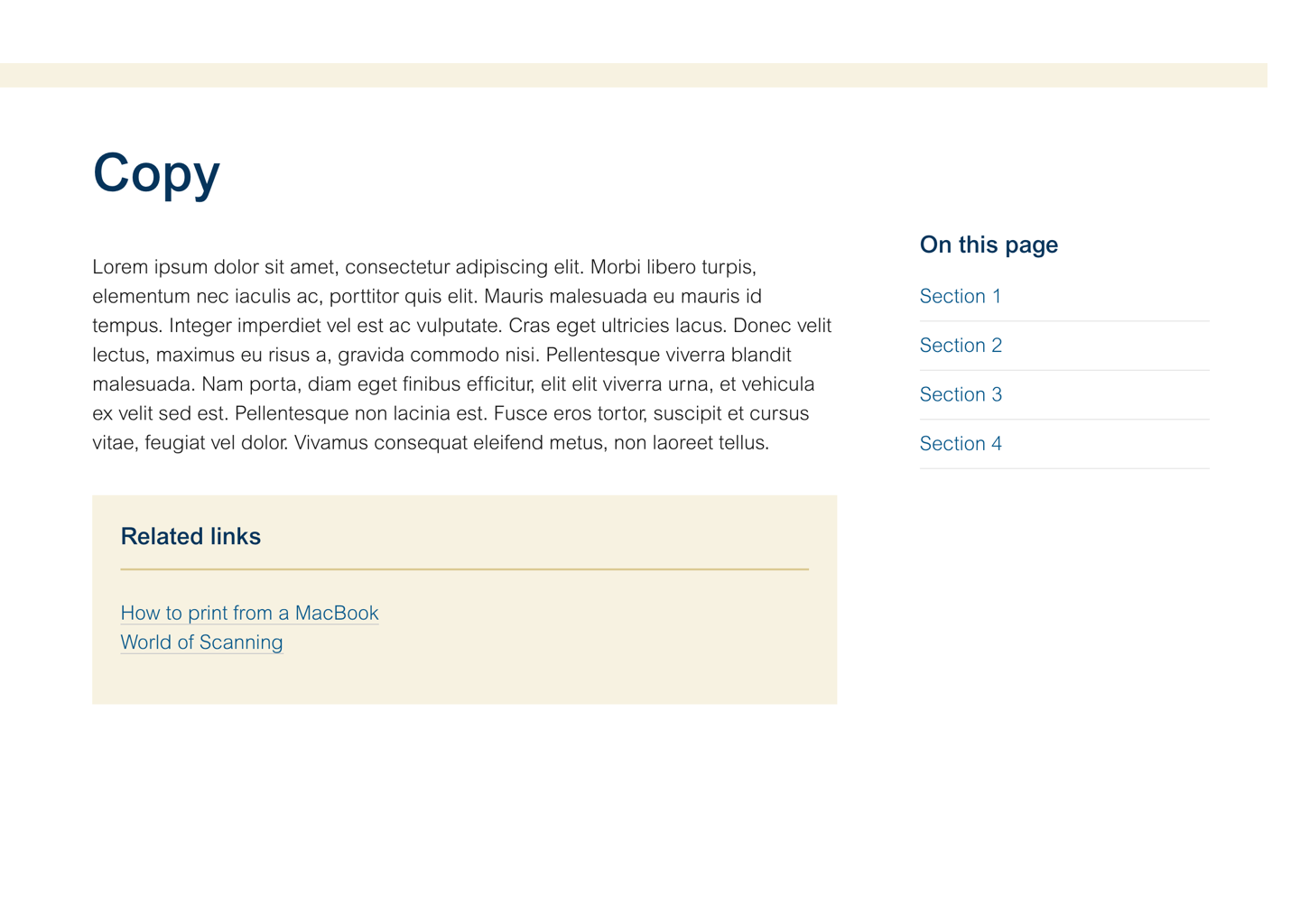
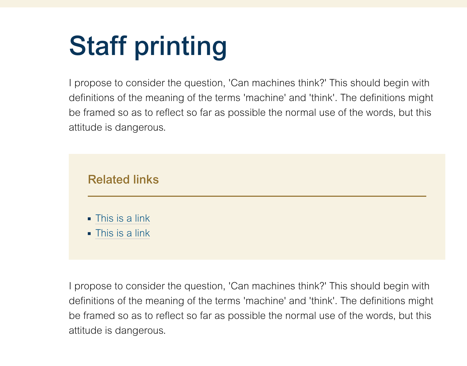
We’ve also tried to reduce the amount of ‘related links’ menus by encouraging publishers to put any links in highlighted blocks in the main content, rather than in side menus. Users are more likely to see these useful links that way, as they scan through the content.
As part of the focus on internal audiences we plan to modify the global header and Kent Bar. Basically removing the global navigation menu (‘Research, Study, Discover’) from all pages with an internal focus, and simplifying the Kent Bar.

Again, this helps users to keep focused on what they need. From practical and aesthetic points of view it also helps free up some space for page titles and Guide headings, so the user can more easily see the key navigation on the page. Users may scroll, but ‘the fold’ – the part of the page users see first – is still important.
Guides: based around tasks
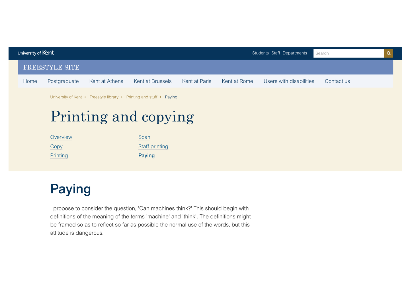
We also noticed that internal content is often broken down into groups of pages. For example pages about printing, copying and scanning.
In the old theme these tended to be pages and folders within folders. Navigating through the pages would fall to yet another side menu, sometimes getting lost in the noise of side-menus. Sometimes the pages would have further tabs, menus and callouts within the content. It just became too complicated.
So instead we’re looking at using what we call Guides. This is something used on the gov.uk site and very simply covers a group of pages based around a single task. An example is a set of gov.uk pages which help answer the question: “Is an HE institution officially recognised?” There are various separate issues, categories and parts to answering this question.
Guides are sometimes – but not always – sequential. They’re sometimes based around an action, and sometimes based around information.
Guides have a clear heading section, listing all the pages in the guide.
Not all our content need be part of a Guide. We’ll of course still have many stand-alone pages of content. But they will still follow the same principle of focus.
Flat structure: services, not organisational structure
Staff and students often want to know how to do something. They don’t – and shouldn’t – care too much about who provides the service. They certainly should not care about who published the content telling them what they need.
Because of our organisational structure we tend to present content in different ways, depending on who’s responsible for the content. You could say why does that matter? It’s just presentation. But if everywhere on our website has different menus, different ways of navigating, as well as a different style, we’re just making things harder for everyone.
The new designs attempt to move away from that kind of fragmentation. Content will still be under the control of different people around the organisation. It’s just that from the user’s point of view the content will appear more homogeneous.
Summary
We’ve recently been looking at how we can help make better-structured content which is primarily aimed at internal University audiences. This is work which we’re hoping to refine and experiment with on a couple of projects over the coming months.
Our design work uses several key principles:
- Keep the user focused. Don’t show too many related links on the page.
- Group related pages within a single topic into Guides.
- Keep the information structure flat. Avoid too many complex menus.
Great article Matt 🙂