We recently finished the discovery phase of the project to update our website.
The discovery phase helped us build up a much clearer idea of the many business needs. We now have a good feel for our users’ needs too.
As a way of wrapping up the discovery phase and starting our alpha phase we decided to have a mood board workshop.
So what is a mood board?
Mood boards have long been used in design as a way to communicate the overall, well… mood… of the thing to be designed.
They are as useful in web design as they are in interior design or product design.
Mood boards are great for rebranding exercises because they can help show stakeholders what the brand will feel like before it becomes a real thing.
They are also useful as a tool for designers to help them think about and implement a brand.
We found ourselves in this situation during our website theme discovery project. We have a University brand, but how exactly do we turn that into something real? How does that become a fresh and engaging new website?
What we did?
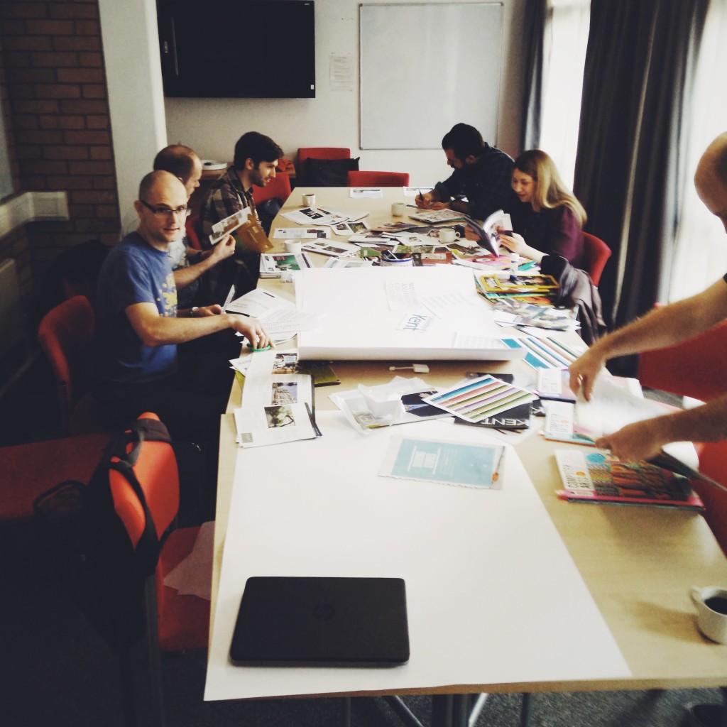
We gathered a group of 7 people from across the University’s corporate communications, recruitment, web and user experience teams.
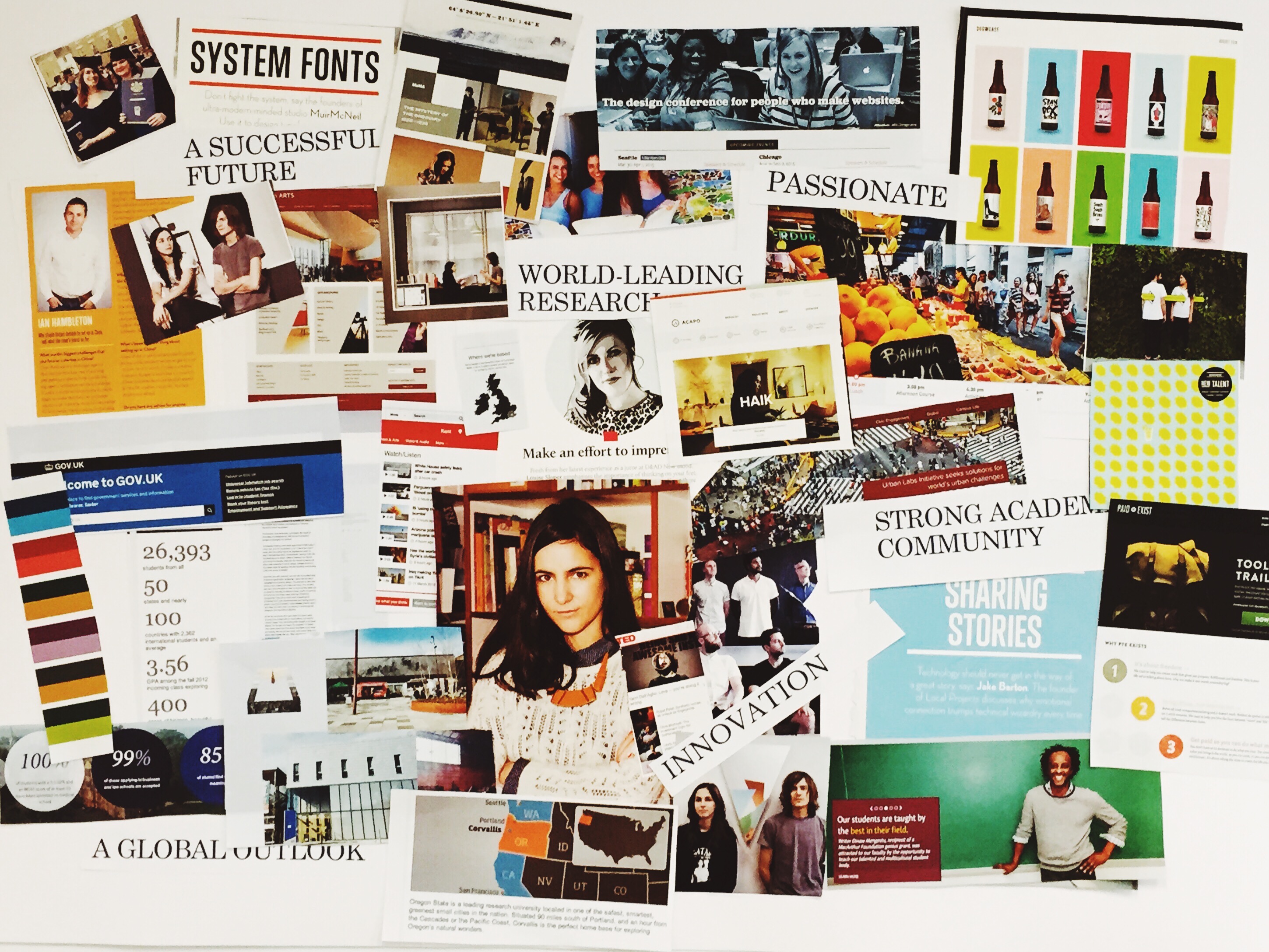
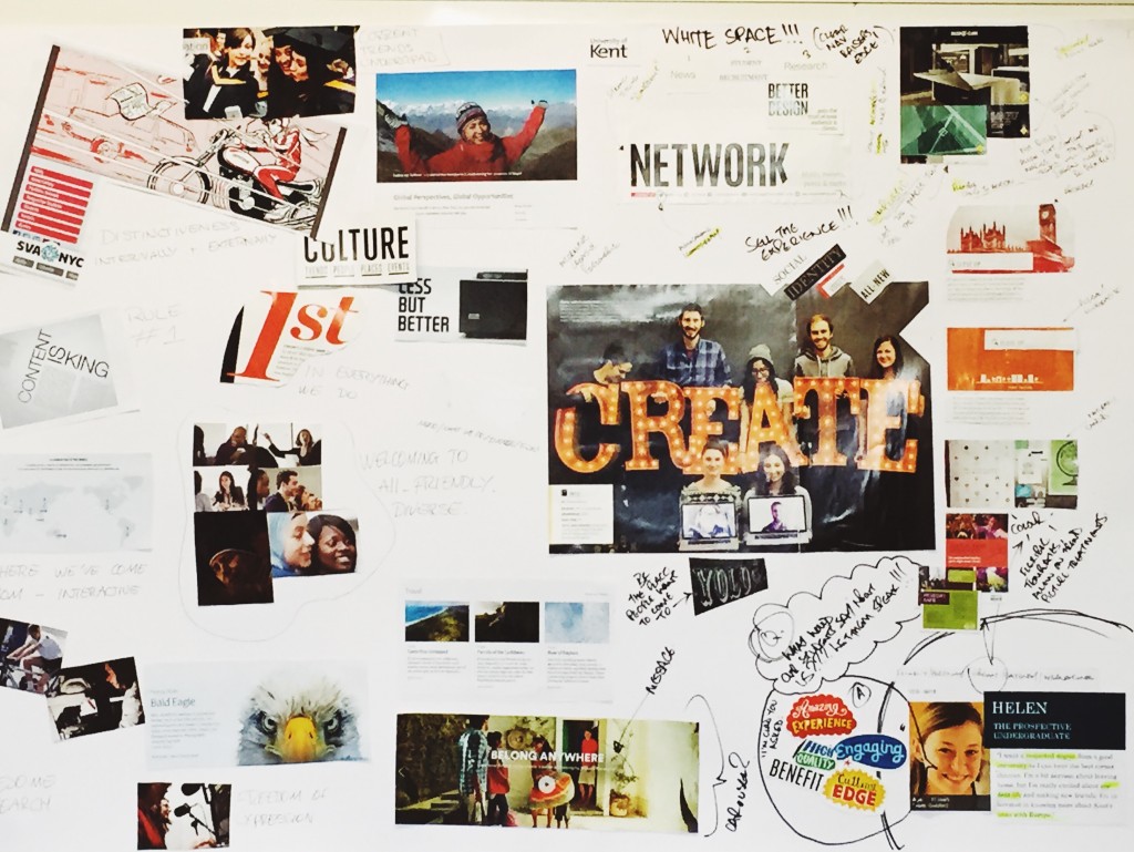
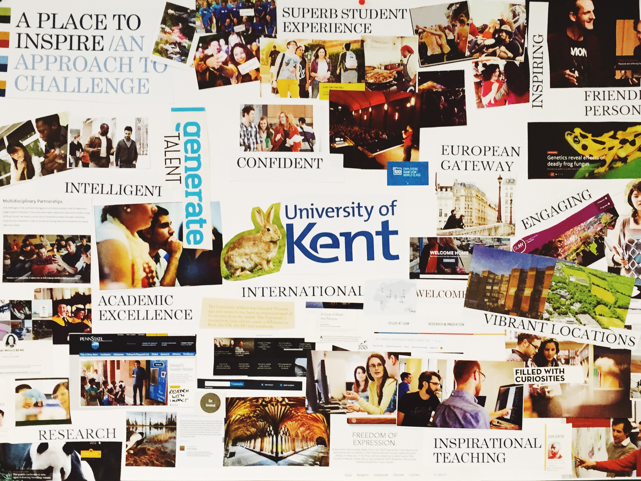
Then we printed out screenshots from a bunch of interesting websites, got a stack of web and design magazines, cut the whole lot up, and stuck the cutouts onto a series of boards.
We also took the key themes of the brand and added them to the boards to remind us what we were trying to capture. These were things like: innovation, confident, intelligent, vibrant locations, passionate, engaging…
The process of doing this was fun (therapeutic?!). It also helped us think about our corporate brand, and how that might or might not work in terms of meeting corporate objectives and user needs.
-

- Confidence, boldness, clarity.
-
- Allow freedom for more imaginative content in the right context.

-

- There is a Third Way between happy jumping people and dull studiousness.
Conclusions from our workshop
Overall our workshop was a great way to highlight how we felt the existing brand could be delivered.
It highlighted how some of the details of the brand will need to be tweaked if we’re going to meet the key themes.
Below are some of the issues we discussed during the workshop.
- Content is king.
- Confident. Vibrant. Positive. Confident is one of the key words in our brand. So why don’t we represent that anywhere on our website?
- A more of a personal angle.
- Ensure the prospective students can visualise themselves here. Do they identify with the people in the photos?
- We need a strong focus on imagery. Imagery creates atmosphere, personality and distinctiveness.
- Current brand imagery doesn’t really do justice for online imagery. It can feel a bit like stock photography. Imagery can feel dull, bland, weak, impersonal, distant – where is the energy?
- Some images and types of content are appropriate for some contexts. Someone staring confidently at the camera might be ok for a profile story but not for creating a lighter atmosphere.
- Whitespace.
- Simplicity.
- How can colours be used?
- Simple, clear information through infographics. We need clear guidelines and patterns for infographics.
- Build so that themes can adapt and look fresh over time as trends change.
- How do we represent functional information vs marketing information.
Excellent blog post. I had been searching for something different completely,
but stumbled on your blog. I am pleased I did. Thank you for sharing
useful information. Many thanks and best of luck.