We are currently reviewing our document delivery service, which students and staff use to request items from other libraries if we don’t have them in our library. We are looking at both the backend and the customer-facing aspects of the service.
As one of the tools to understand how the service works for our users, we ran a journey mapping workshop.
Participants
We invited at least one member of staff from every team involved in delivering the service:
- Content Purchasing (run the service)
- Service Delivery (borrowing)
- Learning and Research Development (technical and backend)
- Support and Liaison (where users collect their items)
- Quality & Marketing (who maintain the web content)
We also invited users of the service: we had two postgraduate students attending.
Materials
We gathered together visuals representing every stage of the user journey.
- You need a document delivery: screenshots of LibrarySearch showing we don’t have the full text of an item and a book reference from a book review
- Requesting a document delivery: screenshots of the online form, request confirmation emails
- Request can’t be fulfilled: printouts of the emails people get if we can get the item for them (we have 4 different types!)
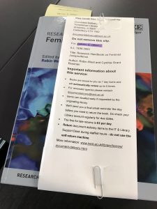
- Collecting the item when it’s arrived: email notifications that they can pick up the item (sent from 2 different systems), photo of the desk where they pick up the item, photos of document delivery books with all the book straps and inserts attached to them and of the envelope to pick up a photocopy
- Returning the item: email that the item has been recalled, another photo of the desk it has to be returned to.

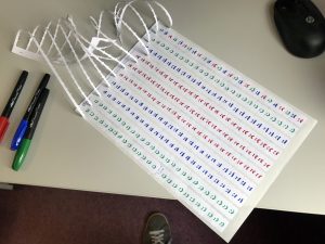
We also used lots of sticky notes. I had a sheet of ’emotion stickers’ (sad, happy, neutral) that we didn’t end up using.

Format
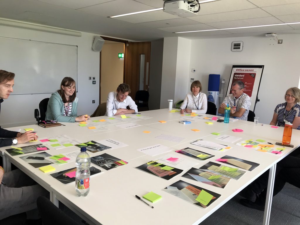
We placed all the material on the table in the order of the different stages of the user journey. All participants got a stack of sticky notes – only the users had orange ones, so we would know afterwards which were their comments.
One of the students was a wheelchair user, so instead of asking everyone to walk around the table looking at each stage in turn, we moved the material along the table, which worked perfectly.
We then asked all participants to look at the visuals for each stage of the user journey, write their comments on sticky notes and stick them on the relevant printout or photo.
I had planned more stages to this process: asking people to put the emotion stickies on things that made them feel good or unhappy, identifying the particular pain or feel-good points, then individually brainstorm solutions and affinity map them. But annotating the stages with sticky notes generated so many ideas and discussion that these additional steps were unnecessary.
After this step, the students and non-project staff left and project staff stayed behind to review the sticky notes.
The whole workshop took 2 hours.
Outcome
This process highlighted a lot of issues with the service:
- multiple emails sent from different systems, many with formatting constraints that make them hard to read
- improvements needed to the web form (which are already in the pipeline)
- improvements we can make to the bookstraps and other materials
- thoughts on how we can better advertise the service.
We also got positive feedback on things that work well and are easy for users.
In addition to this workshop, we are planning some interviews with academic staff.
Overall, although this workshop didn’t use the full customer experience journey mapping (CXJM) methodology, it worked very well for the purpose. CXJM suggests you work with personas, but having real users present gave us valuable insights and feedback. Having representatives from the different teams present was also very useful and has created a much better shared understanding of the service.

