 By
By The Student Guide is a new University of Kent website offering students a range of information and services. This replaces our old Student Portal, which was first introduced 6 years ago when the web was a very different place. The Student Portal did a good job, but it’s time for it to have a well-earned retirement.
The Student Guide has links to services such as Moodle, library resources, and student timetables. It’s this last service – timetables – which I’m going to focus on in this post. It’s one of the things the webdev team worked so hard on this summer!

Timetables
Timetables for students existed in the old Student Portal as lists of lectures and seminars. You could also find timetables in our Student Data System, and on the Timetabling Office website (only this time as downloadable iCal files). That was quite a lot of places, presented differently each time.
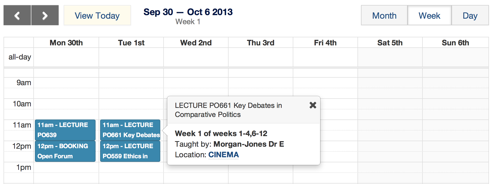
While this was all fine and useful it wasn’t necessarily all that immediate to students’ needs. So we thought why not present a calendar in a calendar format. That way people could very quickly and simply visualise when and where their lectures would be. I know, it seems crazy looking back now. A calendar in a calendar format. But that’s just what we did.

User needs
So what were the user needs?
We already knew that turning up to lectures at the right place and time is a really key thing that students want to do. Making that process easier was clearly going to be a good thing. Senior managers were on board, and the business case was easy to make.
Anytime, anywhere
User need #1 – I want to view my timetable anywhere on any device.
Most people now are pretty much within constant (emotional) reach of their mobile, so anywhere really does mean anywhere.

Therefore our primary goal was to provide a means of viewing lecture times and details in a device agnostic way. That is, giving users a good experience of a site no matter what device they’re viewing it on.
The shift to mobile isn’t just something which affects other websites. Stats for our clearing applications this summer showed there were double the number of hits from mobile devices compared with last summer – up to about 20%. Initial stats for the timetable app show an even higher proportion of mobile at around 30%.
Visual appeal
User need #2 – looking up lecture times should be simple and clear.
Showing timetable data on any device anywhere would be fairly simple. We could just give students a big list of dates and lectures and seminars.
However they’d hate this and no one would use it without resenting the fact that there was no alternative and they were forced to use it by their university. We don’t want that.
Speed
User need #3 – viewing the timetable should be quick.
The key user need these days is that a web page should load very quickly. This is now so key that it’s really an unwritten rule. But we still put it down as a user need to highlight just how important this kind of thing is to people.
Closing the gaps
Closing visual appeal gap
Closing the visual appeal gap seemed fairly trivial. The technical challenges of presenting events in a google calendar type way are superficially quite small. There are plenty of clever javascript libraries which convert calendar data into a pleasant calendar. We chose FullCalendar – a jQuery plugin.
So we very quickly prototyped a desktop calendar which looked fairly impressive. Hoorah! We slapped ourselves on our backs and all was good.
Of course it wasn’t really that simple.
The initial prototype looked reasonable out the box, but we still needed to do a lot of work to turn it into a real, usable application which looked and worked exactly how we wanted. So we took our first steps with backbonejs, which we used to control and customise the app. We also used our PHP templating engine to make the app look like a University of Kent web page.
Closing the “anytime, anywhere” gap
We’d planned a technical solution and had a prototype. On a desktop. This isn’t much use for meeting the user need of being able to view a timetable anywhere.
Mobile first is a new approach, and not something we’ve been able to embrace totally yet. However we knew early on that we had to get the mobile experience right. Although we didn’t start with a totally device agnostic approach, we very quickly moved to mobile designs.
In fact the mobile views took up far more design and development time than the desktop view.
Mobile design is actually very hard, because you don’t have the luxury of space. So it forces you to think very hard about what you’re doing. This can only be a good thing, and that’s in part why mobile first design is such a great discipline. It’s tough, time-consuming, but refreshingly rewarding. The most important thing is that you’re giving people a really great experience.
Closing the speed gap
The app itself is almost entirely fast client-side javascript (we chose to code in backbonejs primarily for its speed). This takes a massive toll off our servers, and puts the load onto our users’ relatively powerful devices.
We did still have to use our rather more server intensive PHP templating engine, although with lots of caching we managed to drastically reduce the footprint on the server.
Login
We had another speed problem to wrestle with. Logging in.
Timetable data is tailored to each student. It’s personal stuff too. So we had to get people to log in to the app. But the login process was a little out of our direct control because it used the university’s central login system.
First impressions really count. We could have built the world’s snappiest, smartest app but the user experience would be ruined by a really slow, bad first impression of having to log in. Never give your users a bad first experience. A ruined first experience means people dread the second experience, or may not even bother getting that far. That’s just not good enough.
So we put a lot (really, it was a lot) of planning, testing, and heart-felt effort into trying to get the login experience as good and as fast as we could.
User testing
User needs and closing gaps are all very well. But you have to ask people what it is that they want, and adjust the experience accordingly.
Jonathan – our UX lead – planned a series of user testing sessions to get our app as close to what students wanted in the little time we had available.
A common beginner technique with user testing is to hold group sessions. This is usually a really bad idea.
Plenty of studies – the most famous of course being Jakob Nielsen’s – show that you can gain as much as 90% of your user needs from just 5 or so people. Interviewing them individually can give you some really rich, and surprisingly consistent, information.
Jonathan held a series of one-to-one sessions with a handful of students to study their interactions with our prototypes, and get really valuable feedback on the user interface and their general needs from a timetable app.
Latent needs
A latent need is a need which the user isn’t consciously aware of, but which brings a great deal of surprise and satisfaction. It’s the design factor that turned Apple from a failing desktop computer company in the mid 90s into one of the most successful lifestyle brands ever.
Finding and meeting latent needs is a mercurial art, but it’s really important.
One need that we discovered students didn’t know they had was the ability to view their calendar data on their device’s native calendar tool.
How did we know they didn’t know? Because almost by accident we happened to mention this to some of our test users. They were amazed. No one had told them this before. They didn’t even know such a simple thing was possible.
We therefore tried to make a big deal of these calendar feeds on our app. Not everyone would choose to view their calendar that way, but for some it could be great.
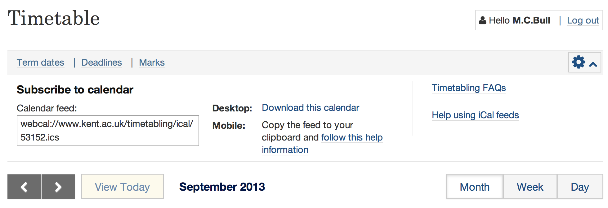
In the end we couldn’t find a really succinct way of communicating to students exactly how to set up their devices, although we think we came up with a reasonably good attempt. It was sad and frustrating for us not to be able to close this latent need fully. But we will continue to try to improve this based on feedback because it was so clearly something that our test users loved.
Summary
The webdev team spent a lot of time over the summer building a timetable app for the University of Kent Student Guide.
We could’ve built something simple very quickly, but it wouldn’t have been a good fit for the key user needs of having a fast, visually appealing way of looking up their timetables on the go.
Instead we put a lot of effort into a very lightweight, fast app which works as well on a mobile as it does on a desktop.
It’s not at all perfect. Nothing ever is. But we believe it’s a great start. As a team we take pride in knowing that we put real effort – and joy – into the app to help make students’ lives at the University of Kent that bit better. I hope it shows.