Google Analytics is an immensely powerful tool for helping you work out how to architect your website structure and target particular content at a particular audience.
Simple and clean
The range of stats available can be quite daunting, but generally a small number of key stats can tell you a huge amount about your site.
The IS WebDev team felt that it would be good to a have a nice, clean, simple way for web publishers at Kent to see stats for the page they’re currently editing: a way of getting a really quick picture of how a particular page is doing, who’s looking at it, and why.
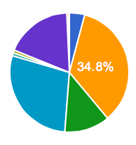
Simple things like pie charts and maps. Big bold at-a-glance figures.
Data-led websites
The reason we want to make stats more freely available is simple: website structure and content designed around what users are actually doing (or more often what they are trying to do) will ultimately give those users what they want. This makes them happy and it also makes the University happy.
The challenge
The challenge we faced was to come up with a way of showing clearly and concisely the key stats for any page on the website. The stats would need to be for internal-only eyes, but wouldn’t need people to log in to Google Analytics or require special permission to access.
Oh, and we only had a couple of days development time to spend on this.
Rapid prototyping (with Google and GitHub)
Our solution was to develop a very simple panel that would be automatically inserted onto every page on our www-test.kent.ac.uk site. It would be hidden by default, and would appear only when you press the ‘Page analytics’ button in the toolbar.
The Google Analytics panel we’ve developed pulls data directly from Google using the Google Analytics API. To help us connect to Google’s OAuth authentication we found a handy little library on GitHub. Although we modified this slightly to use a different authentication method, it was a really nice starting point.
Google Charts
So, getting the data was fairly straightforward. How then to turn it into pretty graphs and tables? Luckily Google have a powerful set of chart tools. So we used them.
Google charts are fantastically easy to use (once you’ve been through a couple of examples). Set up the data in a simple JSON array, tell it which of a dozen or so charts you want to use, and Google does the rest.
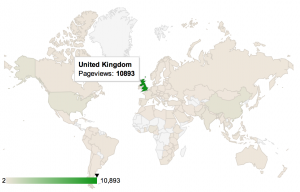 I found the GeoChart particularly impressive. Give it a list of countries with, say, pageview data about each and it spits out a lovely map with each country shaded by pageviews. You can even do the same with city names. It just knows where they are. (Well, this is Google. They are the Map Gods after all.)
Bootstrapped
Another thing we wanted to do was make this look nice. Luckily the Google charts do look good, but we wanted to show perhaps six or seven different charts. How do we fit them all onto a fairly small area at the top of the page?
Well the answer is with something like Bootstrap’s carousel tool. It lets us have only a few charts on the page at once, with a simple way of swiping across to the other charts.
Sadly Boostrap does not play nicely with our existing Kent University Chronos theme. So for that we still need to put in a little more work. The good news is that we’ve recently been investigating a new theme which is based around Boostrap, and which provides a fully mobile-friendly responsive design out the box. You can actually see an early example of that theme in action on the University’s undergraduate course pages. So in that theme this panel works really nicely. You’d even be able to view your stats clearly on a mobile device.
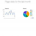
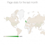
The end result is shown in the gallery below. We think they look rather good.
The Stats
So what stats and charts do we show? Well, since this is a bit of rapid prototyping we’re actually hoping people will tell us what they’d like to see. We’re far more interested in rolling something out quickly and modifying it as we go than spending endless months of consultancy perfecting something that ultimately no one wants.
The idea too is that the analytics panel is a simple set of headline stats. We do not want to replicate the whole of Google Analytics on our website!
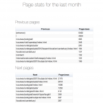
For now we’ve put some key things like pageviews per month, pageviews by browser, mobile and country. We also put in pageviews based on which pages visitors have come from and where they’re going after the current page.
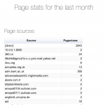
A particularly useful feature, we felt, was having the source that visitors were using to get to the page. e.g. from google, facebook, bing, etc.
Summary
The WebDev team had a couple of days to play around with getting some simple but informative google stats showing up on our test website. We used the Google Analytics API, Google Charts, Boostrap, and a handy little analytics auth library we found on GitHub.
We feel this new stats feature will be really useful for lots of web publishers, and will get people thinking about their page content, site architecture, audience, etc. We hope it will go some way toward improving the overall digital user-experience at Kent.
Our aim was not to give a full set of stats for every page. For that Google Analytics itself is the best answer. No, the aim was to give web publishers a quick and simple flavour of what’s going on with their pages.
Inspired by your post I have started to do a similar thing.
Have you seen http://www.oocharts.com/ It handles the heavy lifting and caches the data for you. In the essence of speed so far I’ve found it a good option. Just not 100% convinced on relying on a third party to access a third party!
p.s. Rereading that it sounds like I work for them! I don’t and am just passing on information.