 By
By The web development team have recently finished the first iteration of the new University of Kent mobile web application, and we hope to get something usable up for you to look at soon.
Why not native?
The decision was made to approach the mobile demographic with a web app as it will provide us with the easiest way to reach multiple devices. A look at our web stats reveals that the split is about 70% on iOS, 18% on Android, 7% on BlackBerry, with the rest being made up of Symbian, Nokia and Windows. Whilst this shows that there would be a vast amount of the student population able to use a native app (should we have developed both iOS and Android versions), it was felt that this would still have excluded too many people. To quote yahoo:
While the percentage of visitors with JavaScript disabled seems like a low number, keep in mind that small percentages of big numbers are also big numbers.
Ok, so we’re not dealing with JavaScript in this case, but the principle still holds true.
So what’s the common ground? The device’s web browser.
The one thing that is true of the mobile market more than any other is that it constantly pushes the boundaries of technology. The smartphone market is leading the way with their support for HTML5, CSS3 and all the other buzzwords that are being thrown about at the moment. This approach means that we can create one solution that fits all, with some graceful degradation for older devices – something that IE6 has forced any web developer worth their weight be good at.
What’s in it for me?
The team worked on getting some of the most requested features from the student-focused mobile devices survey [pdf], which took place earlier in the year. We decided in the first iteration to focus on:
- Feedback system, including statistics
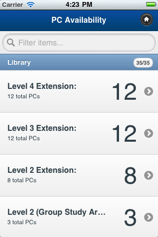
- PC availability
- (Simple) Campus map
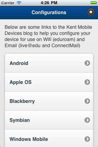
- Connectivity guides
- Timetables
Technology
To help us do some rapid development we chose to use the jQuery Mobile framework. This allows developers to write simple html, with some simple standard attributes. The javascript then loads in the page and presents you with a standard view on your device.
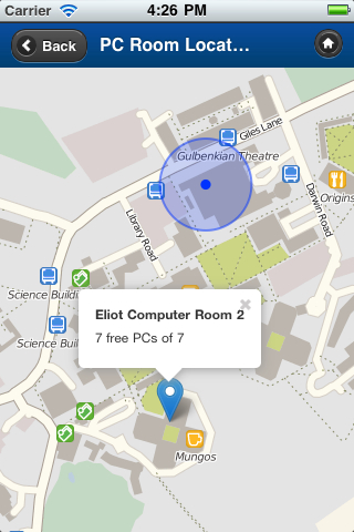
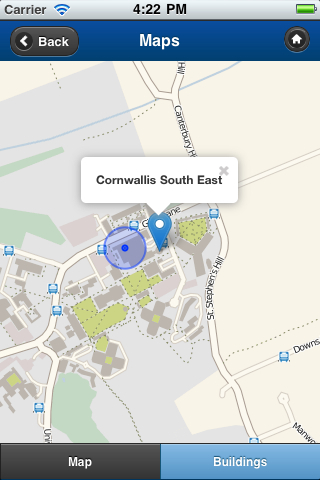
For mapping we chose to use OpenStreetMap as it provides the best map of campus, but we can edit it if we want to improve it. To display these tiles we are using the leaflet javascript library which provides very similar functionality to the Google Maps interface which most users are used to.
We have also started to look into Sencha touch as a delivery method for some pages.
So whats it look like?
Here are some screenshots of what it looks like at the moment. In the next iteration the design of the launch page will be enhanced.


- Feedback page

But what about…?
This is only the start of this project, there is still more development to come. That means if you think something is missing, it may be on its way soon.
It is important to us that we develop things that users want. The best way for us to find out is if you tell us, so we have set up a feedback form which will collect your comments.
Alternatively please leave a comment on this post.
Where is it?
Initially it will be at www.kent.ac.uk/mobile. For now this space contains a proof of concept showing simple PC availability, but soon we will add the features you see above.
Looks great, just a minor comment that it is called Kent Mobile and most of the dynamic features so far are Canterbury centric – so we’ll just need to be slightly careful about labelling.
A very minor typo on the feedback page “you” should be “your”.
Thanks for the feedback – you’re absolutely right.
Some of the Canterbury-centric elements are due to more data being easily available for Canterbury things – I think this is the case for the PC Availability, although we will aim to get some Medway elements in there. Also – labels like ‘Library’ should be clearer: ‘Templeman Library’ would be more accurate.
We’ve also decided that the mapping bit will be location-friendly. If your device can do location-checking, then it will show you the campus that you are nearest to (based on a specific radius). However, when you’re in Aberdeen or Hong Kong we thought it more sensible to set a default – and in those sorts of cases the map will default to the Canterbury campus.
There’s more to come – this week and some of next are devoted to the next iteration. The next blog post (prob early August) will show more progress.
Thanks for the typo-spot too…!
The typo has now been fixed 😉
Thanks for the spot.