We’ll soon be updating Site Editor with user interface updates to make it easier for editors to choose pages and blocks, and choose the right settings to make the most of the tools available.
What’s in the updates and why are we doing them?
When you’re given a blank slate to build a website, it can just seem a little daunting at first. What can a page look like? What blocks are available? What settings can I use on the blocks?
Site Editor has been around for a couple of years, and it’s revolutionised how we build websites at Kent. We’ve spent a lot of time evolving blocks and patterns to make the website look better, and we’ve started to give editors more freedom in building pages. But we’ve perhaps not spent as much time improving the Site Editor editing experience or giving help in how to configure pages to make them look good.
Simpler editing and more help
These updates hopefully make it easier to choose pages and blocks, and edit the many settings in those blocks to get an attractive page design. But building a web page is a complicated process even with a good user interface. We’ll always need good help and guidance.
For this reason we’ve started work improving our help pages, and we’ve linked to these in multiple places in Site Editor. This is very much a work-in-progress, but we’re hoping it’ll give editors a clearer idea where to start when they build a page, and – most important of all – what they’re aiming for.
Feedback
We based some of these updates on feedback from some of our editors during an extensive test period. That feedback is reflected in these changes, making Site Editor better for everyone. We’ll be running more feedback session over the coming months, as we evolve Site Editor.
When?
We’re hoping to put these updates live in December.
So, read on for details on the changes…
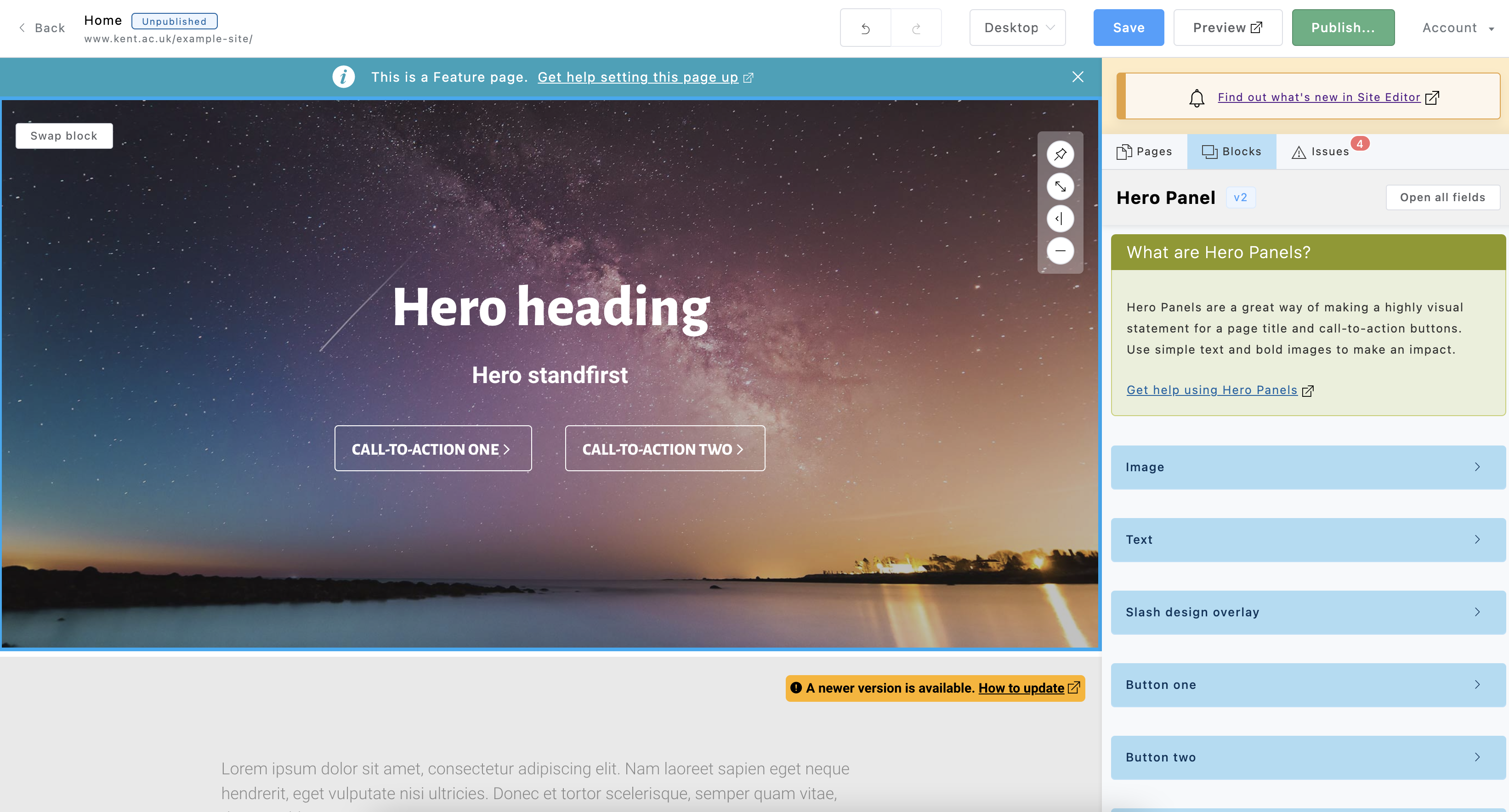
Editing sidebar
One of the biggest changes we’ve made in this release is to the layout of the editing sidebar. There are a number of changes to how this looks and works, detailed below.
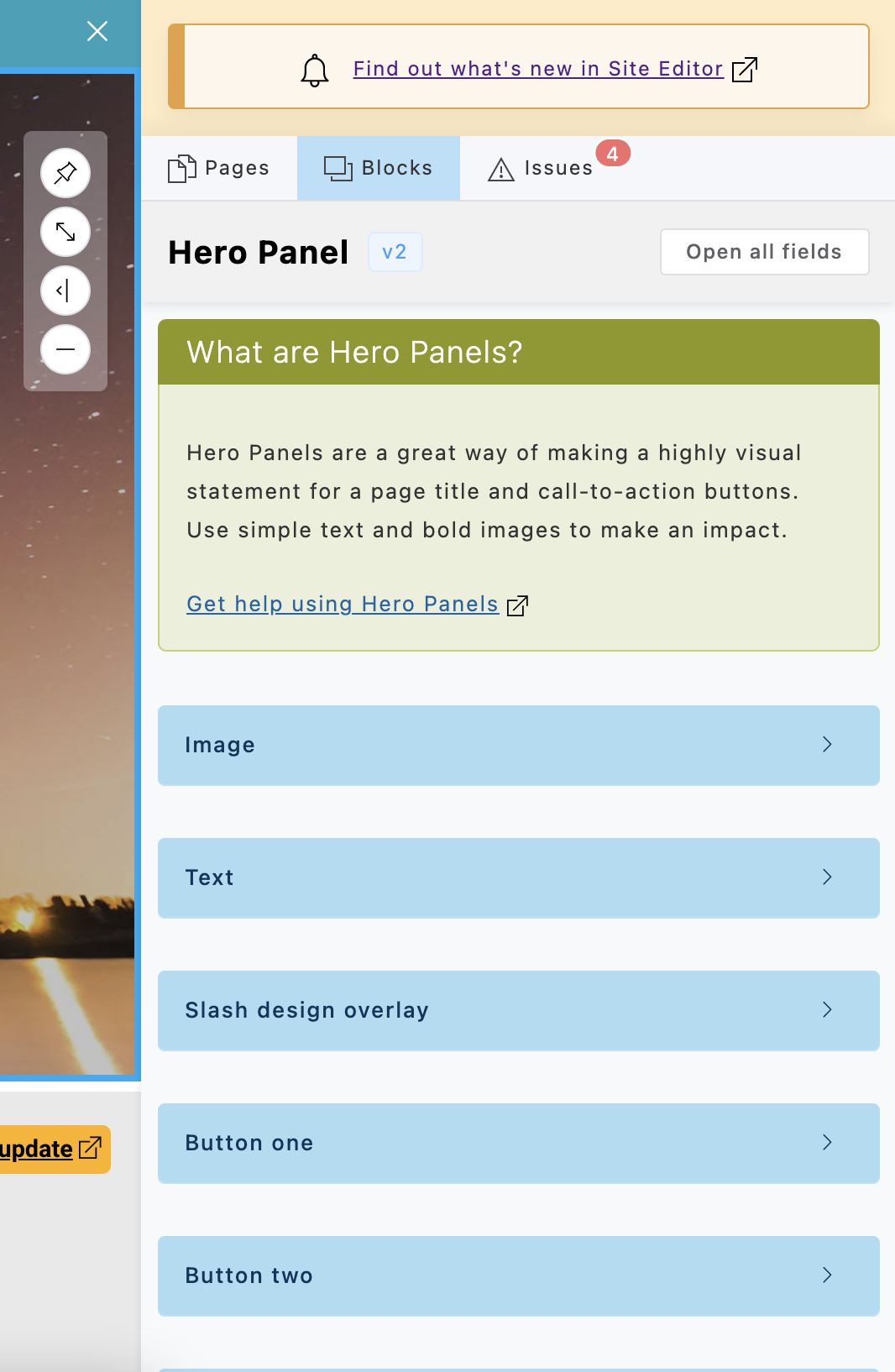
Show/hide fields
We found one of the biggest problems editors had was configuring a block: scrolling through lots of fields looking for a setting. It was very easy to get lost, and it could become quite frustrating.
You can now expand or contract each field or group of fields.
These fields are labelled in blue to help distinguish them one from another.
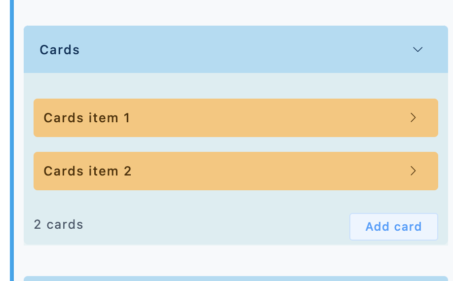
Collections of items – such as a series of cards or links in a panel – are also collapsible and now labelled in yellow.
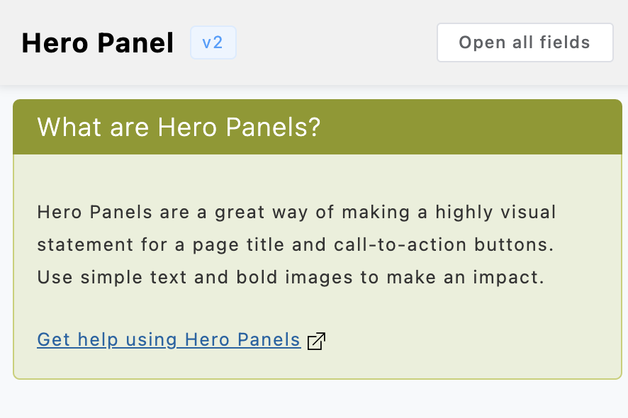
Block-specific help
For some blocks we’ve also added a green help panel at the top, which links to a corresponding help page in our Site Editor guidelines.
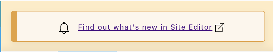
Our blog
At the top of the sidebar you’ll also see a yellow box with a link to an explanation of new features. We regularly outline updates and new features in this blog, but links to the blog aren’t very clear at the moment.
We’re hoping this yellow panel will be a more visible reminder without being too obtrusive. As always, links to external help pages open in a new browser tab, so you don’t have to worry about losing any work.
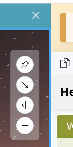
Sidebar position and size
We’ve added four small buttons just next to the sidebar. These allow you to do various things.
You can pin the sidebar (as it is now) or have it float over the top of blocks.
You can also increase or decrease (or hide) the sidebar altogether, or even switch it over to the left of the page.
These features are a little experimental, so we’ll be getting more feedback from editors to see if they’re useful.
Page-specific help
We’ve added a help link specific to the current page type. This appears in a blue bar across the top of the editing area, and sticks to the top of the area as you scroll down the page. Again, we’re hoping this is noticeable and useful without being overly obtrusive.
As with everything here, we’ll adjust Site Editor depending on what feedback editors give us. At the moment this is only for the Feature page layout, but we’re hoping to expand this if people find it useful.

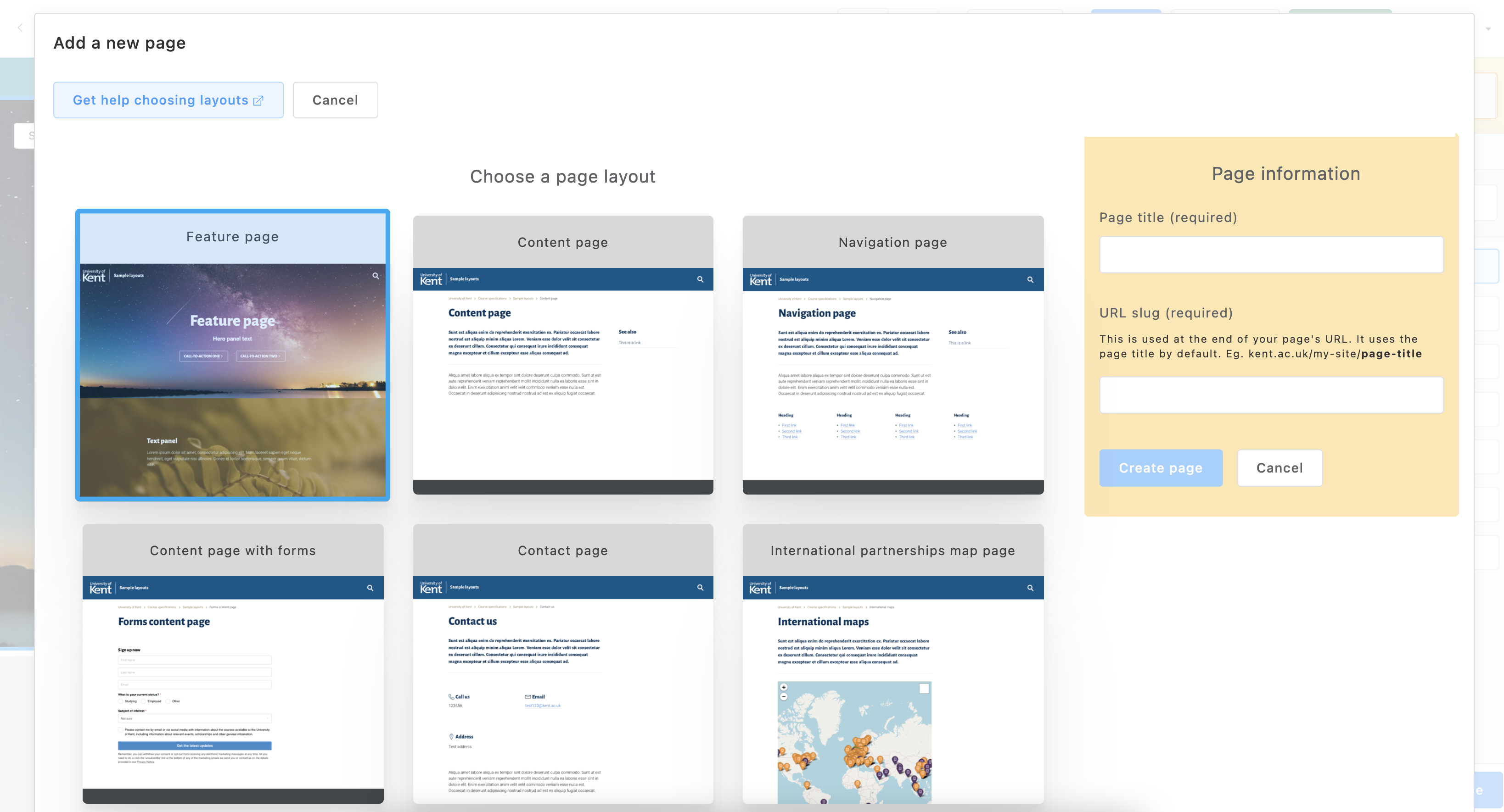
Adding a new page
Adding pages to a site previously was a little confusing. There were quite a few layouts, and these were presented as a simple select list, in no particular order! The page chooser now gives you a better visual idea of what the pages will look like.
We’ve also consolidated some of our page layouts, both to simplify the range of pages you can use and to make it easier to modify a page’s function.
For example, we don’t use a separate FAQ page any more. You can use a standard content page now and add FAQ blocks to that. Equally we used to have content pages with image headers. Now you can make a content page and switch in an image header if you want. We also used to have several different types of form pages, where we now have just one.
We added in a help button to the chooser, linking through to examples of page layouts.
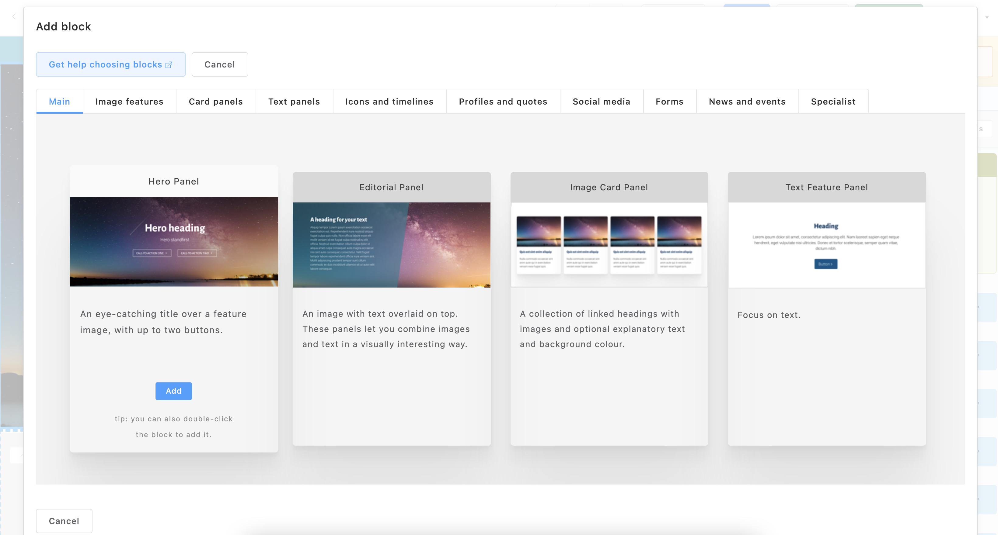
Adding blocks
We’ve tried to make adding blocks a bit simpler.
There are a lot of blocks to choose from, particularly on some page layouts like Feature pages and Content pages. This can be really confusing. So now on Feature pages and Content pages we’ve arranged blocks into different tabs along the top.
We’ve also tried making the process of adding blocks simpler. You now just need to click the blue ‘Add’ button, or double-click on the block.
Once again we’ve made it easier to access some help, with a button taking you through to pages of block examples.
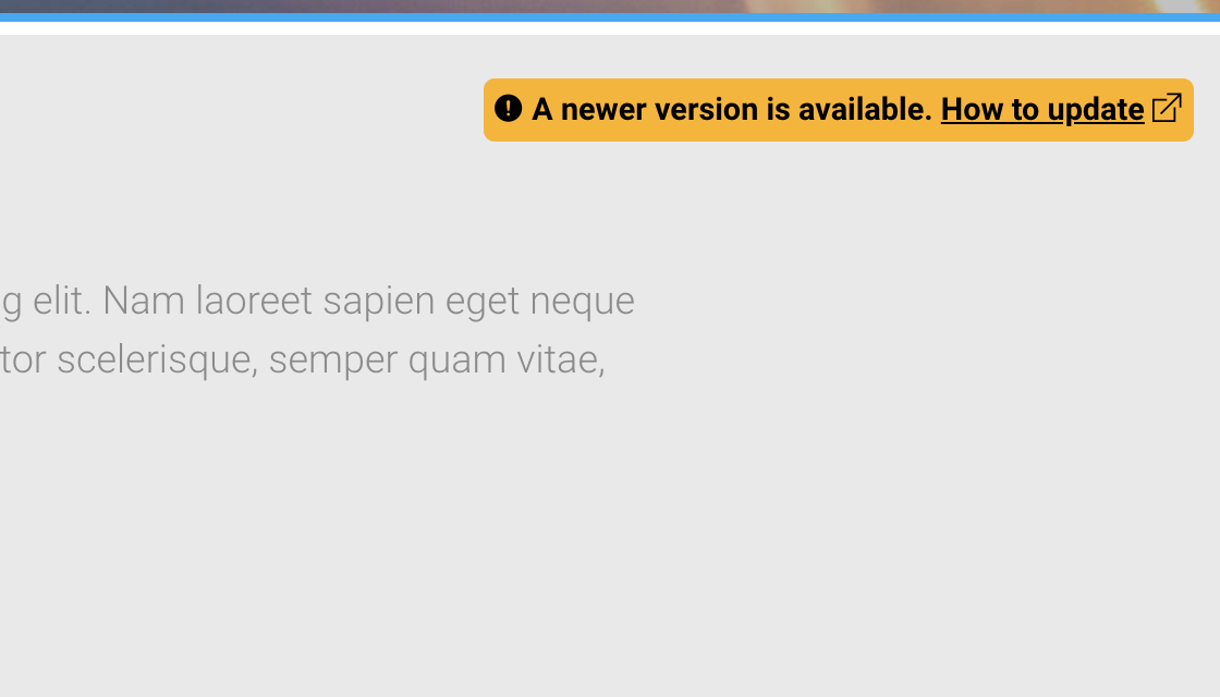
Old blocks
We often make small updates to blocks, such as an increased character limit or a new colour options. Occasionally we need to make much bigger changes that would break existing blocks of that type. So we have to make a completely new version.
We found that a lot of editors never knew that we’d released a new version, because unless you read all our blog posts avidly or stumbled on a new set of fields by accident, you’d just never know.
To help with this we’ve added a yellow flag in the corner of the block in the editor area. The block also gets very slightly greyed out. But don’t worry, these blocks will still work exactly the same, and you can continue to edit them, save them, and published them as before. The flag is just a notice to let you know that if you want, you can use a newer version which will have more features.
Sadly at the moment we have no way of automatically updating an older version to a newer one. You just have to delete the old block and add in a new one. When you add in the block again, the block chooser will always add in the latest version of that block.
It’s probably a good idea to keep the old block until you want to update or edit the content anyway, perhaps as part of ongoing site maintenance and content updates. Then just start from scratch with a new block.
You may find a lot of these yellow flags on older sites, because we’ve recently made significant updates to quite a few blocks: Hero Panels, Editorial Panels, Image Card Panels, and Text Feature Panels.
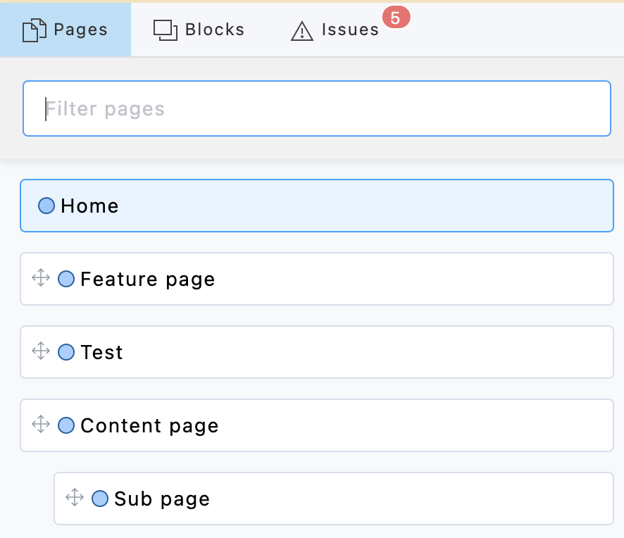
Navigating around pages (filtering)
Finding pages to edit them was always a problem on sites with large numbers of pages.
We’ve now added a filter box to the Pages tab which allows you to find pages by title more easily.
The sidebar Pages tab now also lists all pages with the small +/- collapse feature. Pages are indented where they’re children of other pages.
You’ll notice that you can switch between the Pages, Blocks, and Issues tabs more clearly now. These appear in full at the top of the sidebar, rather than as icons down the side like before.
Summary
Site Editor will be getting a few updates in December. The idea behind these is to make it easier to edit pages and choose appropriate settings in blocks.
We realise there are a lot of blocks and a lot of options, so we’ve started building up some guides to show what’s possible, and give editors a better idea of what to aim for when they build a page.
We’ve updated the user interface for choosing pages, choosing blocks, and editing settings inside blocks.
We’ve tried to make help more available, and given hints about when newer versions of blocks are available.
In all this we got help and feedback from some of our editors during an extensive test period. That feedback is reflected in these changes. We’ll be running more feedback session over the coming months, as part of a constant evolution of Site Editor.
Looks amazing, great work, thank you!