We received feedback from three 1st-year students about our upcoming website changes.
This included the homepage, course page and course help concept page.
Deciding to come to Kent
UCAS led the way in the process of investigating courses and universities.
Rankings and third-party websites were also used for research.
Knowing people who had come to Kent was a strong influence on their decision. Some had relatives who had studied here.
One student applied to Kent through clearing having received a first choice elsewhere. The others applied for specific courses that they had investigated beforehand.
Student life was important, but not the main deciding factor. For those that knew exactly what they wanted to study, their course was the main priority.
They all came to an Open Day on receiving details through UCAS email correspondence.
The application process seemed straightforward to them, with no discernible issues they could remember.
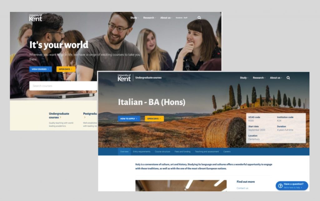
Homepage
There were no issues in using the homepage to find a course.
There was a comment that the look felt more modern with the existing style feeling dated. They liked the use of imagery which has an even stronger impact with the lighter heading.
When asking about contact details, the footer and header were the key places they looked.
One student mentioned that they used the student link heavily on the homepage. If we were to change the way this works, as long as we kept the link, it would be okay once they got used to it.
On a side note, this student also mentioned that he didn’t know what the Student Guide was. He was familiar with the page once we explained where it was. Moodle and SDS were their main go-to applications.
Course page
They all commented that having the UCAS code upfront was helpful.
One student said that although student profiles looked nice, they would be suspicious about it being unbiased. They would still do their course research elsewhere.
They easily navigated the new course page. This uses a new menu which floats at the top of the page.
No one knew what TEF or DiscoverUni were. They did realise that they were third-party ratings and thought that they were useful. They would investigate themselves if they didn’t know exactly what they were.
They were blind to the floating help button, although they liked the gesture.
Help page
They liked the help/contact page and clear, simple ways to contact the university.
Summary
The new font and header didn’t seem to affect any usability, although it’s important that contact information is clear in the header.
Making the floating help button on course pages prominent, using slight animation or different colour, could help draw attention to it.
The students didn’t feel particularly strongly about the design either way, but there were comments about it feeling smoother, pleasing and more up to date.
Overall the more minimal interface puts a stronger focus on content, particularly course and recruitment information.
Strong imagery is more important with the lighter header.
The course pages could play a more active role in pushing clearing as this can tip the balance for students who may be slightly unsure of where they want to study.
Moodle should have stronger signposting to the Student Guide. Our old contact us page is outdated and needs to be refreshed.