 By
By 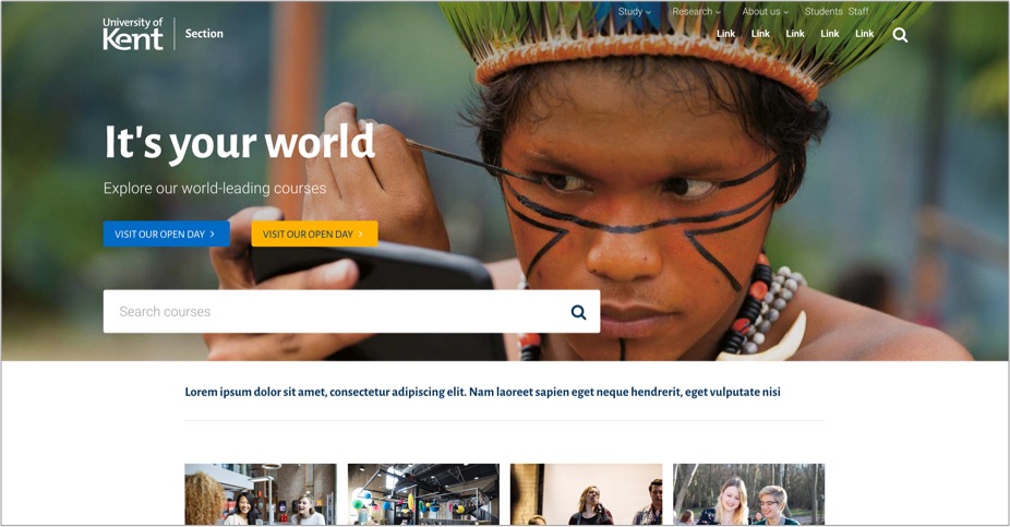
It’s been three years since we released our ‘new’ design. Alongside that we have also been developing Site Editor (the university’s content management system).
In a rapidly changing market we need to adapt to remain competitive.
Working with central Publishing, we’re supporting student recruitment through a more focussed web experience.
We are planning ongoing improvements. The updates we’re working on are:
- an updated header
- a new web-friendly heading font
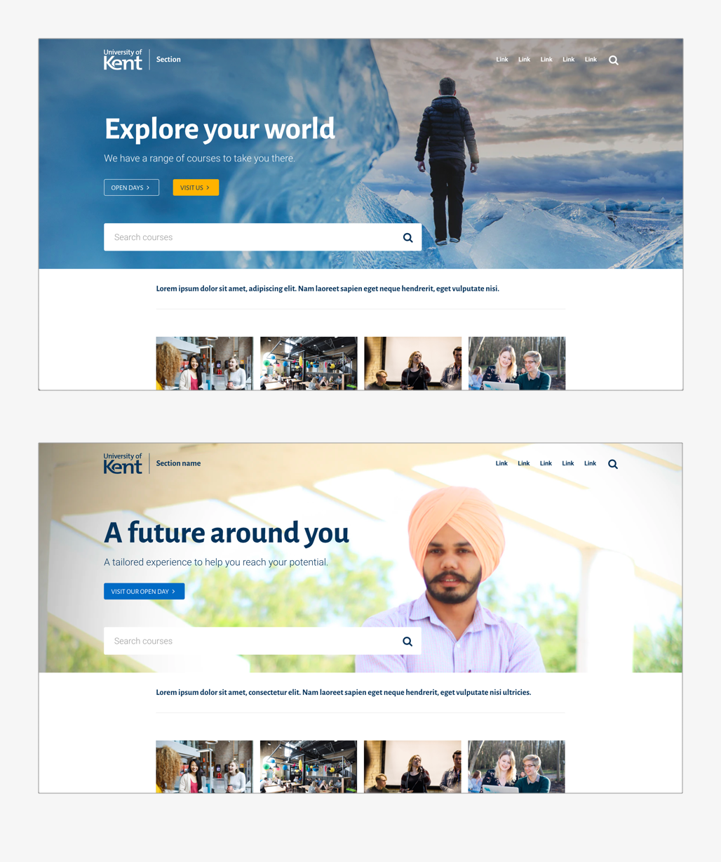
- a new ‘hero’ panel for marketing
- a fresher and more usable course page
We’ll likely be releasing the updates in January, but are hoping to update some limited content in December.
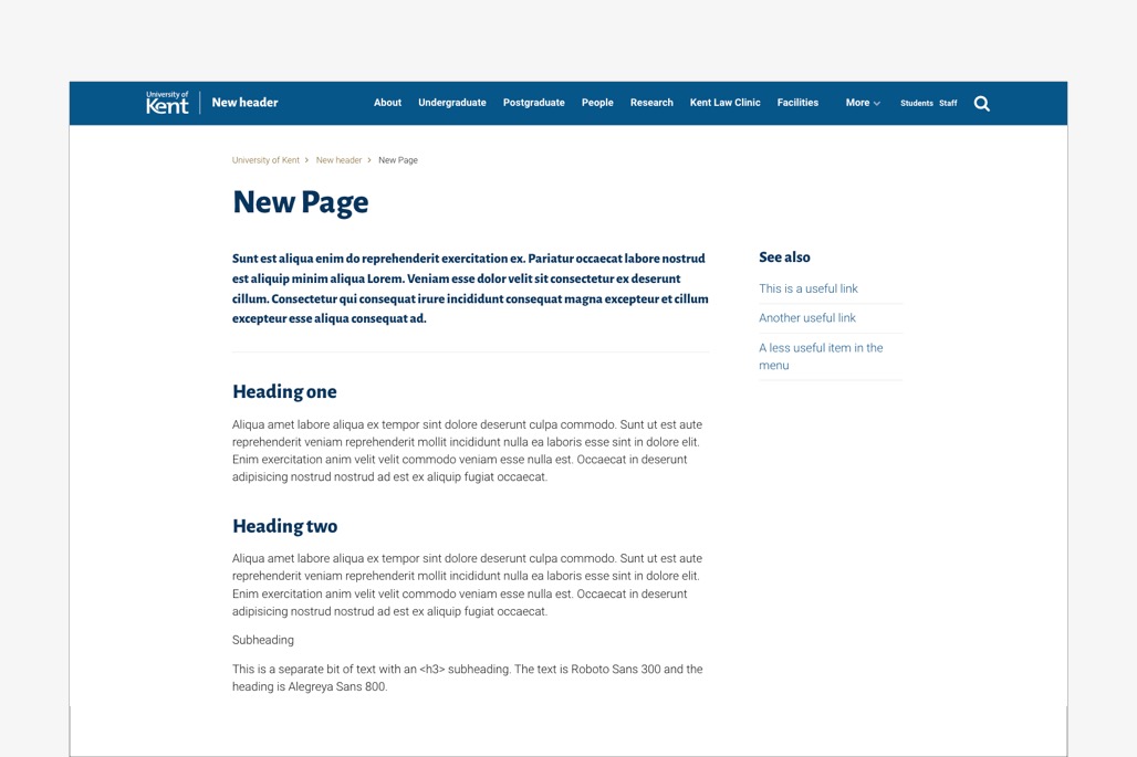
Updated header
Analytics shows that external traffic to the site is primarily about finding course and recruitment content.
There is limited interaction with the ‘research, study, explore’ menu – other than using ‘study’ to find a course.
The current header uses a design to accommodate Century Schoolbook capitals. This style has been challenging to use on the web, often feeling quite chunky and heavy.
Being able to choose a more adaptable font has allowed us to explore a different design for the header. This simplifies it, making it feel more contemporary and less dominating.
The new design will put key section links at the top of the page. This helps avoid confusion with tiers of navigation.
Global links will still be available in the footer or can be added on a site as required.
This has also helped us improve and simplify the mobile version.
The header is still prominent, but lighter and more compact – it is less bulky. This lifts the page putting the focus on the content.
The lighter header will use the sub-brand approach, where the site section is shown to the right of the logo. This gives a clearer marker as to the section and a focussed feel for that content.
The header will have the option of having:
- a fully-transparent background – as we use on the current homepage. This will be the default,
- a semi-transparent background – where appropriate,
- or a solid background – for use on standard content pages.
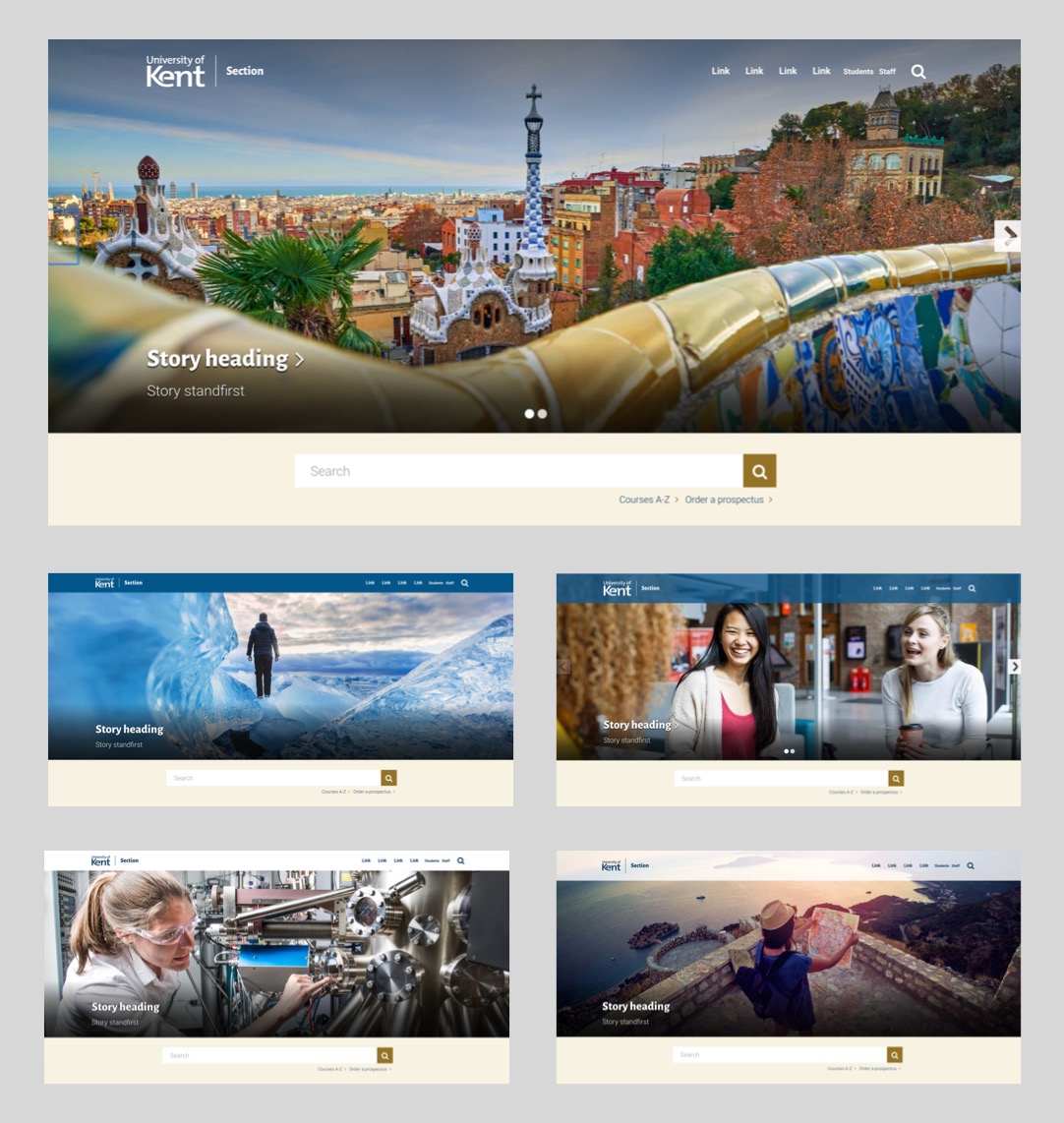
Where we use a fully transparent background on an image, options will ensure that contrast is accessible. We already do something similar on the main university homepage.
The ‘UK’s European University’ concept is currently under discussion. We’ve held back on the strapline for now.
Web-friendly heading font
As a font, Century Schoolbook has never sat comfortably online. We’ve been asked to rethink using it as a heading across the website.
Having stuck to it for years, we’ve been tasked to push the boundaries a bit.
Our brand has to be able to sell effectively online. Arguably what was effective a decade ago, needs to be updated for the current market.
Having looked at other university websites, there is often a shift in the brand to accommodate the practicalities of the web.
How do we keep our brand feel and replace Century Schoolbook? We’ve taken our lead from the font that is used to create the UoK logo and sub-brand text. This is called The Mix.
We’ve needed to find a similar font so that we could have a range of weightings and character symbols.
Having tested a variety of fonts, we’ve chosen Alegreya Sans. This has a very similar feel to The Mix and blends in well with our existing content.
It has a fresher feel, is more legible and friendlier for the web.
We’ve also looked at using a font called Roboto for body text.
Our existing body text font is Arial light. Our version has never had the full range of symbols and weightings we’ve needed and has been a bit buggy.
The fonts we’ve looked at are open source Google fonts. There is no restriction on their use.
Hero panel for marketing promotions
We’ve designed a new hero panel which can be used in different ways, particularly to help finding a course or attend an Open Day.
It provides a strong visual element that can be adapted in many ways to accommodate a variety of content.
It is interchangeable during the year with other marketing promotions to accommodate the recruitment cycle.
Course page updates
Following on from concepts we explored a while ago, we’re moving the course pages into Site Editor.
The course pages will use the lighter header style. A new design for the course header will look fresher and bring content further up the ‘fold’ on desktop. There are also refinements on the mobile version which will feel more slick.
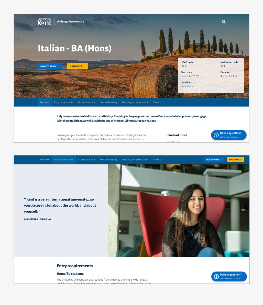
Updated course page with docking page menu and help button.
The course pages will use a new menu that docks at the top of the screen as you scroll on desktop. We’re also looking to add a customer-friendly help button.
These will be the first changes when we launch, but are planning to redesign each section of the course page in a more visual way. Content will be connected using stronger visual marketing and graphic elements.
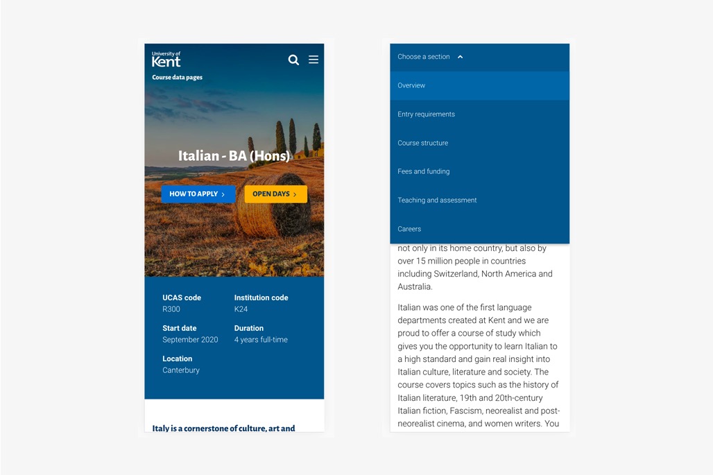
Mobile layout
How will this affect my site?
You shouldn’t need to do anything. The updates will happen automatically and you will see:
- a new, compact header design
- a new font for headings
The compact header will include your section menu with additional links being absorbed into a ‘More’ menu.
What about current students?
The changes we’re making that will improve content for prospective students, will also improve the content for current students that is in Site Editor, such as the central guide.
A lot of work has been going on to integrate and improve current student content and this will continue to develop over the next year. In many cases, the work overlaps and both audiences benefit.
What if my content is not in Site Editor?
If you are not using Site Editor, your content will not change. This is okay for now.
When content is moved into Site Editor, it will benefit from any future updates and work we’ve done to improve usability and accessibility.
Third-party sites will need to manually update their templates to reflect the changes.
Moving on
We’ll need to be able to make quicker changes to pivot and adapt as the institution and brand develops and defines itself.
Working with central Publishing, we will be making more frequent changes.
Having Site Editor as a central content management system, allows us to be more responsive, regardless of what changes occur.
Following on from the website changes in December, we’ll be looking at improvements to:
- Choose a course via subject
- The application process
- The online enquiry process
- The visit us sign-up process
- Course page section refinements