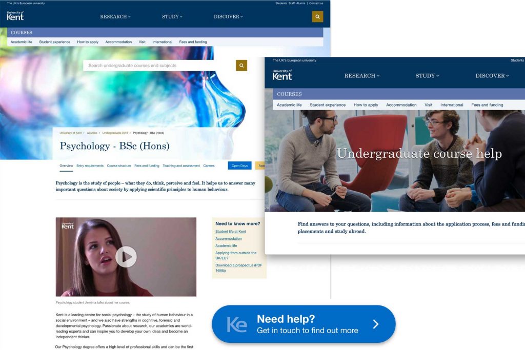
We investigated providing stronger upfront help and easier contact points to prospective students in the updated design. We also tested out visual and usability improvements.
It’s approaching two years since the course pages were revamped and in December we carried out user testing on our proposed refresh of our course page design.
We had sessions at two secondary schools in Kent, speaking to a mixture of year 12 and year 13 students.
Our discussions focused on
- What students thought about the proposed new design
- What they thought about the placement of the ‘Key Facts’ box
- Their thoughts on how to contact Kent and ‘live chat’ functionality
- A range of functionality testing focusing on if prospective students could easily find
- Entry requirements
- Contact details for the University of Kent
- Book and open day
- Course content
- Apply
- Careers information
Use of the new course page design
The new design combines course page content on to one long page, users did not have a problem with the longer page and were happy to scroll through information. Users instinctively used the new floating horizontal menu. The new layout and design were seen as more modern and many users felt this way due to the better header image used on the new page. All users commented positively about imagery and it was key to making a positive first impression of the course and university.
‘They’ve put effort into this’, ‘Modern, clean, up and coming’ ‘– student’s first impression of new course page design.
‘It immediately catches my attention’ – student’s first impression of high quality imagery
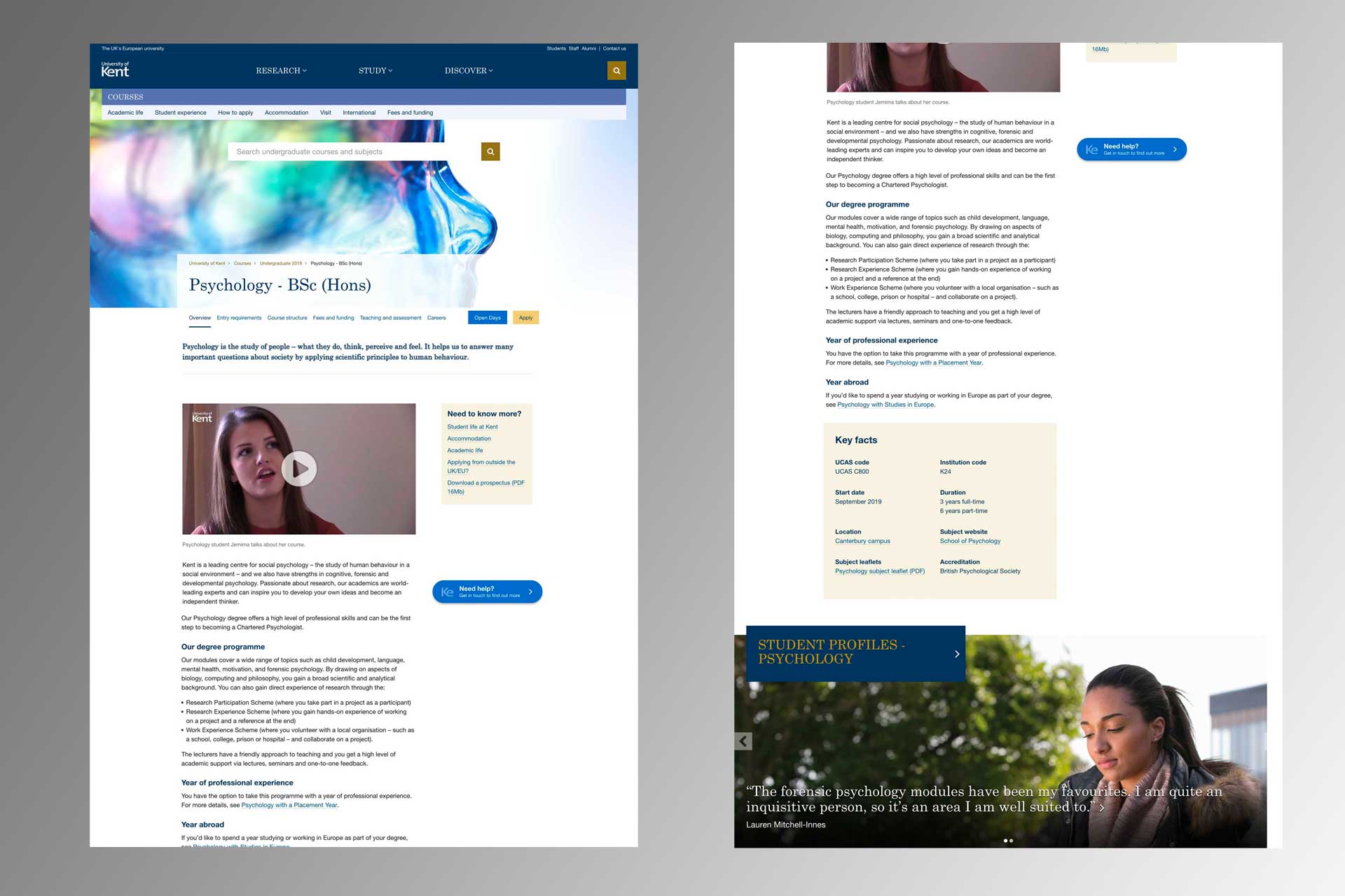
Placement of video
The new design fixes the placement of video content at the top of the page. This was mostly seen as a good move and participants continued to comment their preference for video content. Users commented that the video drew them to explore further course information.
TEF Gold
None of the users had an understanding of what the TEF was, but they were able to understand what it meant once they read the surrounding text. There was also a positive association between Gold and high quality, despite not having a preconception of what TEF actually meant.
Help button and contact information
Users liked the floating help button and most found it easily, it was seen as an improvement making the university seem approachable and friendly. Once users clicked through to a contact page they liked the option of live chat and would use it along with email, with phoning the least preferred option. Contact options were placed at the bottom of the page and should be moved to the top so they are seen more easily.

Key facts
This area of the test was not conclusive. Users did eventually find the information but many scrolled past it even once they had been on the page for a while, Placement on the right hand side of the page seems to be best, but further investigation is needed as to if students need this information and why.
Conclusions
Concerns about the length of the new course page were unfounded as users were happy to scroll and easily used the floating navigation. Users found the new design to be an improvement with average scores out of 10 as follows:
Easy to use
Old design – 6/7
New design – 8/9
Look and feel
Old design – 7/8
New design – 8/9
Modern university
Old design – 6
New design – 9
In general users found the new design to be an improvement and one that reflected a modern university, with header imagery of key importance.
Key facts should be placed at the right hand side for now with investigation as to the need for the information going forward.
Practicality of implementing a live chat function should be investigated with admissions team.
Functionality testing was positive with students easily able to find key information around open days, entry requirements and course content.
Further course improvements
In addition to the updated course page, we’re also looking at improvements to course listings and the introduction of subject pages.