We received feedback from students about the school pilot site for KBS.
We had individual sessions with four students which included:
- a discussion about their decision to study at Kent
- getting their first impressions on the new design
- testing key tasks on the website
Choosing to study
During our discussions, key reasons for choosing to study were:
- rankings (investigated on 3rd party websites)
- recommendation from friends and teachers
- location and centralised campus
- easy access to London
“League tables were very important to me”
“Teachers, friends and college advisors helped me pick”
“I like the fact that it was all on campus”
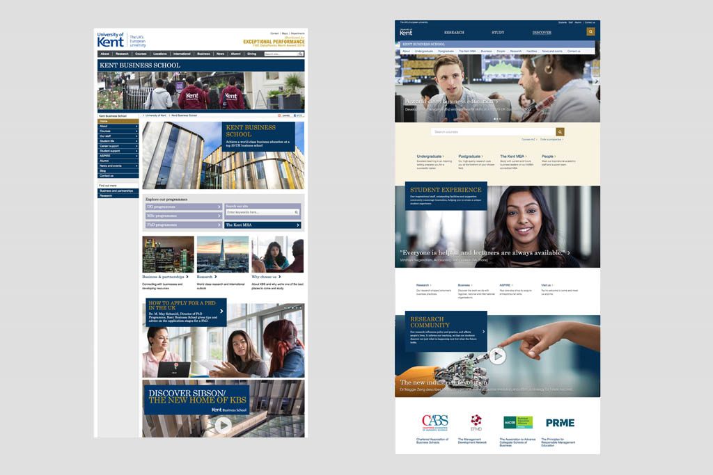
First impressions and brand impact
In order to gauge the impact the design had on the perception of the school, we asked the students to give a rating of 1 to 10 (10 highest) on various criteria of the old and new homepage designs and then discussed their reasons.
This included:
- initial impact
- dynamic and modern environment
- leading research
Average ratings across different criteria were 6.4 for the old design and 7.5 for the new design implying an improved perception from the new design.
The previous design had already included some of the new design elements, so the contrast wasn’t as stark as other school pilot testing.
“more modern”
“It breaks it down easier for me”
Tasks
Starting from the homepage, we asked participants to perform key tasks to ensure that they could navigate easily around the site and find what they needed.
Finding a course
They usually skipped the introductory text on the course pages, generally no issues interacting with filters and finding a course.
Some used the central course search showing that it is good that we have a range of different ways to find courses.
Learning about research
No problem navigating to the research page. Research in context on the course pages would be good.
“If we see too much writing, we just ignore it”
Finding a staff profiles/supervisor
Likely to use global search or people link
“Really nice”
Learning about scholarships
Students found the content via course link. One spotted the link on the footer. Ultimately they all found scholarships information.
Regarding the scholarships finder: “hard to know which ones are for you, a bit confusing”
About
Student profiles were seen as a trusted way to learn about the school.
Learning about student life
Student profiles were popular. They liked seeing student profiles.
“Good to hear from different students”
“Seeing pictures really helps you as you can imagine yourself there”
Learning about facilities
Facilities were easily found and explored. One student particularly loved Sibson.
Visiting the school
No issues finding either visit or contact link.
Learning about the MBA
Easily found and liked the visual presentation of the page.
Career and support options
All students went to the course page and found the careers tab. Student/alumni profiles, stories and testimonials are also good ways to expose support and career options. Users expected to see careers information on the relevant course page.
Conclusion and highlights
Decision to study – often the surrounding detail would have already been researched via 3rd-party sites and decisions made due to league tables, recommendations from friends, family or advisors or the practicality of location.
Impact – overall the new design had a higher rating. The first two students responded more strongly, whereas the second two were less concerned. This was not a huge shift likely because the previous design already had elements similar to the new design.
Key tasks achieved – such as finding a course or searching for a staff profile, were completed easily – no obvious usability issues found.
Student profiles/stories popular – use stories and profiles of students to communicate student experience and future prospects – they resonated strongly. Videos and impactful imagery were popular.
Scholarships finder needs improvement – the scholarships finder can be confusing and inconsistent. The design and display of the content needs to be reviewed.
Careers content at a course level – details about career options were looked for at a course level in relation to what a prospect wishes to study.
Related information is expected to be found in the context of the course pages, such as careers, scholarships and profiles. Opportunities to improve course pages add value across all schools.