To improve the design of Site Editor (the tool to publish pages in the new website theme), we did user testing on a paper prototype and on some working code with web publishers.
Overall the feedback we received was positive with many excellent suggestions to help us improve the design.
Mostly people expect an experience where they can create content quickly and intuitively.
Some support and training to use the system should be available if needed. Training topics which focus on creating great content, which are easily accessed when editing, were welcomed.
There is an urgent need for the basic functions of the Site Editor to replace Dreamweaver, but we need to balance our resource and time with the features we can deliver.
We’ll be prioritising our findings and will then work on refining the user interface design and interactions.
In a few weeks time, we’ll get more web publisher feedback to follow up on the feedback – we’ll keep you posted.
For those interested, technical feedback follows below.
Paper prototype
A paper prototype is a quick way of exploring ideas as part of an experimental/alpha phase before you decide which features are needed.
By using a low fidelity, it helps to focus on concepts and tasks, rather than the visual design detail.
1. Starting points
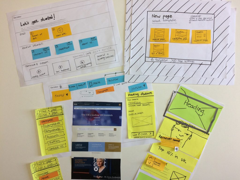
People liked the concept of a starting dashboard.
Selecting a site – was straightforward.
Recent updates – liked the ability to see what state the content from themselves or their team was in. Useful if someone was on leave and makes it easy to return to work that you were busy with.
Labelling needs careful consideration – we need to clarify a workflow and page status labelling which could be ambiguous.
Training and support – this should not be an after-thought that we throw at people because our product and workflows are not user-centred. It needs to be a meaningful addition to an easy-to-use product with topics focussed on creating good content, such as mobile-first concepts, using imagery, audience needs, writing for the web and accessibility.
Some people like to learn via trail and error, while others prefer a quick start overview.
Overall, it needs to be intuitive enough so that people can just get going quickly.
“I’m a have-a-go kind of person”
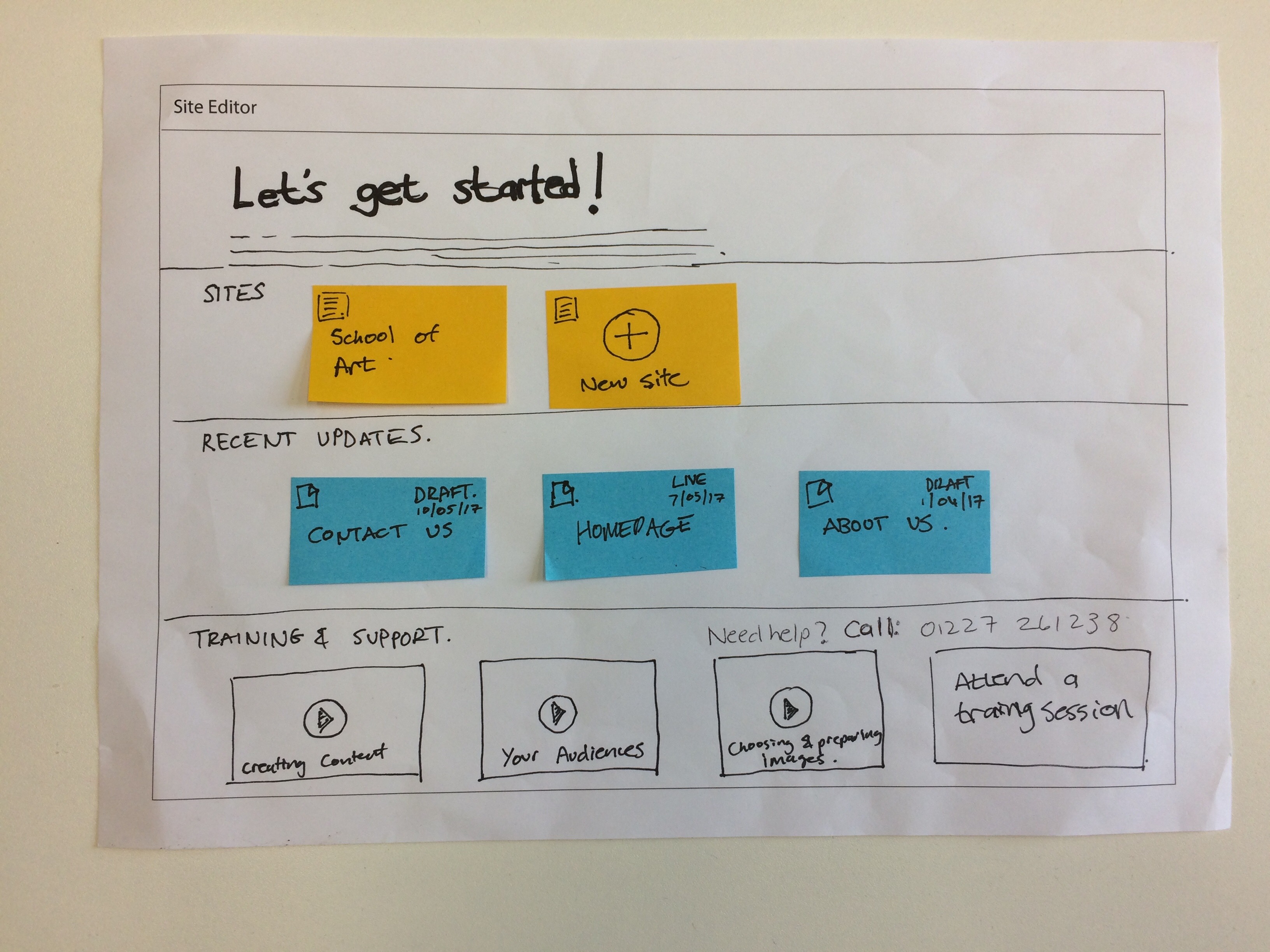
2. Choosing a template

People liked the idea of having a template to start with.
Templates will need to serve a specific purpose relative to the content being created.
We currently have feature, navigation and content pages. These may need refinement and further description at the point of choosing. Being able to show, existing examples is important.
Page purpose and meta data
As there is a maintenance cost to everything added to the site, we want publishers to be frugal and questioning.
The ‘page settings’ screen was to help publishers think about the purpose and value of the content they are going to create, as well as to provide some meta data.
Selecting an audience type/priority – useful, but probably be ignored over time.
Defining outcome/need/purpose – good exercise in thinking about the need to create a page. If the page is within a user-journey flow, where would it link to?
Review/expiry date – a concept where there is a way to review content was welcomed.
The word ‘expiry’ scared a few people, but ‘review’ was seen as less drastic. If this resulted in receiving lots of emails, they may be ignored.
A good suggestion was that of a six month stats review email, which showed best 10 and worst 10 performing web pages, might be more practical.
There was a good suggestion that filling in page settings first, followed by a suggested template, would be better approach.
“Good idea in principal, but could be annoying and ignored”
3. Editing concepts
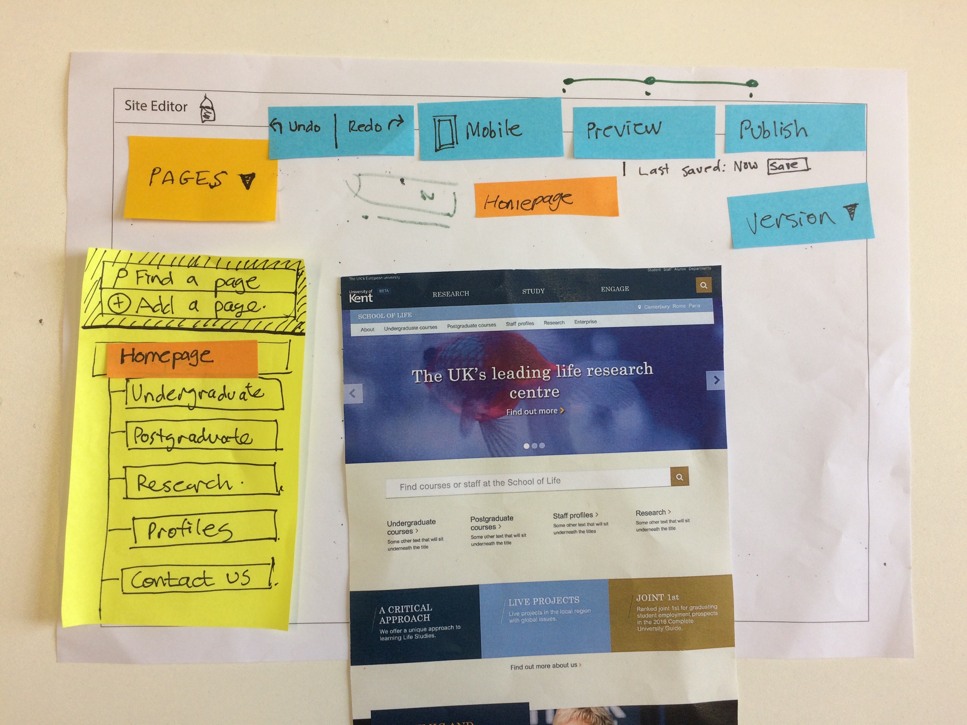
Navigation – the interaction as to how you navigate the site structure and create a new page was understood by most people, but how you add a page within the hierarchy needs thought, as this could be confusing.
Workflow – there was some ambiguity about the workflow. What is a preview? What is a draft? When is my content live? Do we still have test? How does this differ from a version or a copy? And is a mobile view content somehow different to desktop? Clearer visual cues as to the page’s status in the workflow would be good.
Versioning – there was some confusion about what versioning meant, how it might work and its differentiation from archiving. Some people wanted a way to show different content at different times and thought this referred to a different version.
4. Site Editor (work in progress)
The Site Editor interface has not been refined at all, so the testing was quite raw.
“Editing in place helps take away the guess work”
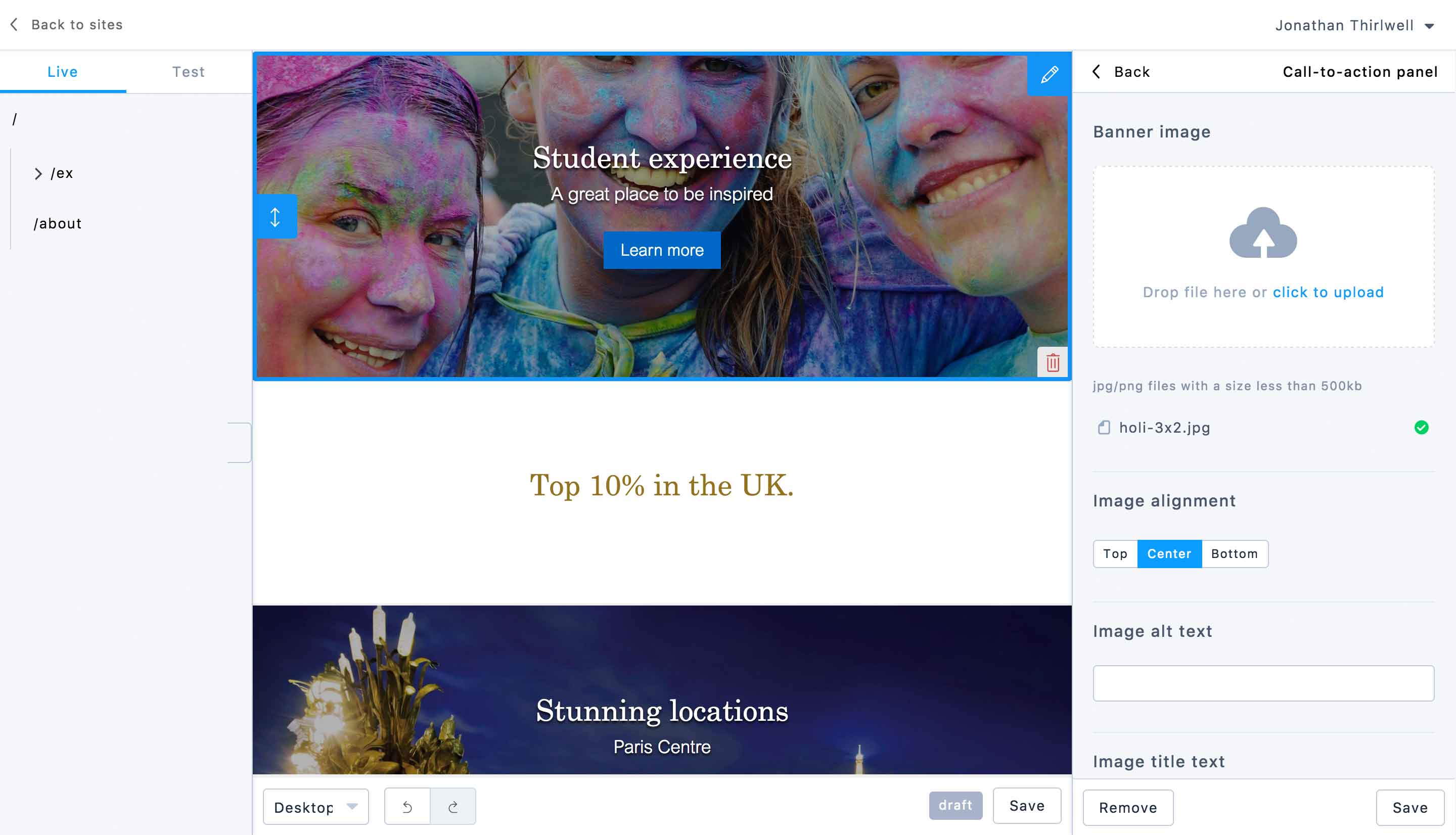
Hover and selected states which outline an editable block are identical. This created some confusion. It was unclear if an element was editable or not.
The visual design needs to give clearer feedback as to what is active and editable in the right-hand panel.
Editing in place – everyone wanted to click directly on an element and edit in place. They didn’t initially spot the editing interface which appears in a right-hand panel.
Text editing options – we should have only the editing options that you need for a given component, they should be context sensitive. For example you were able to add horizontal rules to a quote and this broke the quote.
Also the ability to copy and past from Word into Site Editor, and then for Site Editor to strip Word formatting would be great.
“I just want simple options for the layman”
Adding new elements within a content block – this confused many. There was an option to add additional ‘cards’. As the system never gives feedback once this has happened, it isn’t clear that anything has changed.
Labelling and input order – labels were unclear and the input order should follow the visual order of the item being edited.
Image upload – everyone was able to do this task. There were questions about where images might live (image library) and how they need to be prepared. How will we deal with digital asset management?
Help/support – there were comments that it would be good to have support/help links by the input fields – for example image editing, accessibility tips, content style guides to make them easy to find and access at the point you need them.
Saving – there was confusion as to whether work had been saved or not. Having two save button is confusing. A suggestion of an autosave was mentioned as a good option.
Adding new content – everyone struggled to find the place where you can add a new content block, there was no clear labelling to find this. Most got the concept of dragging and dropping content on the page.
There was no feedback that the dragged element had gone to the bottom of the content so the user didn’t know that it has been added. Also would be good for the block to appear on the area of the page that it was dropped on.
Changing position of content blocks – not all users were able to do this task. It wasn’t always clear that you had to click directly on the up/down icon to move the panel.
“You only find out by clicking around”