 By
By 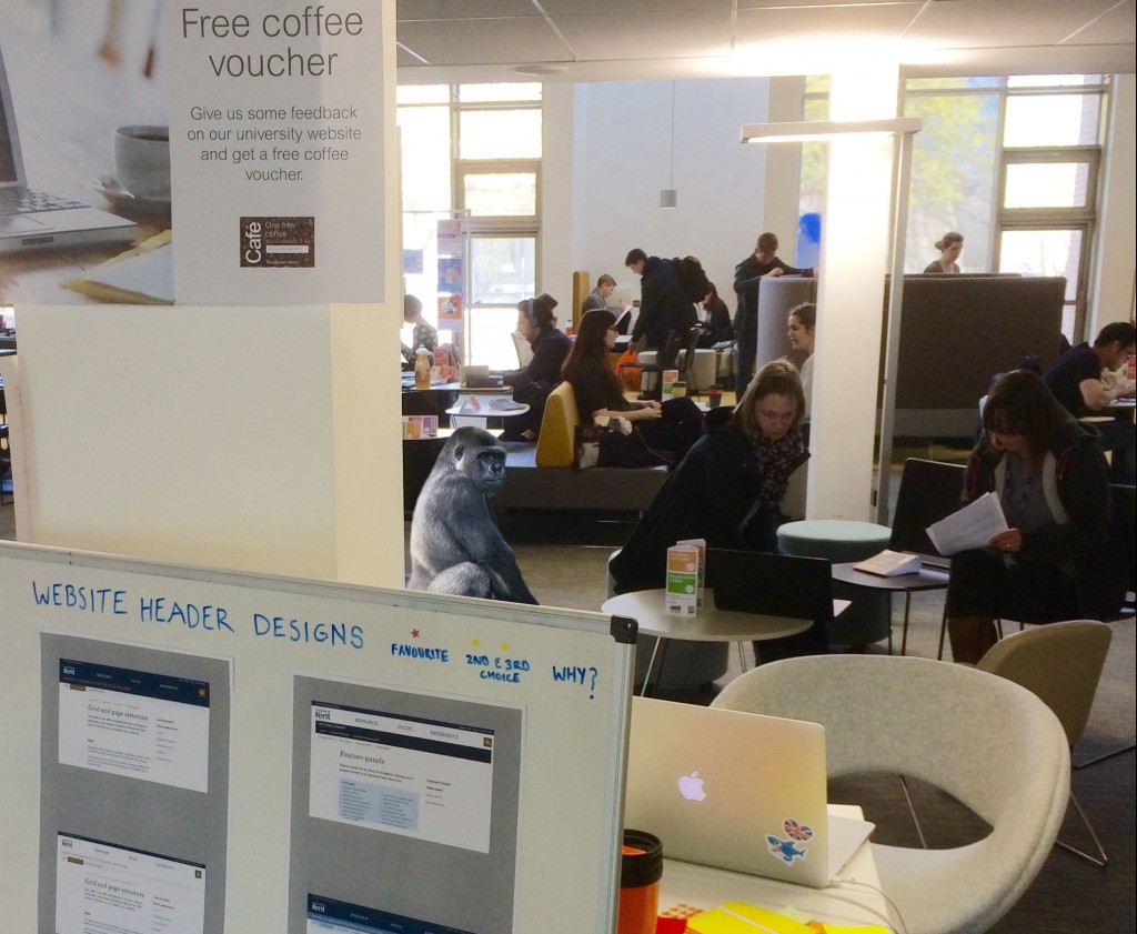
We did guerrilla user testing with students to get feedback on:
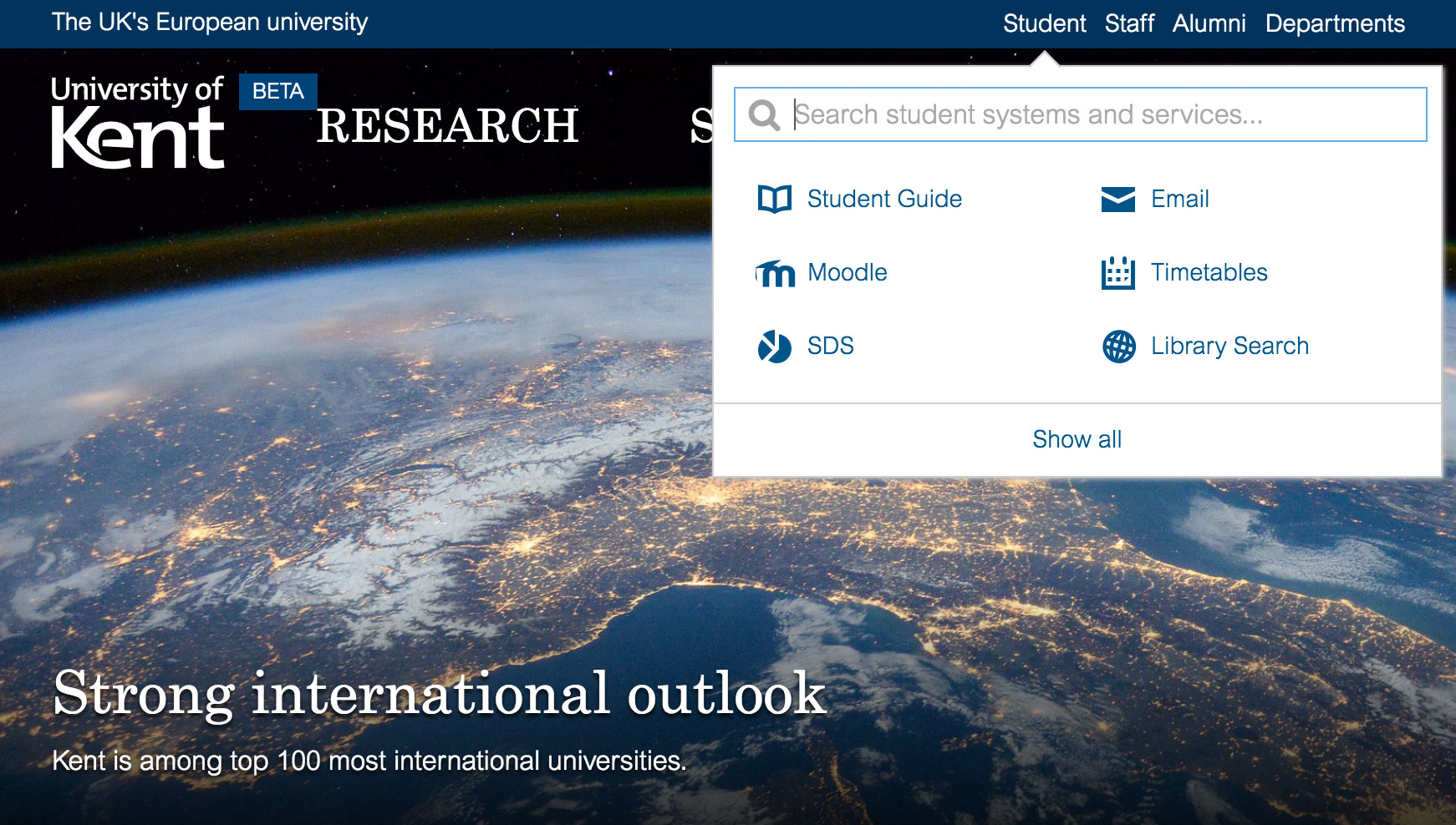
Beta Kent bar
We wanted to get feedback on our Kent bar, this is the blue strip at the top of the design which contains the audience links.
We asked initial questions to understand how students find key systems. Many students use the Student Guide to link to student systems (mostly Moodle, timetables, SDS, Email).
Some students use quick links on the current site, but find it too long. Most are likely to use Google.
On the new beta design, most didn’t spot the new student link at first. Many scrolled to the bottom of the page and looked in the footer.
Most interacted with the new student link panel without trouble. They liked the prioritised student links. It was not always clear that you could search for more student systems.
Once they found the student link, they appreciated the search autocomplete and thought it was useful. There were positive comments about the departments search autocomplete. Some people prefer to browse a list, so there should be a departments A-Z link.
Summary: the students found the student links on the beta Kent bar useful and an improvement on the current quick links. Some didn’t spot the link at first. This may be due to students’ familiarity with the current website. It would be good to add a link to the Student Guide on the footer. Student will often use Google.
The Kent bar will become ubiquitous across key systems. When the website launches, we need a campaign to help current students adapt to the new design.
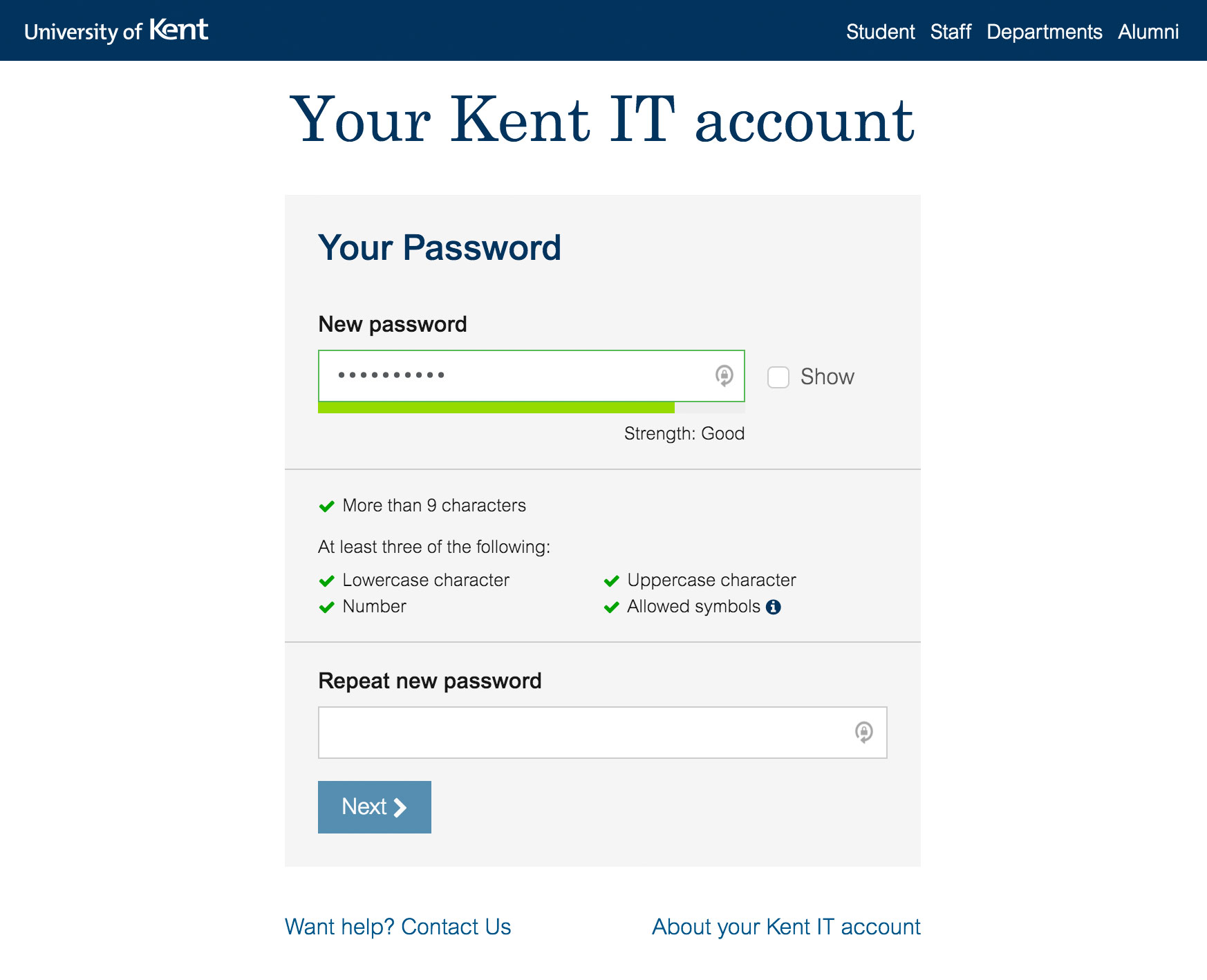
Kent IT activation form
We asked users to follow the new form designs. Everyone found it straightforward.
One uncertainty was the email masking on the “Check your email” screen. Most understood that the email design meant that it was masked. One person did find it confusing.
All interacted as expected on the password screen and understood it. One person struggled to type a correct password in as she had caps lock on without realising. There was positive feedback about the ticks highlighting when you met the password requirements.
One person didn’t spot the ticks highlighting at first. The “show” checkbox, for the password, wasn’t used often. It would have been useful for the last user who kept retyping an incorrect password in caps.
Summary: users found it straightforward and simple to use. They liked the clean design. Improve the email masking design by using clearer masking symbols. Consider making the masked email less prominent or add some supporting text to explain. The green checks for the password requirements could be a bit brighter to get more attention. Show a message when cap lock is active. Change “show” checkbox to “show password”.
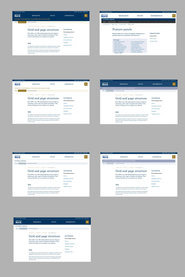
Beta website header designs
We showed users 7 different header designs. All header designs had the same text content. They varied by different colours and small design elements.
Users selected their favourite design and 2nd and 3rd favourites.
Some had a light header design, others darker. Although there was variability in choice, there was a trend towards the darker header. Some mentioned that the improved contrast helped focus between header and content. Others thought that the lighter head was “too white and plain”. Shades of blue created a softer contrast linking header to content.
Summary: the darker header design is worth developing further. It creates a clearer separation between header/navigation and content. This helps users to find and focus on the content. The design with the shades of blue received most positive feedback.