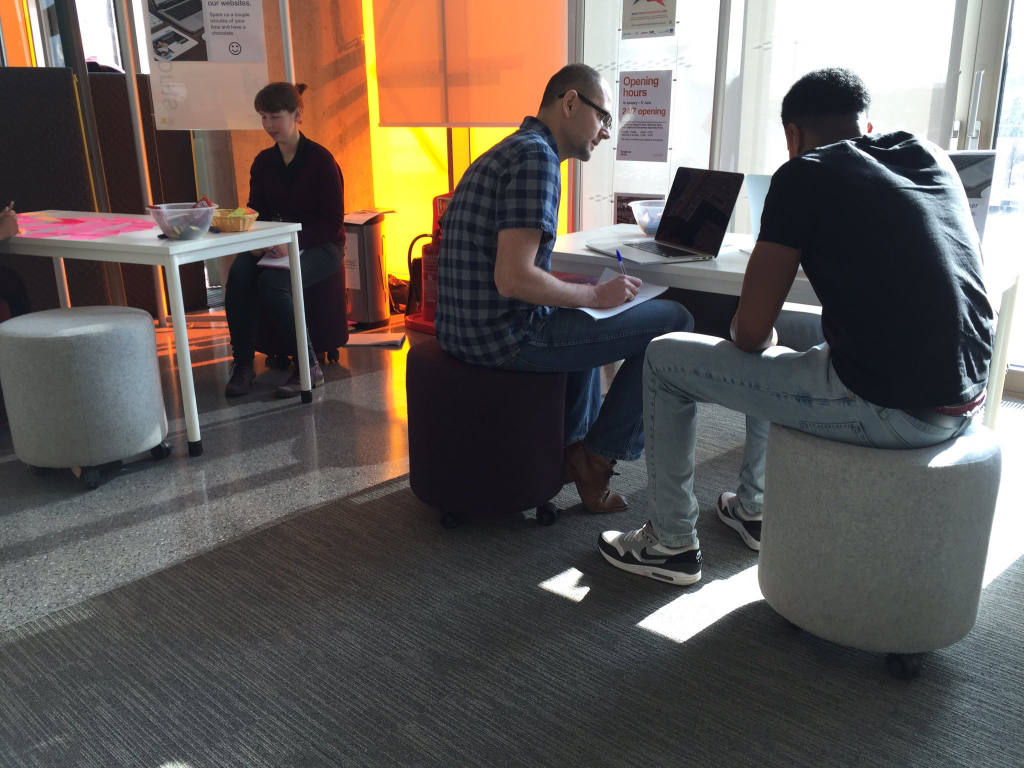
We arranged a morning of guerrilla user testing to get feedback from students on our beta homepage and other online products.
Going guerrilla
Guerrilla user testing is an impromptu way of getting user feedback. It’s user research on the fly. With no controlled environment, there is less structure with a random sample of people.
Guerrilla user testing supports a learning, building and measuring cycle (as in Lean UX methodology). It helps you to validate your assumptions rapidly and cheaply. One of its benefits is that it can be done more frequently.
What we did
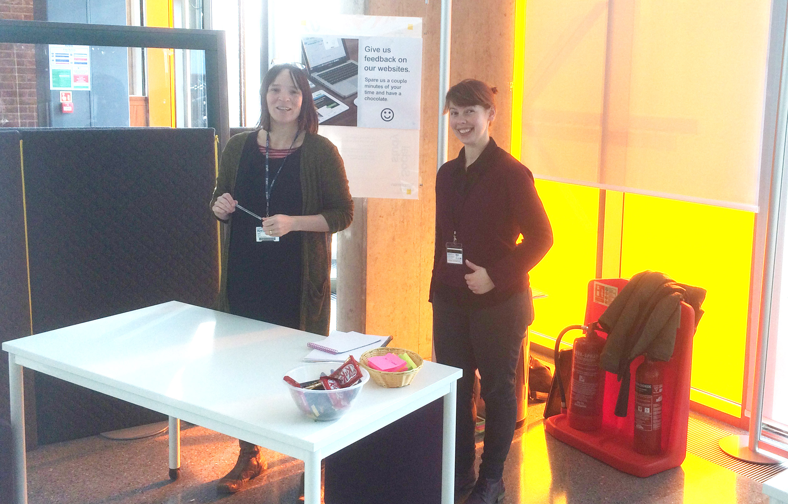
An area was set up at the entrance to the library. Passers-by were asked to spare a few minutes to give us feedback on our different website projects (beta, KentVision and Library/IT web pages) with a chocolate bar incentive!
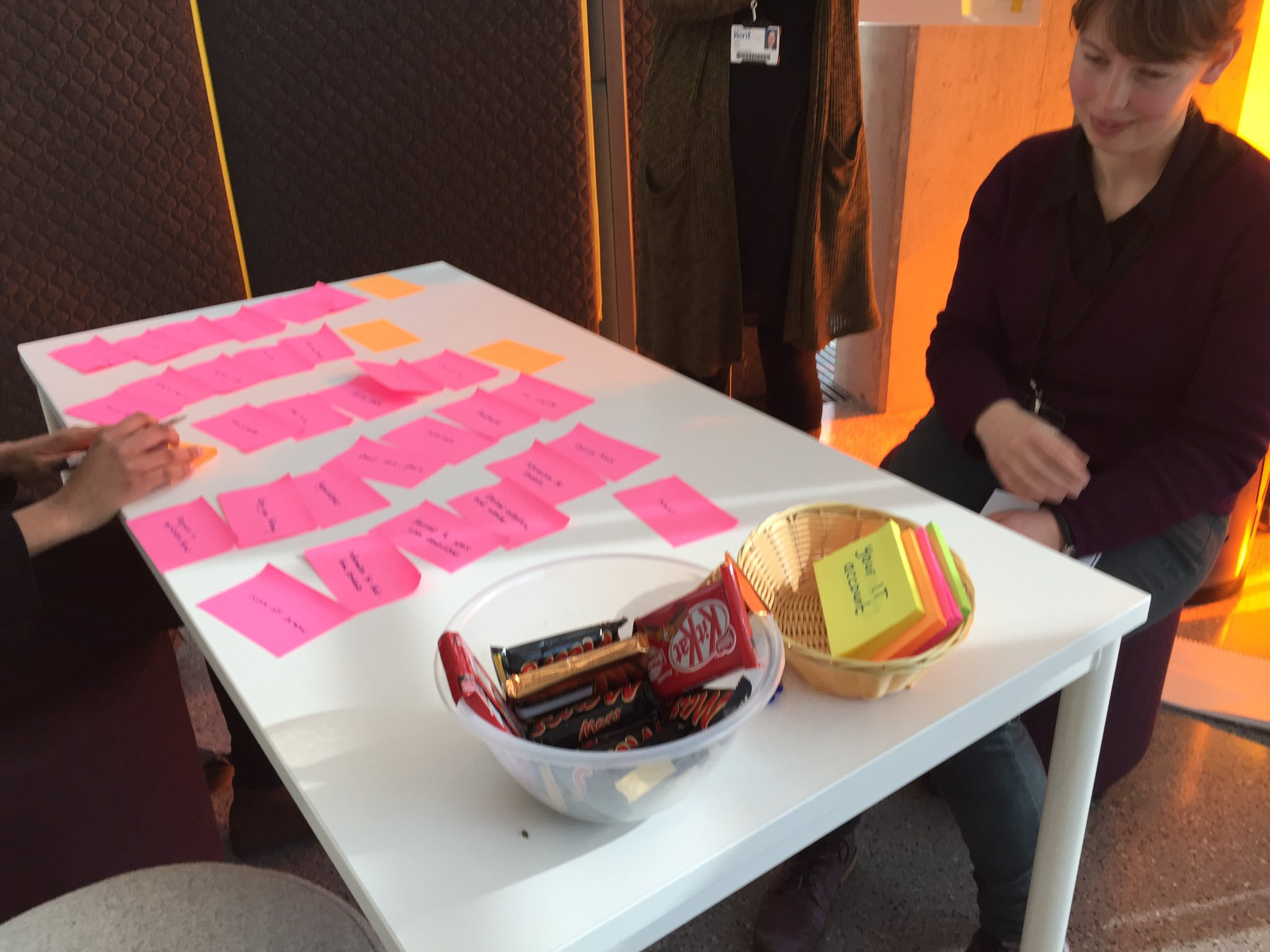
We prepared a range of open-ended questions to help lead us.
It was useful to learn about experiences of using the Kent website, especially first experiences when students began investigating the university and courses.
We then got feedback on the beta homepage content, usability and their overall impression. We observed and discussed their interactions with various elements on the page including:
- Global audience bar (quick links replacement)
- Global navigation – especially their understanding on the “research, study, explore” navigation concept
- Global search
- Course search
- Visual design
- Mobile interaction
Beta homepage feedback
Ten students, mostly undergraduates, gave feedback.
Most students felt that the existing website was okay, what you might expect from a run-of-the-mill regional university.
Surprisingly one international student had never seen the Kent website before!
Menus/navigation
Users liked the simpler navigation and understood the menu items.
Most said they looked for a limited range of initial information on first coming to the website, particularly:
- course details (which they often found via google, not searching
website) - fees/funding and scholarships
- accommodation details
The homepage provides links to this information, however there could be clearer links/labelling for funding/scholarships.
A couple of users clicked off the menu expecting it to close, something we need to fix.
They liked the simpler presentation of priority links.
There wasn’t any confusion with searching. There are various ways that a user can find out about the course: from the course search on the homepage, the global search or simply linking to undergraduate or postgraduate landing pages.
Users mostly spotted the student audience link and expected student related links to be found there (this will be replacing current glut of quick links).
Visual design
We had positive feedback on the visual design. It is likely that some were being polite, however there was a sense of pleasant surprise from some users that was genuine.
- “Cool”
- “Simpler”
- “Gives a better image of the university”
- “Info easy to find”
- “More attractive”
- “More designed”
We did a test of the new Postgraduate landing page which uses a large image. It is difficult at certain screen resolutions to show continuous content.
The users we showed didn’t have an issue with this and simply scrolled down the page.
Mobile
A few students used the mobile design and seemed to understand and interact with the hamburger menu and intuitively scrolled down the page.
Conclusion
Most students seemed ambivalent about the website. They wanted clear course information quickly when first considering a university and were likely to arrive from Google.
They didn’t have trouble understanding the global navigation elements, searching for a course or finding ways to navigate to the key information they wanted.
The visual design received positive feedback. On a subliminal level, a modern, progressive and clearer design may impart a perception about the university that may tip the balance.
We received positive validation on our assumptions for the global navigation elements and homepage content. There are also a few improvements we need to make from what we learned.
We’ll be doing user testing in schools in March and will continue to do guerrilla user testing on a regular basis.