What do users want from the University website? What message is the University trying to convey to those users? How can the University convey that message clearly and concisely?
Users of any online service increasingly want to access content directly, quickly, without fuss, on a range of different devices, and in different contexts.
Digital design across all sectors is showing a move towards simplicity based on offering content to users in a way which is relevant to them.
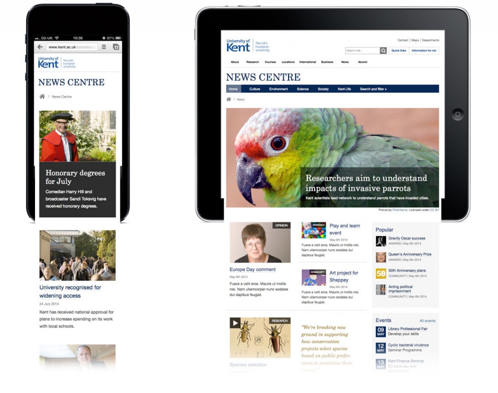
Over the past year we’ve been exploring approaches to refresh the University web theme towards these principles of clarity and openness.
This has led to a simpler, lighter design aesthetic which emphasises:
- space
- bold, high quality imagery
- clear typography
- plain English
- simple, content-rich layouts
Find out more:
