A chair. A bike. A website.
Design is about making technology work for people.
This article outlines one of the core design principles that we want to adopt for the University of Kent’s website. Simplicity.
Simplicity of design allows users to focus on what they’ve come to the website for – the content.
An added benefit is that simplicity allows the website owners to convey a more sophisticated image to the public.
Simple simplicity
How do we go from a high-level design principle such as simplicity to a set of design patterns for building websites?
What is simplicity?
First, simplicity does not mean simple. Designing an iPhone to be simple for a user is a very complex design problem. The challenge for the designer is to give a complex problem a simple solution, from a user’s perspective.
I think a cornerstone of simplicity is what we might call intuition.
There’s no such thing as an intuitive user interface, just a familiar one.
So simplicity can come out of a sense of familiarity. Quite complex tasks like driving a car can appear intuitive given enough familiarity. Of course a first-time learner driver will tell you that driving is not intuitive.
Familiarity breeds… intuition
How often have you battled with a badly designed website because you can’t find what you want, or because everything seems unnecessarily complicated and time-consuming?
So if badly designed websites are so familiar, shouldn’t you just be able to deal with that? Rubbish websites should become intuitive, right?
Back to the car analogy. Familiarity makes a car easy to drive only because driving a car has the potential to be easy. The interface has been well designed over the decades to fit the physical and psychological needs of drivers.
On a Ford Model T the throttle was a hand lever, the brake pedal was controlled with the right foot, and there were a two further pedals controlling gears. This certainly doesn’t seem intuitive now, because it’s not familiar. But in a world where you only have two forward gears and reverse, and where you only travel very slowly, it probably makes perfect sense. I’m sure people managed to drive a Model T just fine.
So we can make users feel that our website is intuitive by meeting their expectations about how websites work, how content is arranged, and by meeting their physical and psychological needs.
Content
Take a look at any of these websites Microsoft, Amazon, Apple, Oxford university, Medium and ask yourself how much on those websites is anything other than relevant content?
Very little. No drop-shadowed boxes. No funny icons. No background wallpaper images. Nothing sliding or moving or spinning. There’s not even much navigation.
In fact, nothing to distract someone from the reason they came to the website: finding out more about the organisation, finding a product, reading a story, finding help, etc. There is nothing superfluous to the primary goal of the website. And that goal is clear.
Everything feels very familiar, very intuitive, and very simple.
Contrast
What we also see from any good website is that what matters in making it usable and understandable is a sense of space. And what matters about space is the contrast between something and nothing.
From a design perspective contrast allows us more easily to focus on what is important. It creates visual simplicity.
Fussy design fails because the contrast is lost between the content, images, layers of shadows, boxes, backgrounds, textures. It confuses the user. They lose focus, and lose interest.
Admittedly Amazon is aesthetically not an eye-candy design. But their target is to put plenty of products on a page. The website is actually very economical and efficient in how it does this: basically just a grid of images. Eye-catching, familiar, intuitive, simple.
Notice too how colour and interest are often provided not by the graphic design of the page, but by the images (which are all clickable, and all convey some meaning). The design itself is very minimal, perhaps with one colour being used for a header or footer background, or to highlight one or two blocks of text. A choice of a couple of different fonts. Very simple and very effective.
Examples
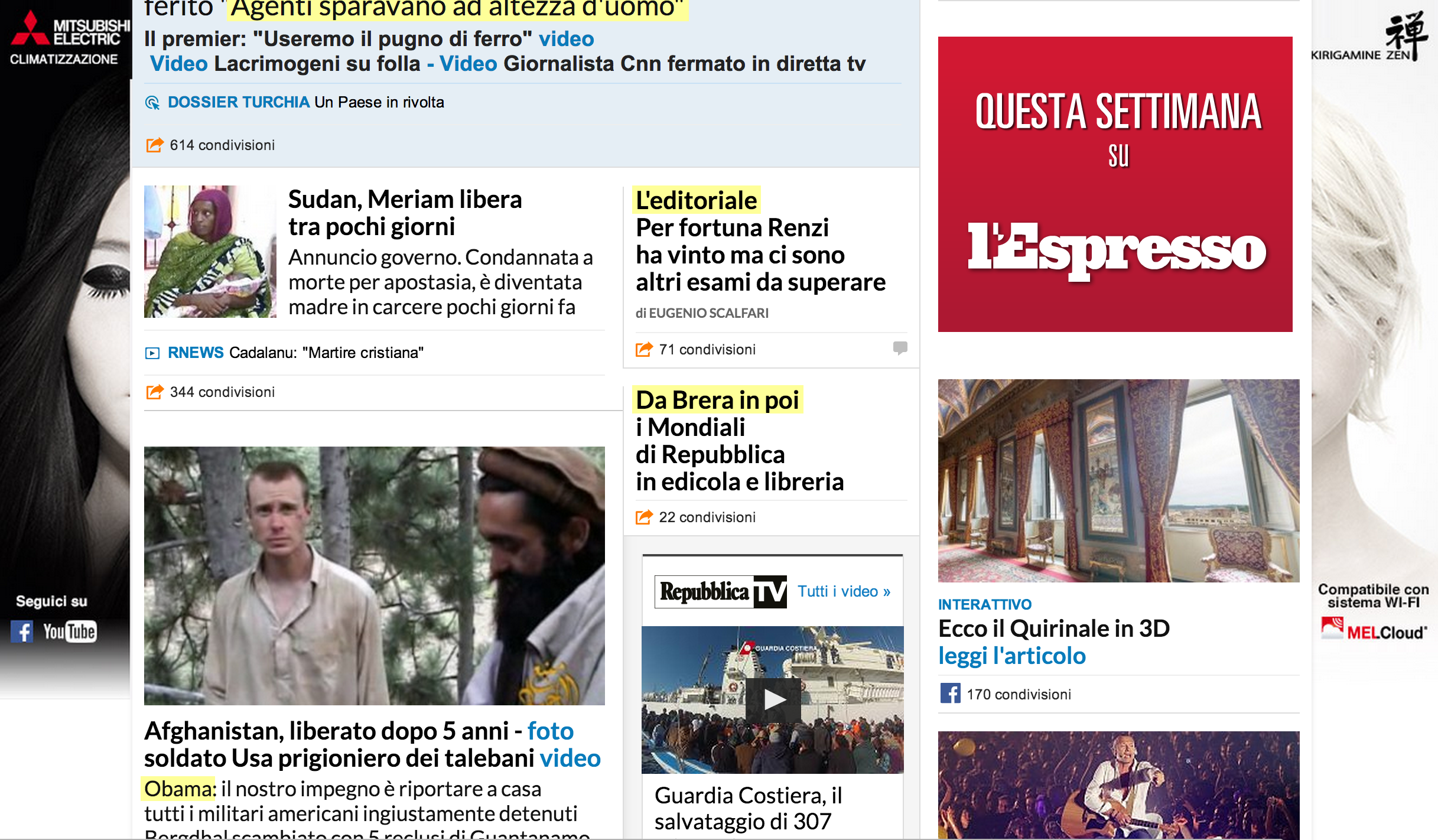
By the way a nice example I found of a bad and confusing website is repubblica.it – an Italian newspaper.
I don’t know about you, but I feel like I need a rest after looking at their website. It’s not the worst website ever, but it’s not much fun either.
Quite apart from the apparently random yellow highlights (yes they are real, and not the result of a crazy browser plugin) the mass of images and ads make it tricky to work out what I should look at. It’s exhausting in an already exhausting world. It just doesn’t fit how the human brain works in any sensible way. It is bad design because familiarity will never make it feel intuitive or simple.
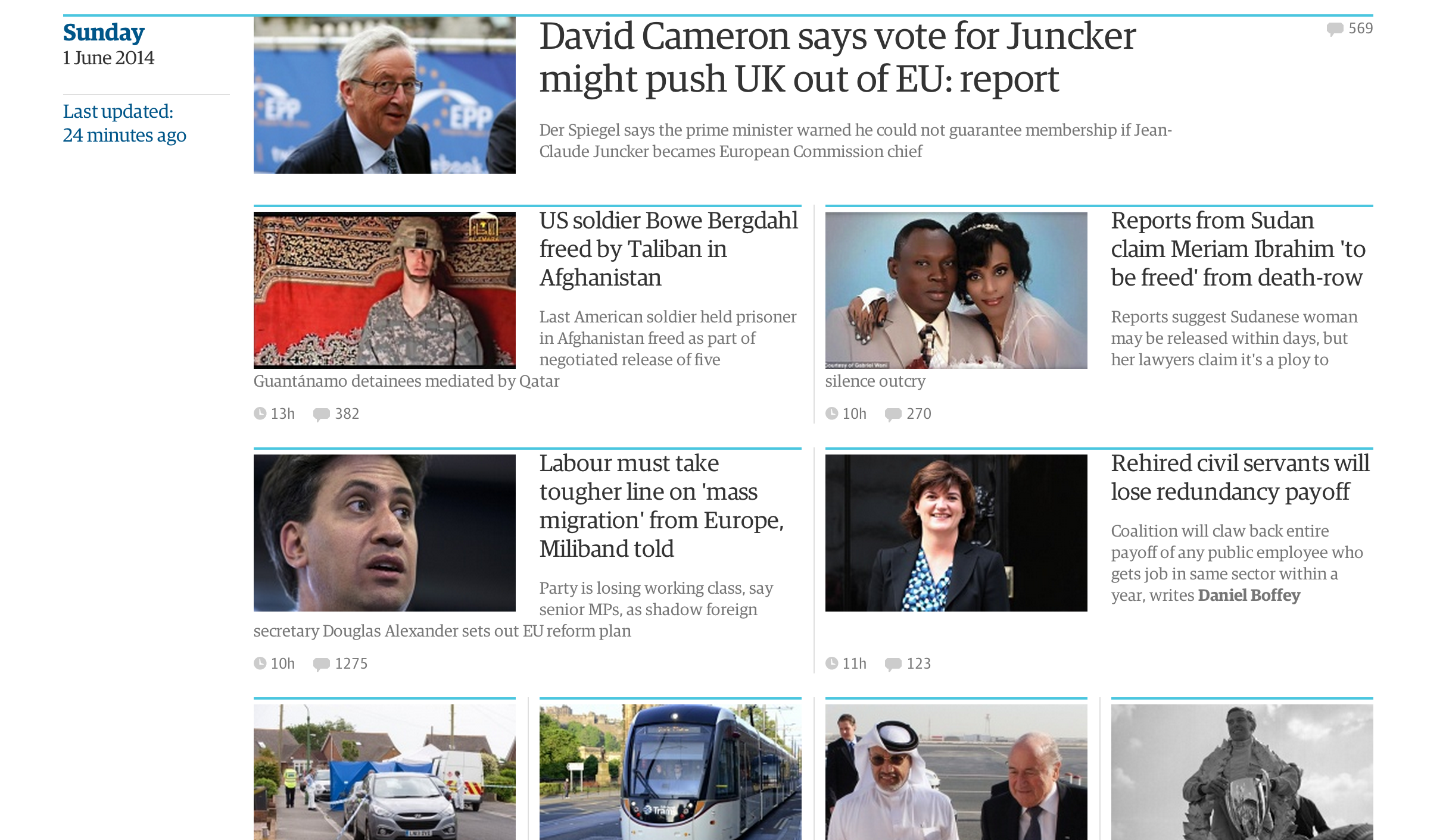
Contrast larepubblica.it with another newspaper – this time The Guardian (actually at time of writing a beta version of their new site). When you look at that, how does it make you feel?
It makes me feel like I’ve come to a page which has news stories on it, with nice clear images and nice clear titles. I can very quickly pick out stories that interest me. This is why I came to the website in the first place. Job done. Good design.
Say cheese!
Space gives an air of calm classiness. So if you want your site to look cheap, don’t use space.
This is admittedly a cultural and stylistic thing. Maybe there are cultures where cluttered is a good thing, and sparseness can be equated with barren infertility. In 19th century Europe clutter and ornamentation were positive things.
That said, many of us operate in a Modern Western World, where space works and clutter does not.
Mark Boulton’s post for A List Apart puts forward the argument for space and openness in design extremely well. I recommend you read it!
Summary
In this article I’ve pointed out that a key design goal for the University of Kent website is to introduce simplicity.
Simplicity results from a sense of familiarity, and from taking into account the physical and psychological needs of users of a website.
One key thing which facilitates our physical and psychological limitations is using space and contrast in physical page design. This allows people to focus more readily on the content that they have come to the website for.
Space also brings with it certain (albeit culturally determined) associations with order, and classiness. It makes you look professional and like you know what you’re talking about. The “scatty professor” effect only goes so far. Cluttered tends to mean confused or at best cheap. So avoid clutter if you don’t want to appear confusing or cheap!
great article… thanks