The new brand
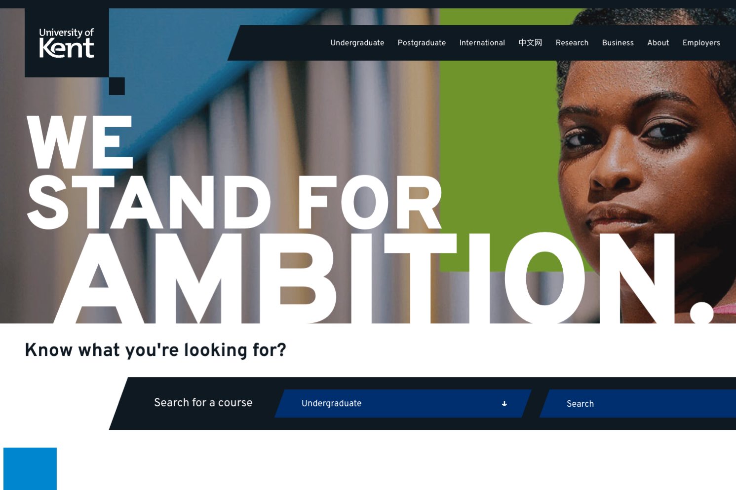
We’ve recently launched the new ‘Ambition’ brand which has introduced new design elements to the website.
The brand’s design elements are inspired by a deconstructed “K” element. This is a flatter design using lots of angular elements.
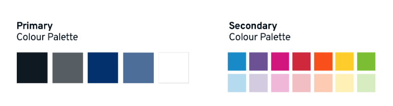
A new colour palette has a range of bold, striking colours that work as highlights alongside a dominant dark navy and white standard treatment. The dark navy is very dark and looks black. I will refer to it as black in this post.
There is a new font that is used called Overpass.
Overall, this style creates a more punchy, dynamic and confident feel.
Things to be aware of during the swap-over
Global elements
Global elements such as the header and footer have been restyled. Mobile navigation is simplified and includes site, search and global navigation elements.
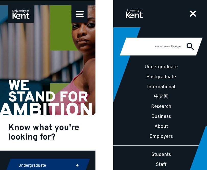
On desktop, the navigation floats at the top of the page if you scroll down and then up.
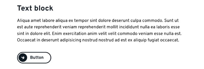
Buttons
These have quite a distinctive look in the new brand. They do not use colour but are white and black.
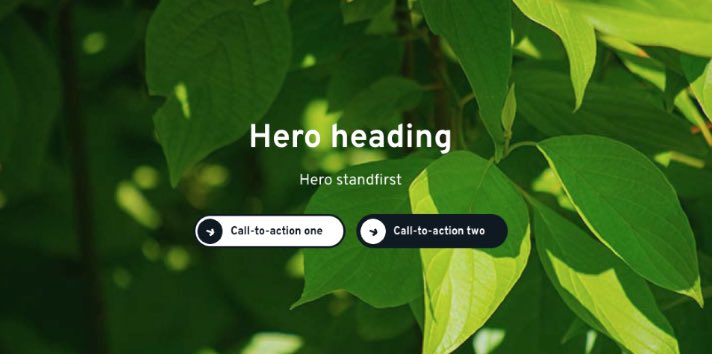
Previously you would have had the option of choosing red, blue or yellow to make a button bolder on the main image panels. Now all buttons will be white or black (replacing red as a dominant element).
During the brand swap-over phase, be aware that existing button colours won’t work. You’ll only be able to have a white button or a black one (where red was previously chosen).
On text blocks, all the buttons will use the black-on-white version.
Page style and colours
Where the old site used a range of colours, often dark blue and burgundy with softer yellows, greys and blues, and a range of brighter ‘energy’ colours, the new brand uses a different treatment.
There is a range of bright colours for the new brand, but they are used more sparingly.
The new brand tends to use dominant black/white elements with highlights and tints from a single colour of the new palette. It doesn’t tend to mix colours up. There is generally a single colour scheme per page.
It hasn’t been possible to automatically change all existing blocks to follow this principle. We’ve matched up some of the old brand colours as best as we can with the new brand colours. Some older colours will not be needed anymore.
You may see ‘no longer used’ colour options in your blocks as the new brand ones are introduced. We’ll work to make the colour-naming consistent over time.
As the brand settles in and we become more familiar with the style, we may introduce new blocks more distinctive of the new brand. We may then ask editors to gradually evaluate their pages and update colour settings on their blocks to represent a single colour theme per page.
Next steps
We’re constantly checking the site to fix any issues. Do let us know if you have spotted any bugs.
We’ll keep you updated with any changes we may need to make to your blocks.
Check our Site Editor Guidelines site on Sharepoint.