We’re changing student and staff links and added a few improvements to existing blocks.
Student and staff links change
We’ve updated the student and staff links which you can see on the top right of the homepage.
These will now link directly to the student and staff guides where popular links can be found at the top of those pages.
All other links and broader help topics will be found by following the help buttons on the student and staff guide pages.
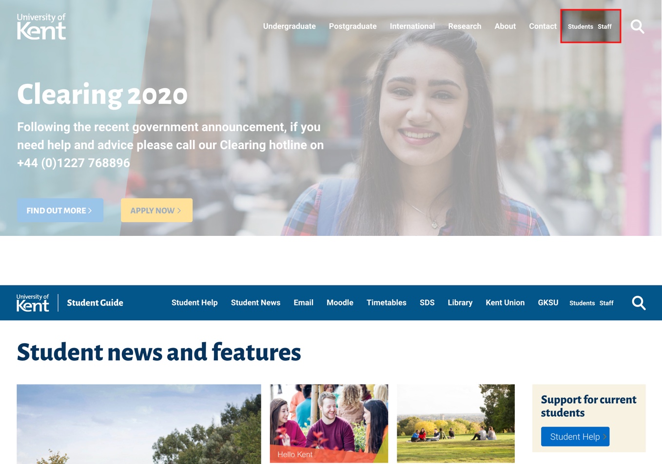
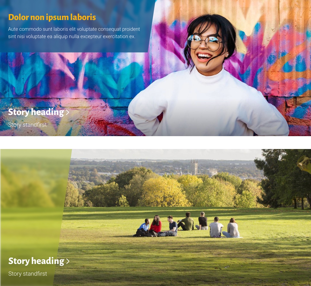
Image panels
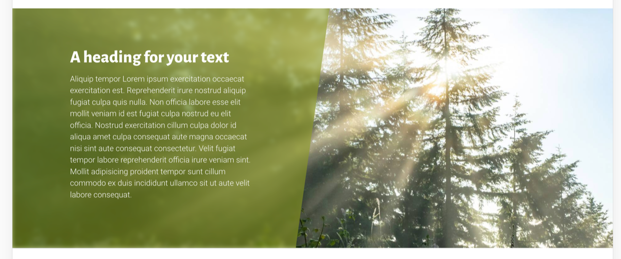
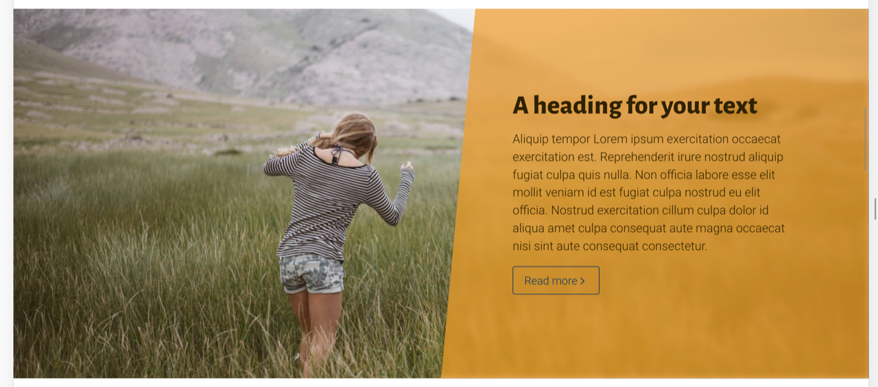
We’ve introduced the angled design to the Image panel. This is to align it with the diagonal design element that has started to be used more prominently in marketing.
The existing blue title block will change to an angled design.
There will now be options for different colours to reflect the ‘energy palette’ where appropriates.
All these blocks will be able to have the slash design idea, again in different colours.
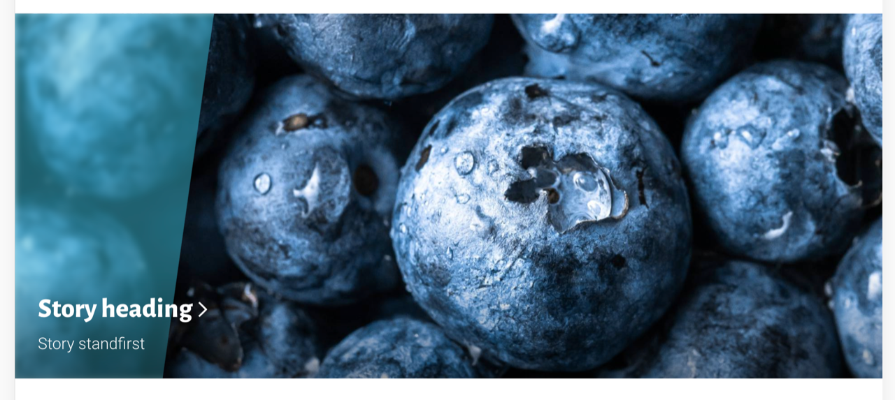
Editorial panel
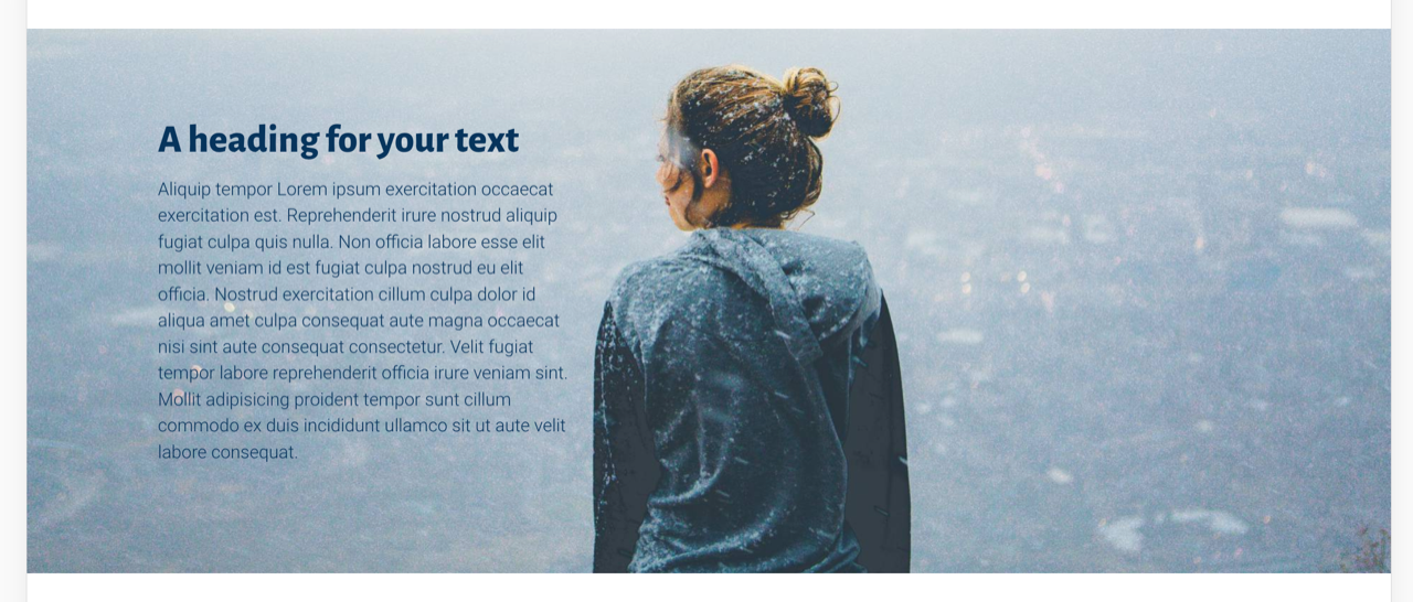
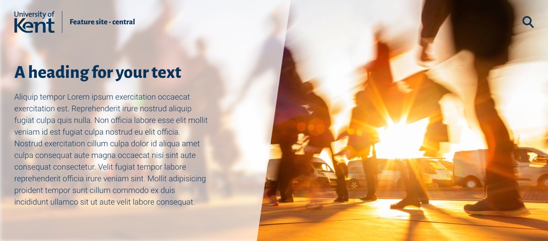
We’ve updated the editorial panel which now includes the slash design element and additional colour and overlay options.
You can choose dark or light text and solid or translucent background depending on what works with your image. We’ve increased the amount of text you can have and can also have two featured buttons.
You can also use the Editorial panel as a header element on the page.
Icons blocks
You’ll also see some changes for icons. You’ll be able to use the energy colours for these, either solid or inverted. And also not have rings around icons so you can use special icons such as ones like Stay Safe.
You can still use the existing simple blue design, so these are just some extra options to help add impact to a page.
![]()
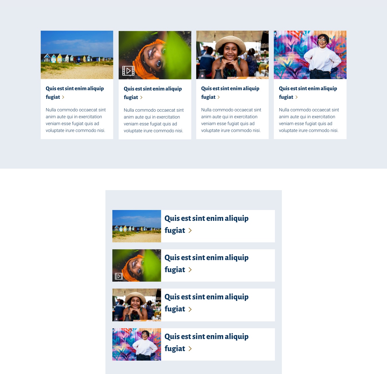
Image cards
We’ve also updated standard image card panels. You’ll be able to choose an optional video icon overlay if you want to indicate that a story contains a featured video.
You’ll also be able choose a compact mobile format. This reduced the size of the card image and hides the description text, making the title more prominent on mobile.
You can also give your cards a white background to help them stand out against a coloured panel background.
Other bug fixes
- Fixed chevrons on icon card titles
- Fixed video card chevron alignment
- Fixed quote panel chevron alignment
- Made uploading video image optional for inline videos
- Made lead text optional on content pages
- Fixed anchor link output on events listing with date picker
- Fixed ‘Contact us’ heading bug