 By
By 
This post tries to show that there’s good evidence the existing WCAG requirements for accessible contrast are overly simplistic. They do not take into account how visual perception actually works. Common colour combinations such as white on red appear to be inaccessible when they are not, and other combinations such as blue on grey appear to be accessible when they are not.
I’d recommend designers still follow WCAG (because they have to, and it is still a handy rule-of-thumb) but it is nevertheless useful to bear in mind some of the false positives that WCAG throws up. A better understanding of colour and contrast is always a good thing for a designer.
What is contrast?
Why do we care about contrast? Contrast has become so ingrained in the accessibility checklist that it’s perhaps easy to overlook what it means, and in fact whether the WCAG requirements are valid. I hesitate to say guidelines, because guidelines with a legal implication seem less guidelines and more requirements.
When we talk about contrast we generally mean a contrast in luminance between text and background.
Luminance is the amount of light given out by (in our case) a computer screen. Brightness is our perception of that light level. Black text (no luminance) on white (full luminance) is an example of the highest luminance contrast possible.
Colours have different luminance levels. So white has 100% luminance. Yellow (#ffff00) has high luminance, blue (#0000ff) fairly low luminance, and red (#ff0000) has mid luminance.
Colours can also create contrast, in terms of their hue. So colours with similar luminance levels, such as pink and light blue, clearly have a contrast from one another based on their hue.
Of course, some people with colour perception deficiencies such as deuteranomaly (classic “red-green colour blindness”) can’t always rely on hue for contrast. Some types of colour perception deficiency are accompanied by lowered luminance perception of certain colours.
“The intent of this Success Criterion is to provide enough contrast between text and its background so that it can be read by people with moderately low vision (who do not use contrast-enhancing assistive technology). For people without color deficiencies, hue and saturation have minimal or no effect on legibility as assessed by reading performance (Knoblauch et al., 1991). Color deficiencies can affect luminance contrast somewhat. Therefore, in the recommendation, the contrast is calculated in such a way that color is not a key factor so that people who have a color vision deficit will also have adequate contrast between the text and the background.”
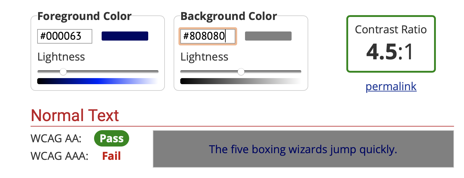
The recommended level of contrast for standard vision is 3:1. The figure of 4.5:1 is arrived at based on research linking contrast levels to visual acuity (sharpness) levels.
“A contrast ratio of 3:1 is the minimum level recommended by [ISO-9241-3] and [ANSI-HFES-100-1988] for standard text and vision. The 4.5:1 ratio is used in this provision to account for the loss in contrast that results from moderately low visual acuity, congenital or acquired color deficiencies, or the loss of contrast sensitivity that typically accompanies aging.”
“The contrast ratio of 4.5:1 was chosen for level AA because it compensated for the loss in contrast sensitivity usually experienced by users with vision loss equivalent to approximately 20/40 vision. (20/40 calculates to approximately 4.5:1.) 20/40 is commonly reported as typical visual acuity of elders at roughly age 80. [GITTINGS-FOZARD]”
The problem with contrast
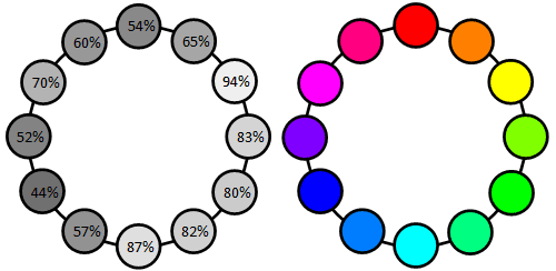
Coloured buttons and panels are a reality of web design. Designers usually have a brand colour palette to work with, and need to create something distinctive which fits the brand. Approximately 96% of people have standard colour perception, so it makes sense to use colour to help make something stand out. Likewise panels or areas of the page can sometimes have coloured backgrounds to add some emphasis to a part of a page.
But what colour text do you use on top of these coloured backgrounds?
The WCAG requirements help with this. They give designers a nice, simple approach. Google Chrome even has a built in contrast checker for designers. So for example a bright red (#ff0000) button with normal sized text must have black text for it to have enough contrast to be accessible. Not white. Definitely not white.
And this is where the cracks start to appear. Have you ever seen a red button with black text? It looks strange, and in fact a bit hard to read. And black with red text?
The perception by many people is that white-text-on-red is easier to read than dark-text-on-red. This appears to be true even for a large proportion of people with different colour perception conditions or lower visual acuity. Blue on grey is also apparently fine, but seems to many to offer poor visibility.


So what’s going on?
I found a really good explanation in one of the comments on a blog post about contrast. The comment was by Andrew Somers, an expert in colour science and visual perception.
“… The method used for the WCAG 2.x contrast is, as I’ve discussed elsewhere, inconsistent with human perception models. When the background is white #FFF, then the math method is “most accurate” but as the brightest color of the pair gets darker, the contrast value reported becomes less accurate in relation to human perception. The reason is the current math is a simple ratio, it is not Weber nor Michelson, nor any other perception model, so it is essentially linear relative to light (with a tiny dark offset), it is not linear relative to perception.”
If you’re interested, there’s far more detail from him in a WCAG github issue at https://github.com/w3c/wcag/issues/695.
As I said earlier, colours have different luminance levels. Yellow (#ffff00) has high luminance so works badly with white. Blue (#0000ff) fairly low luminance so works ok with white. Red (#ff0000) has mid luminance, and doesn’t work so well with white. This is basically how the WCAG formula works. A simple mathematical model where if X is high luminance and Y isn’t, we’re good.
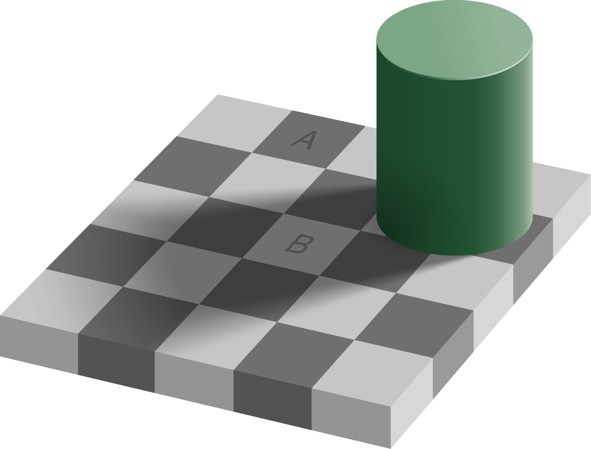
But human visual perception doesn’t work this simplistic way. It’s a highly complex relationship between stimulus and how the brain interprets the stimulus. A nice example is an optical illusion of how we perceive shade based on how our brains think the world should work. No one would never imagine squares A and B in Figure 4 below to be exactly the same shade of grey, but they are.

So what should designers do?
The WCAG approach is simplistic. Its advantage is that it offers a nice, simple way for designers to feel confident they’re meeting accessibility requirements. Sadly, those requirements are sometimes wrong. This isn’t so bad when it discourages designers from using mid-luminance colours like bright red with white (fails the test but actually ok) because there are often alternatives. But it can be highly misleading when you use things like blue text on grey (passes the test but actually not ok for most people).
The reality is that websites get monitored for accessibility, often by automated tools. WCAG has shifted from guideline status to legal-requirement-with-automated-tools status. Contrast is rarely brought up as a major issue with a website, but it does get brought up as an issue which needs attention. We must pass the tests.
So what do designers do? Does this mean we end up with – as one designer put it – the “Halloween effect” of black text on orange buttons, or the “Ferrari effect” of black text on red buttons? Hopefully not. Aesthetics are important too.
For the most part using dark text on very light backgrounds makes perfect sense for the bulk of text.
Where colour is needed as a background, designers may have to use some creativity. Brand colours can sometimes be modified slightly to allow greater readability. Where brand colours are set in stone, larger fonts can help.
At Kent we’ve used shades of red, green, yellow and blue that are in keeping with (but not 100% the same as) the University brand colours. This helps us maintain sufficient contrast with either white or dark text. This includes the use of translucent panels overlaid on images. So we use lighter-than-brand coloured backgrounds where the text is dark, and darker-than-brand backgrounds where the text is white.
Summary
Designers often need to use coloured backgrounds with text on top, for example buttons. WCAG requirements are not modelled accurately according to how visual perception works, but instead to simple mathematical models of luminance contrast. The requirements often make out that colour contrast isn’t valid, when it is. Worse, they make out that colour contrast can be fine when it is not.
There is no simple solution to this right now. Being creative with shades of brand colours, larger fonts? At least being aware of the WCAG contrast requirements’ limitations – and why they are limitations – is a useful tool in the designer’s bag on the journey to providing both usable and attractive websites.
Handy links
https://developer.mozilla.org/en-US/docs/Web/Accessibility/Understanding_Colors_and_Luminance
https://www.w3.org/TR/UNDERSTANDING-WCAG20/visual-audio-contrast-contrast.html
This is fascinating and echoes some of the challenges we’re facing at mhs homes group based in Medway. Our established branding is very bright and clearly needs changes, but some of the quickest solutions – turning the text from white to black on a bright coloured background – makes the issue perceivably worse if anythig.
I’ll share this with our team and we’ll consider. A great writeup, thankyou.
Hi Mathew, nice article! I just came upon it and thought you’d be interested to know that the work I have been doing in developing a new contrast measure for WCAG 3 is now live, it is the APCA: Advanced Perceptual Contrast Algorithm. The simple version is in the link box below, but I thought you might want to see the SAPC development version which has some added “research mode tools” to explore some aspects of contrast perception, and that is here:
https://www.myndex.com/SAPC/
Thank you,
Andy
Andrew Somers
W3 AGWG Invited Expert
Myndex Color Science Researcher
Inventor of SAPC and APCA