SEO has had a tricky past. Search engines like Google have always tried to evaluate websites in the same ways as humans. It’s just that they were relatively simplistic, and could be tricked to try to get a website higher up the rankings. Things have matured a lot in recent years, and good SEO is about good user experience. If a website works for people, it’ll do better in Google’s rankings.
This blog post shows how designers and content creators can improve the usability and visibility of their pages. A lot of this blog post is inspired by Myriam Jessier’s excellent Smashing Magazine article on SEO.
Key themes:
- Mobile first is best for Google.
- Think about user intent and micro-moments.
- Create a clear content structure.
- Don’t be afraid about writing lots of text (just break it up with images and keep in mind why people might want to continue scrolling).
- Descriptive internal linking is important.
- Use images alt text, and optimise image size.
- Think about voice search.
Mobile first
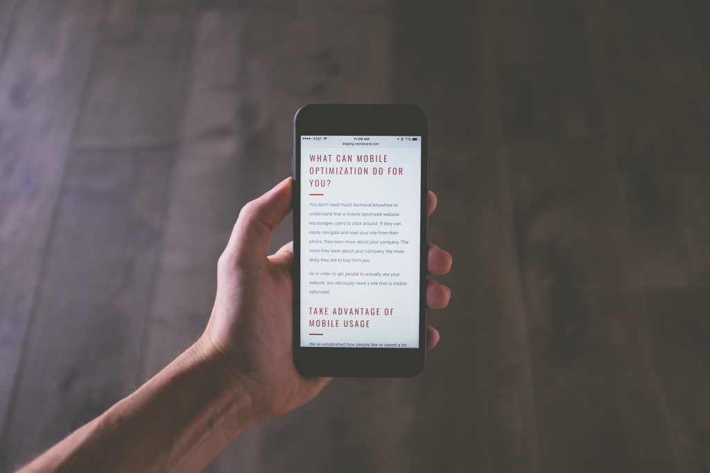
Google has started focusing on mobile sites as a primary means of indexing. They’ve only just begun this process so there’s no need for immediate panic. But the message is clear: eventually Google will see your website as if it were using a phone.
Kent’s new design is responsive: it works as well on mobile devices as it does on large screens. Each part of the Kent website will become responsive as it moves over to the new theme. So we’ll be covered by Google’s new way of seeing sites.
Our content also needs to be mobile-friendly. We need to stop thinking about ourselves, and start thinking about who’s viewing our pages and why they’re looking at it.
- Avoid a big wall of text. Content should be interesting enough that people will want to scroll to find out more. A big wall of text puts people off.
- Don’t think just in terms of text. Videos work well on mobile and can do far more than lots of text, depending on what you’re trying to say.
- Keep your headlines short. You need to convince people to click on links and continue reading.
- Each page should have a primary goal. Everything on the page should help someone get to that goal in a way that makes sense to them. Don’t ramble.
User intent and micro-moments
We need to think about user intent because that way we can find out about the what our users want to do. What immediate problems are they trying to solve?
Google’s content marketing team – Think with Google – uses the concept of micro-moments to focus on user intent. Micro-moments describe all the many times every day someone searches for something online because they have an immediate information need.
These might be moments like finding a good local restaurant for lunch, or finding reviews about an espresso machine for your new kitchen. All these moments might be part of a bigger goal – which perhaps ends up with some kind of purchase – but people might not be totally clear what that goal is or what they’re looking for at each moment. It depends where they’re at.
Answer The Public is a great way to see what search terms people are using on Google. It can help you work out what people are really trying to do when they search for something. You can try to tailor your content to match the sorts of questions people generally have.
Content structure
The easier content structure is to understand – and the better it relates to common user goals – the better pages will rank in search results.
In HTML we give structure to a page with heading tags (H1 to H6). We should use primarily H1, H2, and H3 tags to help a search bot on a path through our content.
It’s best to avoid giving false prominence to generic page headings and menus. A search bot might think your ‘about us’ heading is important on a page about a French degree because it’s listed prominently with a heading tag.
It will probably only be important when someone is researching the organisation generally, so it could be made more prominent on the homepage. People searching for entry requirements for a degree in French won’t be expecting to see anything to do with ‘about us’.
We use tools like WAVE to help check document structure in our templates. This means the key thing left for our content authors to do is think about what section titles to give to their own content. Section titles should be descriptive, and should be used fairly often to help guide the user through the content.
Long-form content
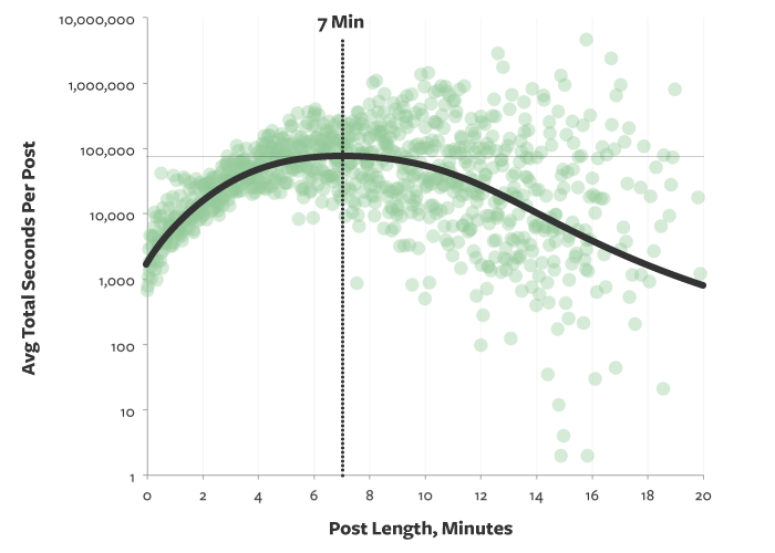
Long-form web content is text in the region of 2000 words long. The blogging platform Medium found that of all the blog posts on their site, those with a reading time of 7 minutes were most popular. Longer text tends to mean pages rank higher, and users engage with it better.
This doesn’t mean writing long pages is a silver bullet. It means a good story is a good story, and the writer has the luxury of a couple of thousand words (and some good pictures) to flesh it out. In a world of social media and quick blasts of information, people appreciate a deeper analysis of a topic.
Of course not all pages need be so long. It depends what your user intent is. A couple of paragraphs and key links to further reading might be all people need in that instance (for example a quick diagnosis of the signs of chickenpox in your child on a medical website).
Pages therefore need to be engaging and the design and layout need to encourage people to keep scrolling:
- white space helps make content easier to read and scan (our designs deliberately give space for content to breathe).
- use images at key points in the narrative to keep interest.
- use clear typography, milestones and headings.
Page meta information: title, description, URL
Titles
Probably one of the first things you do when you search is scan quickly down the first page of results, looking at the titles. Do any of them match the kinds of things you were looking for?
The page title is the first thing a user sees in the search results. It’s your shop sign. It helps Google determine your page’s topic.
If you’re searching for French degrees at a university, you’ll likely be expecting titles like ‘Study French BA’ and not ‘Modern languages’. You’re more likely to click on the link with a useful-looking title.
Description
If a title is your shop sign, a page description is your sales pitch. It’s the chance you have to tell people in a few words what your page is about. Does it match what they’re trying to find out or get done right at this moment?
Google may use your description on its results page, although often Google uses its own techniques to work out a description from your page content.
Still, entering a good description is important in case Google does use it. It’s a good idea to write a description anyway because it makes you focus on who the page is for, what the page is about, and what kinds of things people will be trying to achieve when they go to it.
URL
Your URL is important because Google shows it in search results. Someone scanning through search results may look at the URL to work out if your page is likely to be useful to them.
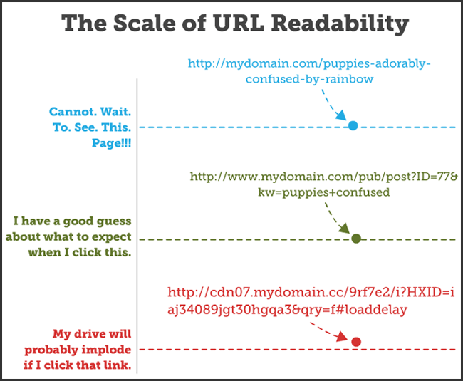
A good URL is also useful outside search engines. People may copy and paste the link on social media, or just notice the URL in a link on another web page.
Try to make your URL relevant to the topic of the page. Use relevant keywords. Our new CMS generates the URL based off the title you give the page, but publishers have to option to override this.
Internal linking
Generally links in a piece of content are better than links in footers or sidebars. They’re highly contextual and have more weight for users and search engines.
Always be descriptive when you choose link text. Avoid things like “read more” and “click here”. They don’t tell anyone – including Google search bots – what the link is about. It’s like labelling a big red button in a car ‘press here’ and hoping people will be able to figure out what it does.
Of course links in text may not stand out, so important call-to-action links can be shown in callout boxes or buttons. Our new designs allow content creators to do this easily, in the flow of text.
Images
Your choice of image can be crucial for user engagement. As far as Google are concerned there are three really important things about images:
- Image title. You have a page promoting a French degree course. You’ve worked hard getting the page title and description right, great text, and a nice image. But you name the image ‘IMG001234.jpg’. Google won’t know that ‘IMG001234.jpg’ has anything to do with French degree courses. But if you’d named the image ‘french-degree-kent-university.jpg’ Google will have a much better idea.
- Alt text. This is a description about an image hidden in the HTML which most people never see. One of its primary uses is to help blind people using screenreader technology. They can hear the description being read by their screenreader. Google also uses it to index an image properly. Well-written alt text will help people find your page based on an image search, and it’ll help people who can’t see your image at all.
- Image filesize. Smaller images load faster. This makes your page load faster, so is better for users. It’s also something Google pays particular attention to. Our website will load smaller images where needed (on a mobile device), and bigger images on desktops. It also loads images progressively, which means it loads a very low quality image first, then the normal quality one. If you’re interested you can read more about how the blogging site Medium does progressive image loading.
Accessibility is for everyone
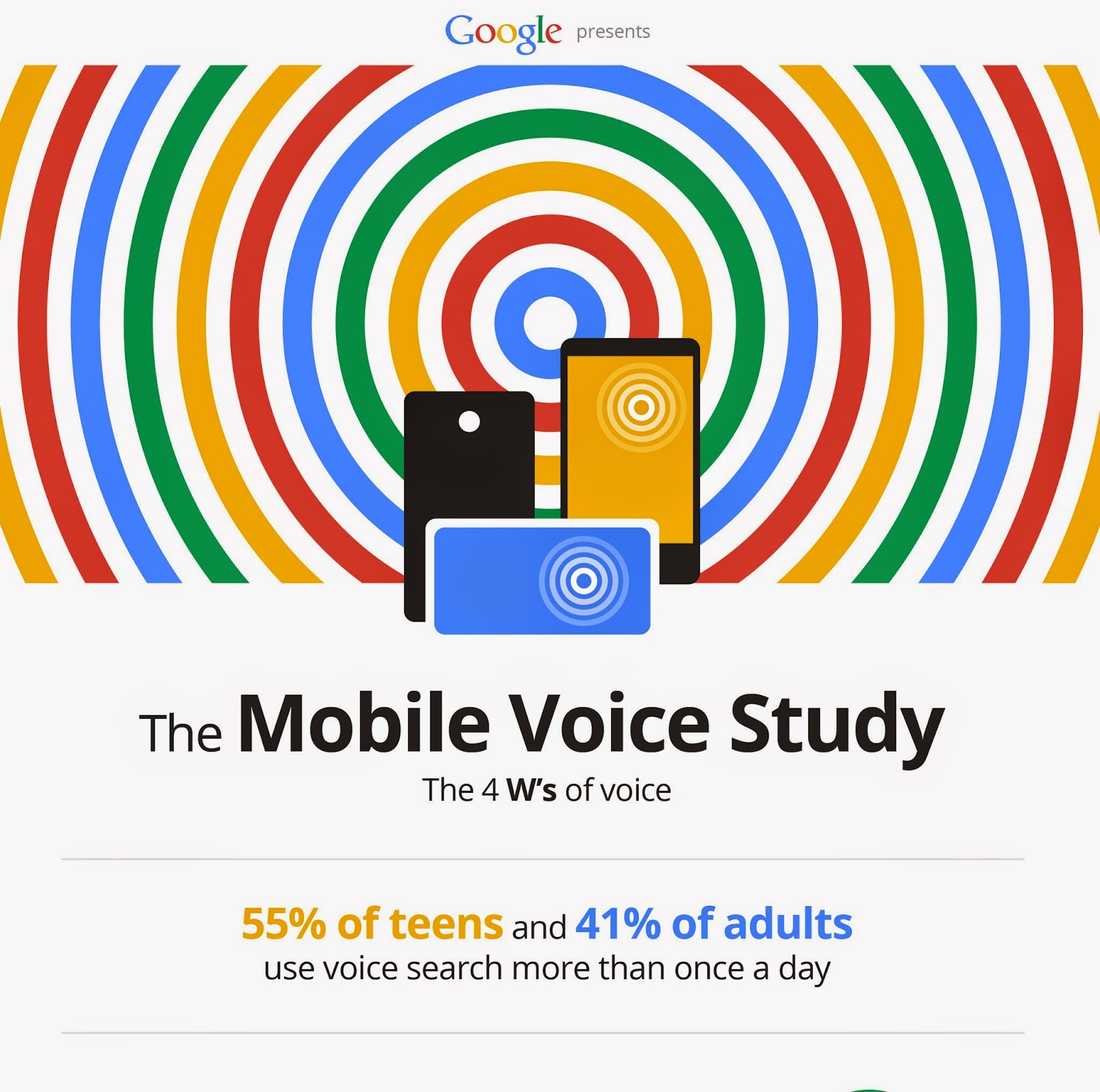
Over 55% of teens and 41% of adults use voice search. This is a very recent trend, but I find it incredibly interesting.
Web designers tend to think that the non-visual element of their websites is for people with accessibility needs using screen readers. Accessibility was wrongly seen as an add-on for a small percentage of users.
Now increasingly we’re seeing people ask Alexa or Google Home for information. It gets read out to them. Accessibility is for everyone, because everyone accesses web content in different ways.
Does our content work well in this way? Is it likely that anyone will ever find it by voice search alone? Are we conveying key information in clear, concise ways that lend themselves to voice search? This is clearly an emerging area and one which will be really interesting to see evolve.
Summary
- Google is about to start indexing and ranking websites based on a mobile rather than desktop experience. Designers have been chanting the mobile-first mantra for years. Now it starts to get more real. Our new designs are mobile-friendly.
- Craft content based on user intent and what Google call ‘micro-moments’.
- A clearly understandable content structure which reflects user intent is going to help your rankings. We try to make sure that page headings always follow a clear path through the relevant content.
- Clear and well-written internal links tell users and Google what your most valued pages are.
- Images need some love. High-impact, attractive images help keep people scrolling and engaged with your message. Good image alt descriptions help users and Google alike in image searches. Smaller images load faster. Your users will love you, as will Google. Our new theme will optimise images, and force you to think about alt descriptions.
- Voice search is becoming more of a thing. Increasing numbers of people will never access your pages visually. We’ve tried hard to make our pages work well in terms of accessibility, although making text easy to understand and listen to is no small task on a large website such as ours.