
The need for accessible websites
Here are a few things to consider about accessibility:
- 15% of the world’s population have some form of disability. This includes conditions that affect seeing, hearing, motor abilities and cognitive abilities.
- About 4% of the population have low vision, whereas 0.6% are blind.
- 7 to 12% of men have some form of color-vision deficiency (color blindness), and less than 1% of women do.
- Low-vision conditions increase with age. Half of people over the age of 50 have some degree of low-vision condition.
- Worldwide, the fastest-growing population is 60 years of age and older.
- Almost everyone over 40 (yes, me included) will find they need glasses to see small objects or text.
(Figures taken from Practical Approaches to Designing Accessible Websites.)
Think also about the times you want to watch a video but you don’t have headphones. Subtitles would be great. Or the times you wished a form on a website was less confusing to fill out? Or the times a website took too long to load on your phone?
Are these accessibility issues, or just good design?
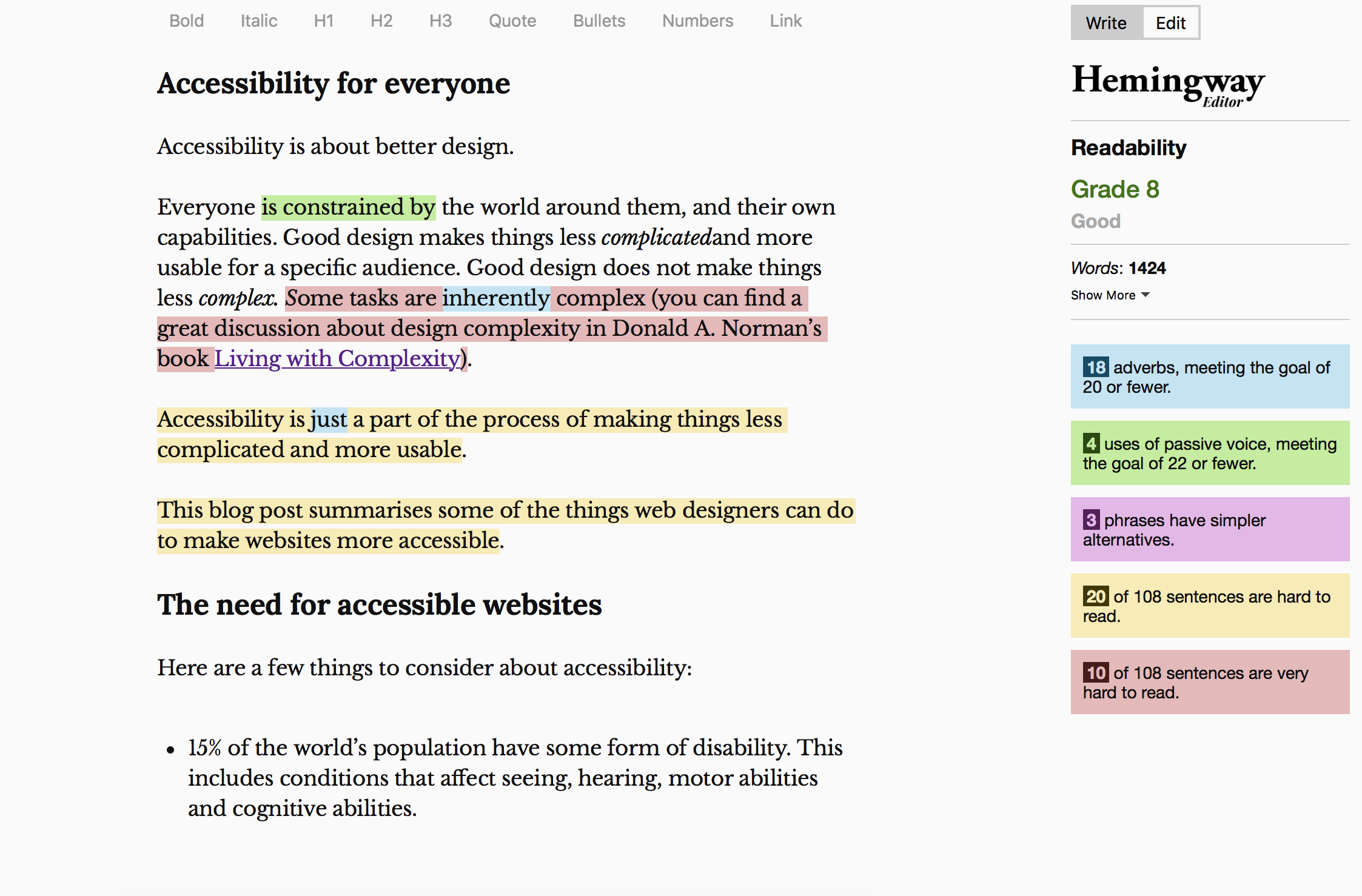
Everyone is constrained by the world around them, and their own capabilities. Good design makes things less complicated and more usable for a specific audience. Accessibility is a part of that process.
Web accessibility initiative
Websites actually have a great advantage over physical things because we can shape them to the needs of different groups of users. We can allow everyone some kind of access to our content, even if the experience will be different for different users.
Designing accessible websites is a complex task, because of the sheer range of needs.
In 1997 the W3C (World Wide Web Consortium) created the Web Accessibility Initiative (WAI). They set up a series of guidelines called the Web Content Accessibility Guidelines (WCAG) to help developers create accessible websites.
The WCAG has 3 levels of conformity: A, AA, or AAA. Most web developers will try to aim for AA compliance at best. AAA compliance is generally nearly impossible for large websites. It’s a common ideal to aim for, at least.
Screen reader technology
Screen readers allow people with visual impairments to use a computer, and access websites.
JAWS, NVDA and Apple VoiceOver are the most popular screen readers. Like conventional web browsers each interprets standards in different ways.
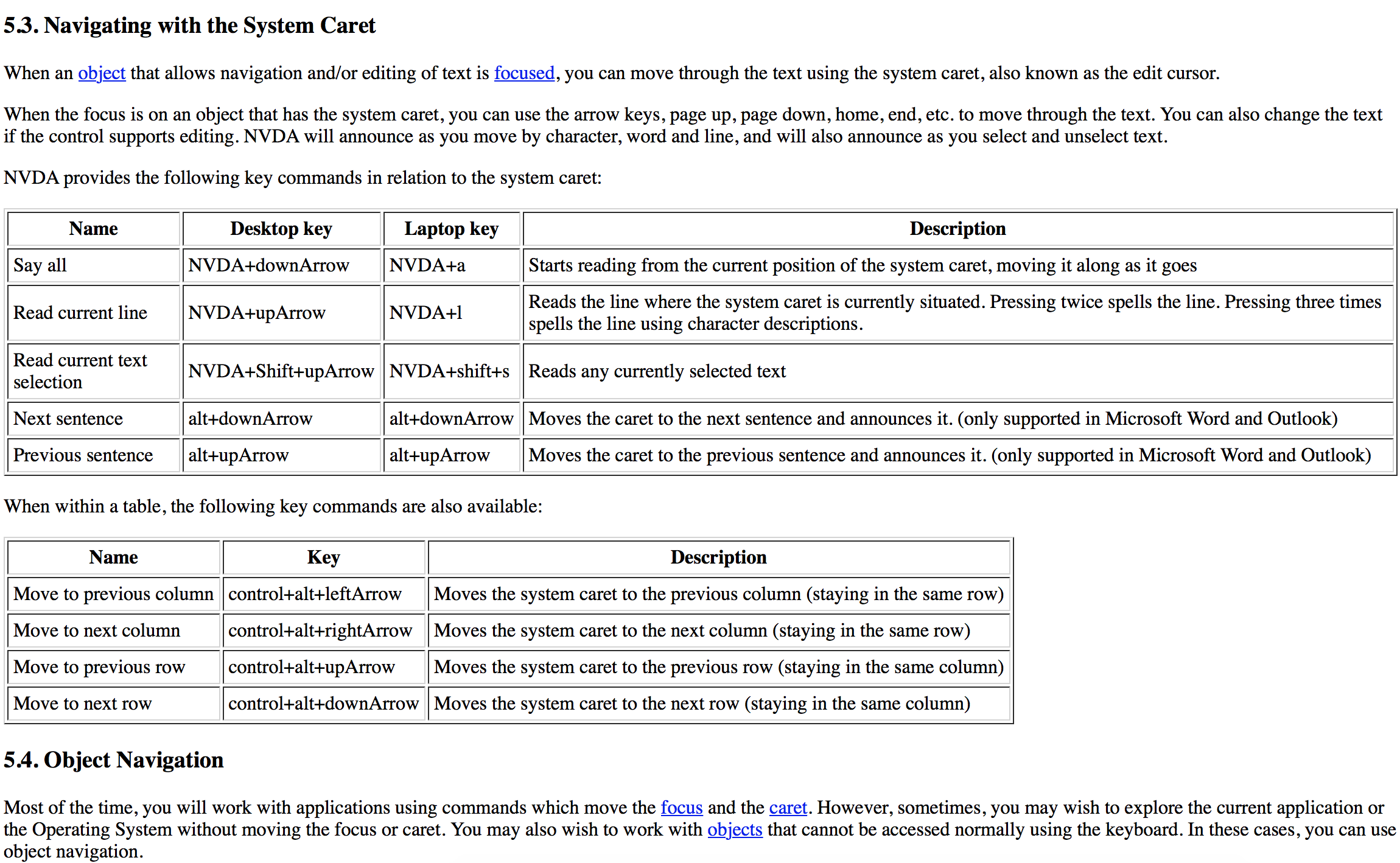
Technology – and how people use technology – often change faster than standards, so following standards strictly won’t always give a great user experience. But at least a good understanding of the most popular screen readers helps make our websites better.
A good example of standards compliance vs practical reality is the longdesc HTML attribute. It’s been around for years as a way of describing a diagram in words. This sounds like a great thing for accessibility.
The problem is that only screen readers support it. If you use a standard browser you’re never going to see the description. This matters to lots of people (for example people with cognitive impairments) who use conventional browsers and would benefit from a clear description.
So standards are just a useful tool to help us build good websites. Designers still have to put some thought into the design.
ARIA
A more recent development is the WAI-ARIA (Web Accessibility Initiative – Accessible Rich Internet Applications… whew…) set of standards. Let’s call it ARIA for short.
ARIA helps developers describe what parts of a web page do, and how those parts relate to each other. It means users don’t have to make the sorts of visual assumptions about web pages that used to be forced on them (“the menu is obviously the thing running along the top of the page” or “that’s a button because it looks like one”, and so on).
By and large screen readers are pretty good at recognising ARIA attributes in HTML. You can find ARIA examples on the w3.org website.
Colour, text and images
Colour is a fundamental building block to a designer. For readability, simplicity is best. A subtle grey on a white background is utterly useless for many people. Even high contrast white-on-black text can be quite difficult to read (I find it makes my eyes go funny after a minute or two).
There are now many very good colour contrast tools to help designers. There really is no excuse for poor text readability.
Likewise text size and line length matter. A good, readable line length is somewhere about 60–80 characters. Text should be large enough for the majority of people to read comfortably. There are even some fairly scientific ways of calculating a good font size. Built-in magnification tools for Windows, macOS, iOS and Android can help people who need further text magnification.
Images are used widely on the web. The alt attribute is a very simple way for developers to help people who can’t see the image work out what it’s about, by tagging the image with a short description. Twitter now allows a similar thing, and very much worth considering next time you tweet a picture.
Mice (and fingers)
Some people cannot use a mouse or trackpad, but can use a keyboard. Many websites are primarily aimed at people using mice, trackpads and fingers to navigate and click around the screen.
Browsers do however allow people to use the TAB and arrow keys to jump from one interactive part of a webpage to another, and move through lists and menus. For the most part this works well, but sometimes developers still need to make sure they design their pages so they work well with keyboards.
Language
Accessibility is partly a technical design issue: ARIA attributes, well-structured HTML, good colour contrast, larger text, tabbing through content… But one of the hardest things to get right is language.
Keep your language simple. It helps everyone.
It isn’t patronising to use simple language. There’s a place for more complex writing, and websites selling things or providing services are not that place. You don’t know the context of where people are reading your text. They might be in a hurry, or have other more important things to do.
If you take pride in making your writing over-complicated, bear in mind that people will probably assume you don’t know what you’re talking about.
What are we doing about accessibility at Kent?
Our website redesign means we’re able to review many of the technical parts of the design. We have some useful tools to help us:
- Lighthouse. This Google tool is built into Google Chrome, which makes it ideal for developers to run a quick accessibility check.
- WAVE. WebAIM’s accessibility checker tool.
- Hemingway. A great tool to find out if your text is clear and readable, and how to improve it. I used it for this blog post, which is apparently a US Grade 8 reading level.
We also have guidelines for accessible editorial content to help our content creators and editors. Our new content management system makes those alt attribute descriptions on images required. We also encourage content editors to use captions in videos, and where possible provide a transcription of the video.
This summer we’re going to team up with our colleagues in the Student Support team to run some accessibility user testing on our website. There’s nothing like actually testing your site out with real people to make sure it works well.
Summary
We try to think about accessibility as a fundamental part of our user experience, rather than just as an afterthought of ticked boxes.
Accessibility is hard to get right on web pages because of the many different user needs.
However web designers have a set of tools and standards to help guide them. Web Content Accessibility Guidelines (WCAG), WAI-ARIA, Lighthouse, WAVE and Hemingway.
Standards are great, but technology has a habit of moving faster than them, or not sticking to them particularly closely. Web designers and developers need to bear this in mind too.
Recommended reading
Smashing Magazine’s Practical Approaches to Designing Accessible Websites
Donald A. Norman’s Living with Complexity
Well said, and brilliantly communicated!
I agree. Absolutely spot on.