Most people who study or work at our university will have some form of active contact with us before coming here. It might be an Open Day, a phone call, an online enquiry, an email, or filling out an application form.
An important goal for our website should therefore be to make it easier for people to find out how to contact us.
Even if many of our website’s external users never actually contact us directly, having information readily available helps build a sense of credibility.
Moreover what we call ‘Calls to Action‘ are a key part of getting our users from a passive relationship with us (browsing the website) to an active relationship (visiting, calling, applying). Contact information is a really useful Call to Action.
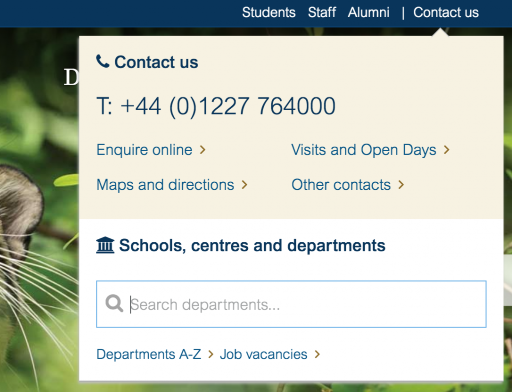
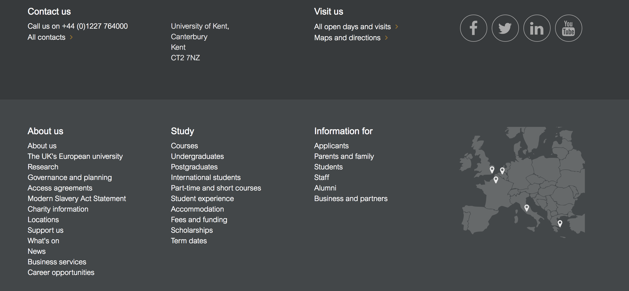
So, we decided to try to improve the visibility of our contact information. These details were previously only in the website footer. We know from our own user research that this is where a lot of users expect to find contact information, but we felt we had space on our website to double-up on this and make it clearer to everyone.
The old link to ‘Departments’ at the top of the page in the global kent bar felt a bit superfluous, and a bit internally focussed. We were getting some clicks, but not enough to warrant a key bit of space on the page. So why not use that space for a contact link?
We designed a small panel with a key University phone number, and a few important links. Because we didn’t want to get rid of a departments search completely (analytics showed us that many of our users clearly found this useful) we kept the department search as part of the new Contact panel.

Some simple guerrilla user testing helped drive the design. Business needs drove the inclusion of the key links and phone number details.
This is just the first step. We can improve the mobile experience, and perhaps tighten up the overall design and experience. In terms of user journey, the contact details page itself is still in our old design and its layout and use of calls to action could be improved. Generally, getting in touch with the University feels like it’s possibly a confusing process for some groups of people. We need to find out more about that, and improve on what we provide.
This is a good move forward. ‘Enquire online’ only covers applicant enquiries. Perhaps it should be ‘Want to study? -enquire online’ or some such so that it’s clear what the difference is between ‘Other contacts’.
Looks good, and it’s nice to see the site still evolving based on testing and feedback. Thanks for sharing.