 By
By 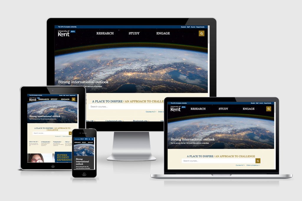
We’ve been testing a beta design for our homepage as a part of our new website project. Thank you for all the feedback we’ve received so far.
The beta concept is based on our discovery phase and University Plan which calls for increasing our international research profile and attracting quality students and staff based on user-centred content.
Below is a summary of the positive and negative themes from the feedback.
Positive feedback
Mobile friendly, user-focussed, less clutter, clean design, strong imagery
We are creating a mobile friendly design following our user experience and design principles. Thinking about mobile first, enables us to simplify our content. This is a great way to prioritise the most important content for our users.
Providing simple starting points based on unified user journeys rather than departmental structures is an important concept. We have a short window of time in which we can attract users. Simplifying and prioritising content based on our users’ needs makes it easier for them to choose and find content relevant to them.
We’ve used bold, strong images and added interactivity into the design. This comes from our research which show that that prospective students expect engaging, rich content. We need to provide impact and it also aligns with the aesthetic of the Kent brand.
“Larger font, better focus, less clutter, less things vying for my attention.. ooh, look.. it’s mobile-ready.. niceness.. love the feature image, but why is it of Italy? great work..”
“video backgrounds, scrolling over images. very smart”
“clean, logical design ”
“Well-designed, engaging layout. Much better than other universities I have looked at.”
“more welcoming to new visitors”
“more aesthetically pleasing and user friendly”
“full of images, colors, easy to navigate”
“Great design! Modern and simple to navigate.”
“The student/staff pop up at the top right hand side is better than the previous quick links.”
Negative feedback
Need to scroll, large images, confusing labelling, poor quality imagery, colour, no quick links
The print concept of a “fold” does not translate directly to the web. Different screen sizes and devices will present content differently and research shows that users scroll, especially on mobile devices, however we need to show that content flows continuously and have noticed this isn’t always clear on some screen resolutions.
- We’ll try improve the design to imply vertical continuity of content across the most popular screen resolutions.
The aesthetic of the design uses bold, quality imagery. This is something that our focus groups and user testing feedback has shown to be desirable and expected for prospects. However it depends on the type of content that you are creating. Quality imagery should not be compromised and it is a challenge to source impactful, quality imagery and video. Poor imagery does little for our reputation.
- We’ll look to see if we can improve how imagery scales up on larger screens.
There is ongoing work to get investment in quality imagery and video so your feedback helps the case.
The colour palette follows the university brand. The design needs to resonate and align with the brand. The colours were developed to position ourselves as a strong, serious research university.
- Imagery and video helps to add colour and interest in addition to our primary generic corporate palette.
We haven’t removed quicklinks or department search, but have improved them. We’ve introduced an audience bar at the top of the page. This allows quicker access to key student and staff links and systems.
- We have future plans which involve greater personalisation and customisation for our current staff and students.
Using only three links to represent our university is a bold move, but aims to make strong statement about who we are and forces us to prioritise tasks for our key audiences based on user journeys. We are evolving our labelling and we appreciate the feedback on the word “Engage”.
- We previously have tested “Experience” which aligned more clearly with what users expected to find within that menu item, but will continue to test labels.
Not all the imagery and video on our beta is yet optimised for mobile which may result is a slower loading time depending on your connection speed.
- We will be optimising content so that it loads as quickly as possible on different devices.
Currently we only have the homepage, news section and a small selection of pages in beta. These will link off to existing content in the old design until we are able to replace it. This isn’t ideal, but is a soft approach to gradually expanding our beta website.
“It is so big that I have to scroll quite a bit to see everything!”
“but your colour palette is so dull and boring”
“Where are the quick links? ”
“I think the word ‘Engage’ is an unwelcoming word to use on the front page.”
“There is a lot of scrolling to do!“
“This page looks good, and is miles better than the previous. However, the other pages, for example the Undergraduate Study page, is still on the old theme. It just doesn’t fit the house style. The main page is all new, but the other pages are old.”
“The images are too large and not overly obvious where staff links are anymore.”
“I enjoyed the use of pictures, and moving imagery. It is clearly set out, well defined. Clear search option and more. Though I still feel the need for the Quick links still as I often used those to navigate through the site.”
“The video thumbnails aren’t the greatest quality”
Next steps
The beta homepage is a small taster to get quick feedback on our approach as we continue to improve.
We’ve also been doing user testing and screen reader testing and will continue in this iterative way.
The beta site will be changing over time based on the feedback we’ve received. Other areas in development which we’ll be dropping into our beta over the coming months are:
- undergraduate and postgraduate landing pages
- course page
- research
- school pilot
The new website will need to be powered by a modern content management system. The University is in the process of acquiring such a system. Once acquired, the technical teams will move into an implementation stage. Once done, the project will then move to a migration stage. The migration to a new look and feel new website will be a vast and complex procedure. This process needs to be resourced and managed effectively.
We are awaiting funding details about the implementation and migration stages. Several executive meetings over the coming months will determine the extent of this funding. The level of funding will determine timelines, therefore once funding details are confirmed, timelines will be disclosed.
Great to see some of these responses, looking forward to the homepage finally going live, its a much better approach for user journey and selling ourselves as a university.
Looking forward to see the mega menu and quick links go, these are usful for staff but not the people actually using the website.