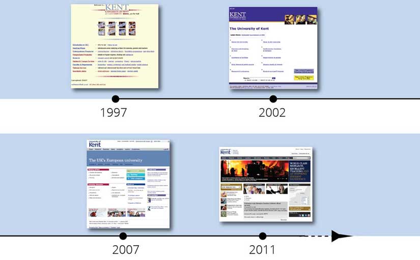
Over the past year, we’ve been exploring a new visual language and defining UX (user experience) principles to evolve Kent’s online user experience.
The exploration has developed based on various projects (see news, 50th, student guide). This has led to mobile-friendly designs which contain the principles of clarity and openness.
It is exciting times. We’ve had a brand relaunch and the time is now ripe to consolidate a new approach: a fresh, modern, confident university website which puts user needs at the forefront.
Future vision
We want to set us up for the future by providing a simple framework for creating engaging, accessible, mobile-friendly content.
It is necessary to adapt to a multi-device, multi-context world with UX and publishing focussing on the heart of our content. We need to be able to innovate and keep abreast of new technologies.
Developing an excellent online presence with content that people love to use and which drives our University’s ambitions forward is our aim.
Process and timings
Working alongside our partner team, Web Solutions, and with input from the UX group we’ll be following a user-centred design process to lead us through discovery, alpha and beta phases before going live.
First we need to understand the business and user needs as part of discovery. We’ll then begin our alpha phase of brainstorming and exploring multiple approaches directed via user feedback.
Once we’ve boiled down our options to the strongest one, we’ll then begin the beta phase, where we will be creating design patterns and a prototype. This will comprise ongoing user testing and iterations.
Finally, by next academic year, we plan to have a new design language (pattern library and templates) for the website at which time an implementation phase will be planned.
We’ll be posting progress and updates as we more forward.
