How can we provide current students a more unified experience when using our systems and services?
Over the years new systems, services and applications have been introduced to support current students.
These have provided huge benefits. Some have been developed in-house, while others have been off-the-shelf products.
The increase in our product range has also introduced some challenges highlighted by students in user-testing, survey and focus groups:
- systems can be disparate without a joined-up way of navigating around them
- key services should be easier to find
- visual design and branding varies greatly, the range of systems doesn’t feel cohesive
Students want to access key systems from a single place, in many contexts and on varying devices.
Originally accessing system has been done by selecting links from the ‘quick links’ drop down list on the University website header – an overwhelming list in need of attention.
Typically students end up using the website search to find student systems – it is telling that student email is our top search term.
Student Guide and single sign-on
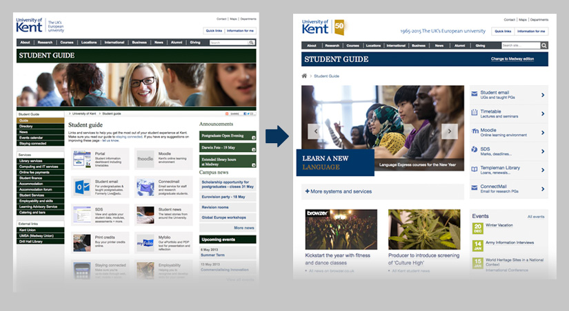
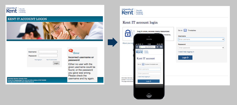
The first step in providing a more integrated service was the redesign of the Student Guide and Single sign-on login pages. This allowed key systems and services to be grouped and easily accessible on a mobile-friendly webpage with additional systems and services neatly categorised in a collapsed panel.
This helps students focus on the most important systems they need with fewer distractions, presented as an integrated suite of products. Simple, flat icons have been used to provide a visual hook to the applications. This approach acts as a convenient starting point for current students hinting at future ambitions for personalisation.
Work was also done to increase the session times for single sign-on along with the introduction of a new, mobile-friendly login page. This means that students have to log in less with fewer distractions to their flow.
Light branding and navigation bar
Key student systems and services vary in design and have no way of linking to each other.
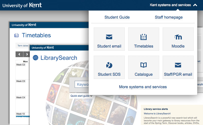
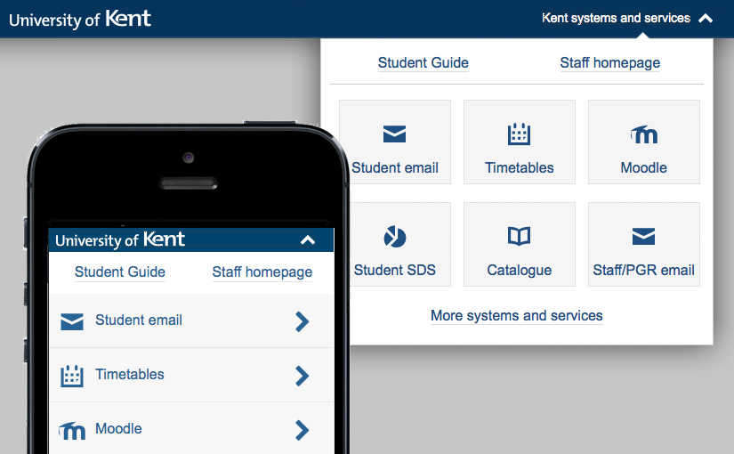
We created a bar to help provide an element of consistency across the disparate systems, allowing current students to easily switch between the key family of systems and to find their way to the Student Guide and other systems and services.
Although primarily student focused we added a ‘Staff homepage’ link too. Our future aim is to have a personalised offering of links for different audience types based on their log in.
We used a horizontal version of the University logo in the bar. This helps create a consistent branding element and helps separate the branding from the utility of the application.
User experience and visual design
We have been exploring a new visual identity over the past year. Along with our user experience principles, we want each system to feel more cohesive, unified and user-focussed.
Sometimes we have off-the-shelf products where we are limited to the degree we can customise them.
We’ll be trying to improve the design of our systems, where we can, to bring them in line with our principles and reflect a new pattern library planned as part of our website redesign.


