If you’ve read the blog post from our ops manager (CDC Power Cut 11th June 2020) then you’ll know we had a slight issue a couple of weeks ago resulting in our primary data centre losing power for around 10 seconds.
We run 3 Hitachi Data Systems (now Hitachi Vantara) disk arrays on our SAN. A G600 in our primary datacentre, a G400 in our DR data centre and a G200 in a third site.
The G600 provides virtually all of the disk storage to our systems during normal running. Around a third of the capacity of this is then replicated to our DR site and onto the G400. The G200’s primary role is to provide a quorum vote in the event of an outage and it is connected to both the G600 and the G400 via separate fibre channel paths to try to ensure connectivity is always maintained between at least two of the arrays – fairly standard clustering. The G200 is also stuffed with large disks to provide an offsite, online disk backup service as our first line of backups for disasters – thankfully, not needed in this outage.
The storage is replicated synchronously across a private fibre connection to the DR site using Hitachi Global Active Device (GAD). This maintains the replicas, and also provides read write access to any replicated disk, at either of the two main disk arrays. In the event of a failure, hosts (nearly all ESXi hosts these days) see a couple of paths go away, but they still have two connections to the other array, so they carry on completely unaware that an array has gone missing. At least, that’s always been the theory and although tested thoroughly during commissioning a few years ago, it’s never been used in a real DR situation… until a couple of weeks ago!
Thankfully, it all worked as expected. Once the power was restored (around 10 seconds) the Virtual servers started booting, and could see their disks and carried on completely unaware of the fact that their disks were coming from the other side of the city.
As part of the “what went wrong” exercise that always follows this sort of major incident, we took a look at the reports we get from our storage arrays because everyone loves a graph 🙂
First, a normal week of traffic (well, as normal as a Covid-19 week can be – quieter than normal as most of Campus is closed and it’s out of busy term time).
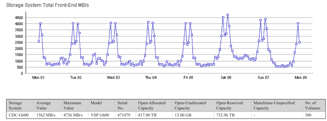
Pattern is fairly regular – some nights higher than others. Always interesting that the disk arrays are far busier at night that during the working day. Overnight jobs and backups hit disks far harder than users these days.
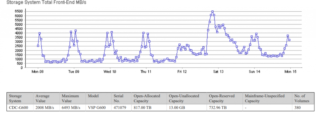
The following week, the pattern is noticeably different

Once systems started coming back on Thursday PM, we quickly decided to cancel all backup jobs for that evening. We had a good backup from the night before the outage, and given systems were running from storage at the remote site, we didn’t want to add to the load on the link between sites by trying to backup over it – we already knew that backups are the busiest time for the array, so removing that load seemed a sensible option. We also began work on replicating back to primary array from around 16:00 – again, not something we wanted having to contend with the backup traffic.
Backups were restored on Friday – clearly visible on the graph as the busiest time of the week – peaking at 6493MB/s as a larger than normal backup took place (two days worth effectively, plus some extra from services where failures had triggered a larger backup than normal).
The DR array usually sits at a fairly constant rate, pretty much all write traffic as apart from a couple of small hosts in the DR site, in normal use all it does is take disk replication from the primary array. The graph from this DR array for the week of the outage shows an unusual traffic pattern!
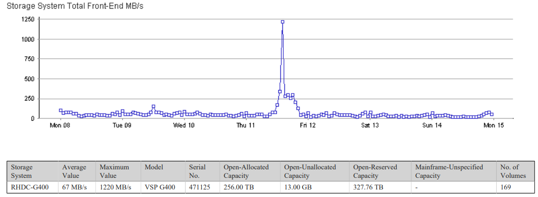
It’s fairly clear from this that the array between 13:00 and 14:00 suddenly found itself busier than it’s ever been (well, apart from the initial seeding of the replicas where it ran flat out for a few weeks!). The peak is significantly lower than the normal peaks on production, but significantly higher than normal day time traffic. the peak of 1220MB/s shows a large number of servers booting around the same time – these are the replicated disks, and virtual machines booting up unaware that their data is now served from the DR array. Normal peaks during the day the previous week were under 1000MB/s – and that was for significantly more servers (only around a third of servers are replicated to DR site). Booting multiple servers simultaneously hits the array hard,
The afternoon of the Thursday we were on limited power, so only core services running. This shows a fairly solid 300MB/s of traffic from the DR array once the boot storm had died down and services were running.
Any failure of the primary array causes the DR array (with a casting vote from the G200 quorum array in the third site to avoid the classic split brain cluster problem) to instantly takeover and begin mastering the disks. This process automatically marks all replicated disks in the primary array to as unclean, and hosts cannot use these disks without intervention – the arrays block all paths to these disks and direct all traffic to the DR (and now primary) array. Given the DR site has limited capacity and no generator backup work began on replicating disks back to primary site as soon as possible.
This work carried on throughout Thursday evening, and the graph of individual storage FC ports out of the DR array controllers clearly shows the final replication back to primary array happening from around 20:00 through to around 23:00 when the storage was switched back to being mastered out of the primary array once again, and normal service (at the storage level at least!) resumed.

The commands to fail storage between sites is something we have never needed to run on production arrays, and normally there would be at least two of us looking, scratching heads and double and triple checking before hitting enter. Given this work was all happening remotely due to Covid restrictions, one member of staff had the task of performing this fairly risky task. The final graph comes from the Apple watch he was wearing at the time and shows heart rate.

I think the correlation between those two last graphs is fairly clear!