Amanda Perry-Kessaris is Professor of Law at Kent Law School. Her current research focuses primarily on how best to approach the field of legal development – that is, the role of legal phenomena as means, ends, obstacles or irrelevances to human welfare. In particular she is exploring what happens when we think not of ‘law and development’, but of econo-socio-legal development, and the potential of graphic design as a method of communication in that process. Amanda, who is also studying an MA in Graphic Media Design at the London College of Communication (LCC), writes about this topic on her blog. One of her most recent posts is copied below:
My second brief as a student on the MA Graphic Media Design at LCC was to explore how ‘we formulate a critique and articulate a position through design’ using the unfamiliar form of a visual essay.
We were asked to respond to one of three ‘source materials’ (articles). I chose Max Bruinsma’s contribution, entitled ‘Watching Formerly Reading’, to the ireadwhereiam project.
Our first task was to use visual tools to analyse the piece as a group. This lead us to focus on Bruinsma’s insight about growing overlap and flattening of hierarchy between watching/reading, and between oversight/insight.


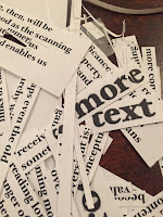
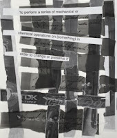
Later I cut up the article, revealing further insights: We read differently. We process more text. Image has become text.
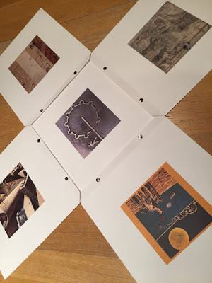
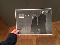
I experimented with i’mgoogle.com-inspired format (circular slideshow with sound). It was too closed to be dialogic. A photo of Nicosia’s ‘walk the walled city’ graphic provided the centre for a solution: I set type to reflect its circular path, other images fold out from it, each layout loosely organised by topic (e.g. occupation, development) and visual content. A dialogue opened between walker/reader and images.
The folded format allowed progressive disclosure and low-level interactive dialogue. But the Paris Salon/Warburg-style (Johnson, Undated) layouts were too closed.


Following the advice of my LCC tutor, Paul Bailey, I closely read visual relationships, eventually fully integrating images within each layout. My visual language (layering, interlocking, echoing) hinted at possible connections and their inherent fragility, and was inspired by the commitment of the Association for Historic Dialogue and Research (Cyprus) to ‘dialogue and multiperspectivity’ in history.
I chose heavy, tactile paper-stock and bolted binding to evoke the impermanence of apparently rigid structures/perspectives. I aimed for Lee’s (2014) calm tone using quiet palette and generous white space. The typeface (Traveling_Typewriter, Carl Krull) echoes British Government papers.
Some elements of the final output are too small/faint, and I am in two minds about whether the images are still (differently) closed.
I plan to produce visual essays in future legal research despite hurdles of copyright costs and inflexible publisher guidelines.
Critical statements on all of the projects produced in response to this brief, together with comments on them, can be found on the course blog.

