Introduction
Albrecht Dürer was one of the leading artists of the Renaissance. His innovative ideas in geometry and the proportion of the human body, his realistic representation of nature, and his imagination in probing new printing techniques, lead to his reputation as the Leonardo Da Vinci of Northern Europe. In this essay I am going to describe different aspects of Dürer’s philosophy and practice of drawing, and embed his artworks into the understanding of nature at the time.
Setting the Scene
At a time in which the world people knew was rapidly changing – with new landmasses being discovered, expeditions returning with exotic never before seen objects and more people on the move – art was used as a medium to vent this newly formed uncertainty, to bring order to confusion. The Renaissance was therefore a period which, on the one hand, was still anchored within the features of classic Antiquity, whilst at the same time, it was being unhinged by the after shocks of the discovery of the New World (Keller, 1972, 11; Sleigh, 2016, 1). Society was rapidly adapting to new philosophical concepts and ideas, as new technological developments increased and the traditional views on nature and its place in the Universe were suddenly being questioned (Eichberger, 1998, 13-14).
Contemporary artists such as Albrecht Dürer, Leonardo Da Vinci or Conrad Gessner sought to incorporate the changing aspects of this period into their art, an art that had undergone a dramatic change. The new way of painting shifted from the former “elegant and graceful gothic style characterised by figures of dignified beauty” and “rich with precious decorations often of pure gold”, to scenes which were full “of passion, of pain, of sentiments, and full of life” (Tonelli, 2013, 68). This ‘visual revolution’ came into being through the rise of a new assortment of techniques of representation, including perspective, proportions and the imitation of nature (Kemp, 2006, 4). An “almost systematic exploration of the visible world” developed in the early fifteenth century in northern Italy and was carried over to Germany by Albrecht Dürer after his visits to Venice and Bologna in the late 1490s (Eichberger, 1998, 15). A vast amount of his artwork from the early 1500s demonstrates his interest in naturalistic studies.
Dürer’s Ways of Visualising Nature
Dürer was convinced that nature, being God’s creation, was the very source of art. He embodied the belief that artists should draw exactly what they saw in order to make their work as convincing as possible: “The more precisely the forms in your work are compatible with life, the better it will appear. That is the truth. So never imagine that you can or should attempt to make something better than God has allowed his created nature to be. For your ability is impotent compared to God’s creativity” (Dürer in Ashcroft, 2012, 386).
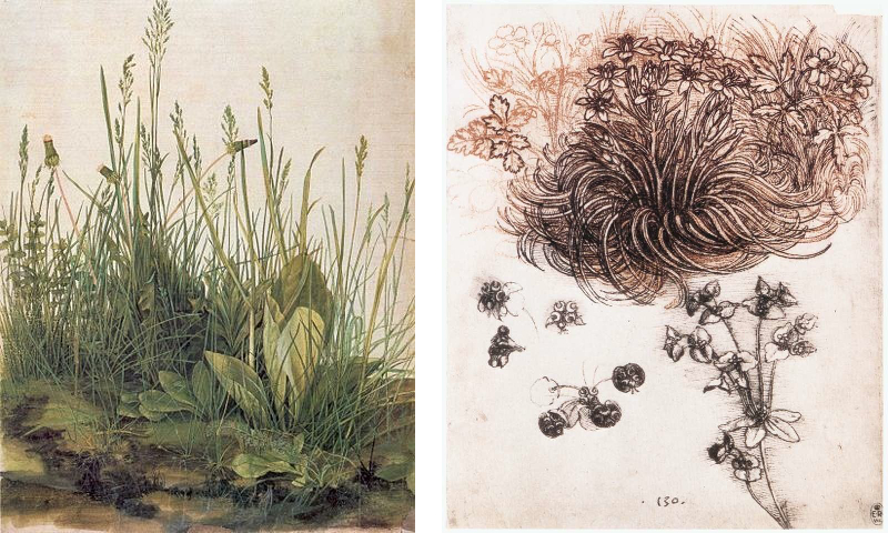
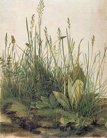
Fig.1. (left) Albrecht Dürer’s The Great Piece of Turf, 1503. Watercolour and opaque, 41×31.5cm. Vienna, Graphische Sammlung Albertina. (right) Leonardo Da Vinci’s Star of Bethlehem, 1510. Pen and ink over red chalk on paper, 19.8x16cm. Royal Library, Windsor.
Dürer’s own pictures from the early 1500s are impeccable representations of his opinion. With almost microscopic observation of detail he produced colourful drawings and watercolours of a number of animals and plants, which he mostly studied from life (Eichberger, 1998, 37; Panofsky, 1955, 80). One such painting is the Little Hare, 1502. He reproduced his “absolute faithfulness to nature” in three stages – after drawing the animal’s outlines, he would colour in its body, and to represent the animal’s fur he would paint every single hair onto the colour wash in full detail, producing the illusion of a real fur coat (Berger, 1994, 82/86).
Another of Dürer’s famous depictions of nature is the watercolour painting of an unobtrusive, rather mundane patch of meadow, called The Great Piece of Turf (1503). It shows a mixed patch of flowers and grasses from the perspective of a small animal (Doyle, 2013, 14). Although microscopes did not exist at the time, Dürer’s drawing looks as though he examined every single blade of grass under the lens of one of them, so that even the different species of plants can be identified – grasses, dandelion, pimpernel and plantain. It was a completely new endeavour, “never before had anyone dared to paint anything as insignificant as a piece of turf” (Berger, 1994, 76).
In the context of naturalistic representation, it is interesting to compare Dürer’s work with that of other contemporary artists. The Italian artist Leonardo Da Vinci shared Dürer’s pursuit of an art that would be universally accepted and executed, “one that constructs representations of all forms in nature on the basis of a profound understanding of natural philosophy in all its relevant facets” (Kemp, 2000, 14). The way in which they interpreted the performance of this art, however, goes into completely different directions. When comparing Dürer’s The Great Piece of Turf with Da Vinci’s Star of Bethlehem (1510), the artists’ different interpretations of similar motifs of the natural world become clear. Whilst Dürer, as explained above, goes into minute detail – individualising each blade of grass, and therefore giving his patch of meadow an individual, distinctive and inimitable character – Da Vinci uses the general principles and characteristics of the plant, so that its representation becomes one that is transferable to all other plants of this species (Kemp, 2006, 178-179). This was a central issue around Dürer’s representations of nature – should the illustrator show the particular specimen he was observing, or should he present “a synthesis of many specimens in such a way as to represent the archetypal form”, as Da Vinci did with his depiction of the Star of Bethlehem (Kemp, 2002, 744)?
Dürer exclaimed that the diversity of nature was such, that every work of art that tried to depict the same natural object would always be a little bit different from the original, “for all out works, none is truly and completely identical with the other” (Dürer in Ashcroft, 2012, 384). This can also be read in another way, namely, that he himself as an artist would never be able to reproduce exactly what he saw in nature, and therefore, he told his readers to try their best, to “look closely at it, take it as your guide, and do not depart from nature” (Dürer in Ashcroft, 2012, 386). His fascination with nature went so far that once he travelled for several days in a boat just to examine and draw the carcass of a whale, which had been washed up on the shores of Zeeland in the Netherlands (Berger, 1994, 13; Eichberger, 1998, 27). Dürer’s numerous studies of nature – animals, landscapes, plants – can be seen as attempts to order and understand what he was seeing, to harmonise the universe, and above all to “reflect a God-given order” (Eichberger, Zika, 1998, 5-6). The combination of his religious faith and his belief in nature can be found in Dürer’s various religious paintings and drawings.
Dürer’s Religion and Nature
Dürer believed that “God had endowed artistic people with very special creative powers” and hence it was the artist’s duty to stay close to nature, “God’s own masterpiece of creation”, and not to venture from it. The artist was to devote his unique powers into depicting nature in the best way possible (Eichberger, 1998, 27). Therefore, he often included his studies of nature in pictures of common Christian imagery. Although this was not the first time animals had appeared in traditional religious paintings, it was the first time they had a realistic look to them.
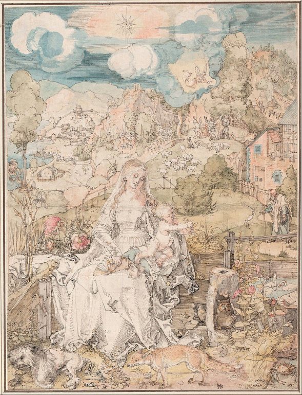
Fig.2. Albrecht Dürer’s Madonna with a Multitude of Animals, 1503. Pen and ink and watercolour on paper, 32.1×24.3cm. Vienna, Graphische Sammlung Albertina.
Even in the middle ages animals appeared in works of art. During that time it was common to give each animal a symbolic meaning – “the Lamb of God; or the lion, ox and eagle represent three of the evangelists” (Sleigh, 2016, 2). So when Dürer inserted animals into his religious paintings many believed that he too, gave them a symbolic meaning. Whether this is true is unknown, but the repetitiveness with which specific animals reappear in his artworks led to the belief that they did embody some form of symbolism (Eichberger, 1998, 30). Especially the appearance of exotic, newly discovered species is somewhat puzzling. Either, Dürer was “eager to incorporate newly gained knowledge and freshly made observations into his pictures” or he wanted to leave some room for interpretation (Eichberger, 1998, 31). Most probably, it was a bit of both. This can be proven by looking at another of Dürer’s paintings.
Dürer’s painting of the Madonna with a Multitude of Animals (1503) illustrates his wish to show as many different species as possible, and also leaves a lot of room for symbolism. The fox at
the bottom of the picture symbolises the evil and sly, but as he is chained, there is no harm in him – rather, his demeanour is one of submissiveness. Therefore, the viewer senses a certain harmony emanating from the painting, “all animals now peacefully coexist in an environment which recalls life before the Fall […] humankind is in harmony with nature, for the image of the Virgin and Child among the multitude of animals seems to offer spiritual place in a time of upheaval and change” (Eichberger, 1998, 37). Not only does the picture speak of harmony within itself, it also reveals the central wish of the Renaissance period – an urge for conformity and for order – in a time of development, expansion, achievements and change.
Another picture dripping with symbolism is Dürer’s print of Madonna with the Monkey (1498). The monkey, in this case, can not only be seen as a symbol of the artist’s interest in exotic species, but can also be interpreted as “the symbol of lewdness and sin” (Eichberger, 1998, 30).
The Place of Dürer’s Paintings in Collections
The discovery of new countries and continents brought with it the trend of collecting. The thirst to capture the ever growing knowledge and to structure and organise it, benefited the artists of that time in several ways. Many specimens were too fragile to be transported across longer distances, others were too valuable. An artist’s job therefore, was – in part – to produce an image that “could stand in for a specimen for the purposes of description and identification” (Sleigh, 2016, 3). The techniques, as described above, used by Dürer were so convincing to the viewer that he felt “the direct experience of the specimen, which no longer needed to be consulted” (Kemp, 2002, 744). An entire new movement developed, in which Dürer’s naturalistic drawings were purchased to subsidise the absence of the ‘real thing’ – the object or specimen – in a collection.
Dürer’s own collection of so-called Naturalia and Artefacta – specimens of rare plants, minerals and exotic animals, and a range of manmade objects – is further proof of his obsession with nature (Eichberger, 1998, 18-19). Most of these items were “received in an almost ritualistic exchange of gifts”, in which Dürer would give away a print or drawing to initiate the exchange of an object. This also meant that he soon developed close contacts with very influential people. As Dürer’s social status grew, so did his collection, and in the mid 1520s he purchased a live Meerkätzlein – a small monkey. By that time he had been studying this species for twenty years, and it had even appeared in his above-mentioned Madonna with the Monkey (Eichberger, 1998, 27-30).
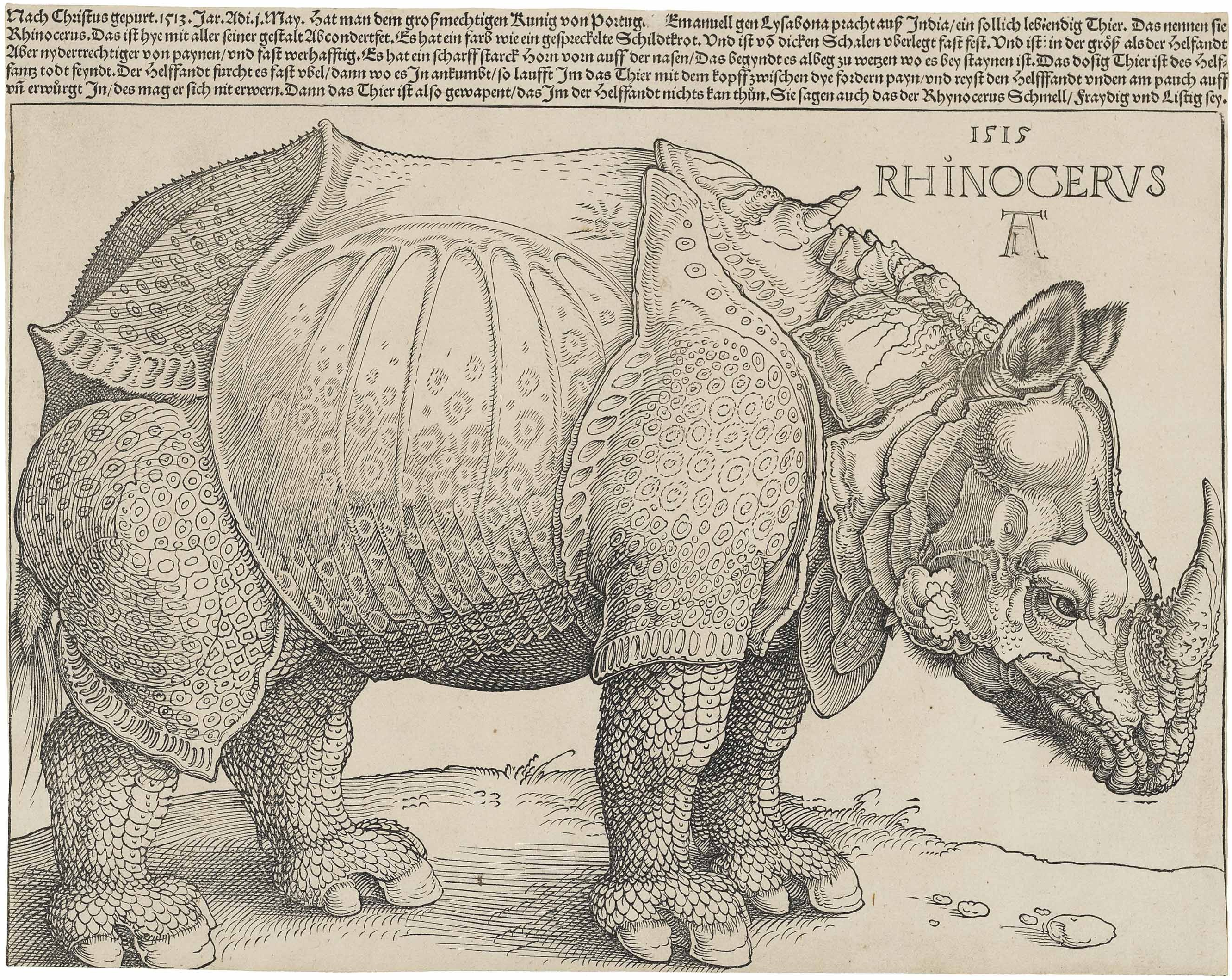
However, this new frenzy of collecting brought with it certain dangers (Kemp, 2002, 744). Dürer mostly made his drawings or paintings using the ‘real thing’ as a model, but at times his interest in the novel specimen got the better of him, and he would create a piece of art based merely on written or visual evidence. So when in 1515 he heard that a real live rhinoceros had been sent as a gift from the governor of Portuguese India to the King in Lisbon, and an eye-witness sent him a detailed note and a drawing to Nuremberg, he immediately set to work (Eichberger, 1998, 16). The resulting picture has the general outline and basic features of a rhinoceros, but its exterior looks more like it is wearing a metal plated armour – “what he did not know of the physical appearance of a rhinoceros is more than compensated for by his imagination” (Bartram, 2011).

Fig.3. Albrecht Dürer’s The Rhinoceros, 1515. The original was a pen and ink drawing. The above is a woodcut print, 23.5×29.8cm. National Gallery of Art, Washington.
As a live rhinoceros had not been seen in Europe for over a thousand years – the specimen for the King never reached its final destination, the Pope, after the ship on which it was being kept sank – Dürer’s print spread across Europe like a wild fire. This was possible, due to the technique of woodcut printing. Between 4000 and 5000 copies of The Rhinoceros (1515) were made in Dürer’s lifetime (BBC, 2011). Unfortunately, this also meant, that whoever saw the print of Dürer’s Rhinoceros believed that this was exactly what the animal looked like, illustrating the central problem of visual representation, “a picture is only as reliable as its network of production and distribution” (Sleigh, 2016, 4).
Representing ‘The Real Thing’ – Perspective and Proportion
Although such lapses, as mentioned above, happened even to the best artists, Dürer was a man of
ability and determination. When he was thirteen years old, he drew a silverpoint self-portrait of himself by observing his reflection in a mirror. It was followed by further self-portraits in 1492, 1498 and 1500 (Ashcroft, 2012, 377). His first is the oldest preserved self-portrait of a European artist (Doyle, 2013, 5). Dürer spoke of them as Konterfei, which means ‘likeness’ or ‘making exactly like’ (Berger, 1994, 12). Again, this proves his conviction to represent the natural world as true as possible.
Dürer was convinced that the key for achieving exactly that – the beauty of nature and its true representation – lay in the mathematical formulas of geometry (Kemp, 2006, 174). Soon after his first visit to Italy around 1500, Dürer began to question his previous works. He now saw them as “powerful but unsound” and, influenced by his Italian contemporaries he began to study the main aspects of Renaissance art theory – human proportions, the proportions of animals and perspective (Panofsky, 1955, 80).
Panofsky gives three reasons why the technique of perspective was received with such a universal enthusiasm. Firstly, the placing of an object anywhere in a picture and the production of a certain distance and point of location symbolised the character of a time in which a “historical distance between itself and the classical past” had given “man a place in the centre of the universe”. Second, perspective “satisfied the new craving for exactness and predictability”. And third, the application of mathematical formulae agreed with Renaissance aesthetics (Panofsky, 1955, 261). Latour tops this theory and states that perspective is a form of fiction, “even the wildest or the most sacred […] things of nature – even the lowliest – have a meeting ground, a common place, because they all benefit from the same ‘optical consistency’. Not only can you displace cities, landscapes, or natives and go back and forth to and from them along avenues through space, but you can also reach saints, gods, heavens, palaces, or dreams” (Latour, 1990, 28). Geometrical longitude and latitude create the perception in the viewer of standing right in the middle of a painting. This also meant that the observer was not detached from the painting anymore, but a full part of it – the artist became a manipulator of visual images, able to “play perceptual games” with the viewer (Scribner, 1998, 104). Dürer’s work on geometry, Instruction on Measurement, is the first document to treat a representational problem with a scientific answer. He points out that perspective is not a technical discipline limited to architecture and painting, but rather an essential part of mathematics (Panofsky, 1955, 253).
Like perspective, proportion also has an underlying mathematical method. What perspective is for the room in a painting, so proportion is for the human or animal body. Dürer sought to set up geometrical explanations for proportions, merging each body part with a geometrical form: “The total length and general axis of the body is determined by a basic vertical […] The Pelvis is described as trapezoid, and the thorax in a square […] The head, if turned in profile, is inscribed in a square, and the contours of the shoulders, hips and loins are determined by circular arcs” (Panofsky, 1955, 262). He soon realised that he could not apply this model to every human being and abandoned the geometrical curves in his drawings, stating that “the boundary lines of a human figure cannot be drawn with a compass of ruler” (Dürer in Panofsky, 1955, 264). Instead Dürer decided to consider a series of female and male body-types, which he assembled in his Four Books on Human Proportion (published posthumously in 1528).
Dürer was influenced by his older contemporary Leonardo Da Vinci. But whilst the latter focused on the underlying structures – muscles, bones and tendons – beneath the observed object, Dürer was more interested in representing the exterior of a given object (Eichberger, 1998, 15). This can be traced back to two interacting points that were very important to him. First, he saw beauty as one of the main features of art, as art is the representation of nature and nature is the product of God – “There is no living person on earth who can say definitively how the most beautiful human form might look. No one but God knows that” (Dürer in Ashcroft, 2012, 381). Second, as his main focus lay in the education of young artists, he saw no point in observing what lay beneath the exterior of an object. To him, geometry was a part of beauty and education, he cautions his young readers to stick to the function, because “what is not functional in a human being is not beautiful. Avoid superfluity” (Dürer in Ashcroft, 2012, 381).
Although the importance of works, such as the Four Books on Human Proportion, might be overlooked or forgotten today, the world of book publishing was revolutionised by the printing press during the Renaissance (Keller, 1972, 13). However, the printing press only allowed the processing of written works and it took time and patience to replicate paintings or drawings (Sleigh, 2016, 7). The most common forms were wood or metal engravings. Most of these wore off easily and did not allow a vast amount of shadowing or detailing. Furthermore, the process of woodcut printing “is one of double reverse”, which means that the original image has to be engraved in reverse onto the wood and is then printed in the right way onto the paper (Sleigh, 2016, 7). Dürer developed the remarkable technique of copper engraving and print – “it allowed the skilled artist to engrave exquisitely thin lines or sets of lines and marks in infinite variety. Thereby, stunning effects of shading, glittering, or even movement, as in animal’s furs can be produced” (Meyer, 2004).
Conclusion
I have shown that Albrecht Dürer was one of the great artists of the Renaissance period. Not only did his artworks embody the Renaissance theories of proportion and perspective, but they also depicted scenes from nature – plants, animals, and landscapes – as realistic as possible. His engraving, drawing and painting techniques were known across Europe and his studies of geometry on the depiction of the human body, meant he was a pioneer in his field. The frequent travels to and from Italy ensured that the Italian Renaissance moved across northern Europe with Dürer as its messenger.
Larissa Warneck (2016)
Bibliography
- Ashcroft, J. 2012. Art in German: Artistic Statements by Albrecht Dürer. Forum of Modern Language Studies, 48(4): 376-388.
- Bartram, G. 2011. A History of the World, Dürer’s Rhinoceros. BBC. [online] at http://www.bbc.co.uk/ahistoryoftheworld/objects/0eHcrXb8RuqIEVYKkExljg
- Berger, J. 1994. Albrecht Dürer. Benedikt Taschen Verlag GmbH. (7-13).
- Doyle, M. 2013. Albrecht Dürer, Master Drawings, Watercolours, and Prints from the Albertina. National Gallery of Art. [online] at https://www.nga.gov/exhibitions/2013/durer/durer.pdf
- Eichberger, D. 1998. Dürer’s Nature Drawings and Early Collecting. Chapter 2 in, ed. Eichberger, D and Zika, C. Dürer and His Culture. Cambridge University Press.
- Keller, A. 1972. Mathematical Technologies and the Growth of the Idea of Technical Progress in the Sixteenth Century. Chapter 2 in, ed. Debus, A.G. Science, Medicine and Society in the Renaissance, Essays to honour Walter Pagel. Heinemann, London. (11-28).
- Kemp, M. 2000. Visualisation, The Nature Book of Art and Science. Oxford University Press.
- Kemp, M. 2002. Naturally Natural, Albrecht Dürer’s Studies of Animals have a Life of their Own. Book Review of Science in Culture. Nature Vol. 420. Nature Publishing Group.
- Kemp, M. 2006. Seen and Unseen – Art, Science, and Intuition from Leonardo to the Hubble Telescope. Oxford University Press.
- Latour, B. 1990. Drawing Things Together. In, ed. Lynch, M. and Woolgar, S. Representation and Scientific Practice. The MIT Press, Cambridge, Massachusetts and London, England. (19-68).
- Meyer, J. 2004. Albrecht Dürer at the Crossroads of Art and Science, Response to Wadsworth. Endeavour. 28(1).
- Panofsky, E. 1955. The Life and Art of Albrecht Dürer. Princeton University Press, Princeton and Oxford. (80-106; 242-284).
- Scribner, B. 1998. Ways of Seeing in the Age of Dürer. Chapter 5 in, ed. Eichberger, D and Zika, C. Dürer and His Culture. Cambridge University Press.
- Sleigh, C. 2016. The Paper Zoo: Introductory Essay. British Library. (1-24).
- Tonelli, F. 2013. Science as Ground of the Renaissance Artists. Clinical Cases in Mineral and Bone Metabolism. 10(1): 68-69.
Pictures


 Having looked at a huge range of universities and the courses on offer I decided to apply for the MSc Science Communication and Society at the University of Kent. I chose this particular course as it offered an opportunity to study a combination of Biosciences and History modules allowing me to gain a fantastic insight into how these different disciplines are interconnected. My BSc was in Food and Nutrition and I wished to progress towards looking at the impact of food throughout history. While I really enjoyed the Biosciences modules available and found Dan Lloyd a brilliant lecturer, I took more of the history modules as they allowed me to delve into a different area from my scientific Bachelors degree. The optional modules on offer were incredibly interesting and it was very difficult to choose, but I settled on Deformed, Deranged and Deviant, which examined changing medical science and attitudes towards people who were ‘different’. The module was a fascinating insight into a delicate and sensitive subject. I also chose Places, Spaces and Things: Museums, Material Culture and the History of Science module, which really challenged me to think and look at museums and places of science from a new perspective. As a member of a Heritage Group in my town, with plans to start a local museum, this module will prove invaluable in helping me to contribute to my community. Kent has been supportive, enjoyable, challenging and mind expanding! I have great respect for the lecturers here who have developed the MSc Science Communication course as it opens a path between Science and Humanities and allows students to discover the connections between these two disciplines. The knowledge gained on this course has enabled me to gain a PhD scholarship in History where I will be researching food in rural Kent during the Second World War.


 by David Lugmayer

Recent Comments